Design Tokens
Design tokens are Lolly's single source of truth for brand primitives - colours first, then dimensions, type, and the rest. One canonical token document feeds three things at once: the values baked into tools, the swatches the colour picker offers, and an import/export bridge to other design tools. The format is the W3C Design Tokens (DTCG) standard - the same format Penpot imports and exports - so a brand defined in Lolly round-trips with Penpot and Tokens Studio. (Tokens carry the brand variables both ways; finished Figma/Penpot files come in through Layout Studio's Import a design.)
This page is the spec. The engine model is engine/src/tokens.ts; the format contract is pinned by tests/tokens.test.ts.
Status. The colour slice is shipped: brand colours are canonical tokens, the picker's swatches come from them, and a chosen brand colour stays linked to its token. Dimension tokens (radius, spacing, sizing, stroke, opacity, rotation, shadows) and typography (brand fonts) are shipped too, editable in the Brand Studio's Tokens and Type tabs. User import/export is shipped - import W3C DTCG / Tokens Studio / Penpot in the Studio (or via
ingest:brand), and export aLollyBrandpack or a design-tokens palette. Token-aware tool injection into templates remains on the roadmap.

Why tokens
Before tokens there were three disagreeing colour "truths": a hard-coded swatch array in the web shell, a palette catalog asset that tools could reference, and the engine's colour-management maths. Tokens collapse the first two into one canonical, versioned, git-reviewed source - and make it portable. The goal the project states plainly: keep as many things as possible canonical via tokens, and be able to import/export them with tools like Penpot.
The format (a DTCG profile)
A token document is DTCG JSON. A token is an object with $value (required) and $type; groups are objects without $value and pass their $type down to descendants. References between tokens use the curly-brace alias {dotted.path}.
{
  "color": {
    "$type": "color",
    "brand": {
      "jungle": {
        "$value": "#30ba78",
        "$description": "Jungle",
        "$extensions": { "com.suse.lolly": { "cmyk": [70, 0, 65, 0] } }
      }
    },
    "semantic": {
      "primary": { "$value": "{color.brand.jungle}" }
    }
  }
}
Two deliberate choices keep us interoperable with Penpot while serving Lolly's print needs:
- Colours: read every form, emit hex. DTCG's newer colour object (
{colorSpace, components, alpha, hex}) and every CSS string Penpot emits (#hex,rgb()/rgba(),hsl()/hsla()) are all parsed; everything normalises to a hex string (#rrggbb/#rrggbbaa/transparent) - the form the rest of the app already speaks. Lolly emits hex, which Penpot ingests cleanly. - CMYK rides in
$extensions. Print anchors live under the vendor keycom.suse.lolly. DTCG reserves$extensionsfor exactly this, and Penpot round-trips it untouched - so a colour stays print-correct without breaking compatibility.
Sets and themes. Top-level keys can be token sets; a $themes array selects and orders sets per theme (later sets override earlier - Tokens-Studio layering), with $metadata.tokenSetOrder fixing the order. A document with no $themes is one implicit set, and token paths keep their color.brand.x shape.
The four layers
1. Engine - engine/src/tokens.ts. Platform-agnostic, like units.ts. createTokenSet(doc, { theme }) parses a document, inherits group $type, resolves {} aliases (chains, cycle-safe), applies the theme, and returns a flat lookup with get / resolve / query({type}) / colors() / themes(). It knows DTCG and nothing else - no DOM, no storage, no SUSE - so it ships as part of the open-source engine.
2. Catalog - a tokens asset. The canonical brand document is suse/tokens/brand (a tokens-type catalog asset, core tier so it's always available offline). It is generated from the shell palette by scripts/build-brand-tokens.ts and validated against schemas/tokens.schema.json by npm run validate:catalog. Versioned and checksummed like any asset.
*3. User tokens - shipped.* A device-local store for the tokens a user creates or imports (from Penpot, DTCG, or a LollyBrand pack), travelling in the portable backup as the reserved tokens.json part (see Data Transfer). The Brand Studio handles import, editing, the active theme, and export back to DTCG.
4. Bridge - host.tokens. An additive, optional v1 capability (like net/text): get / colors / resolve / themes. Each shell implements it over the engine model and its sources; a shell that doesn't is simply not token-driven. Loading is offline-safe (prefers the core-prefetched blob, falls back to a direct fetch, then to the built-in palette).
How tools consume tokens
Platform hydration (the common case). Most tools never mention tokens. The platform feeds them:
- The picker's swatches are tokens. The colour field sources its swatches from
host.tokens.colors()for the active theme, labelled and grouped by token. This is what thepaletteinput field always promised. - Brand-bound values stay linked. Choosing a token swatch stores a reference, not a frozen hex (see below), so a later token edit propagates everywhere.
*Direct injection - (planned).* A token-aware tool (a brand sheet, a style guide, a chart that maps series to brand colours) can receive the resolved token tree in its template context via the existing extras mechanism, opted into from the manifest.
The value model: reference + cached value
When a user picks a token-backed colour, the stored value is a reference plus the hex it last resolved to:
{ "ref": "{color.brand.jungle}", "value": "#30ba78" }A token-backed swatch reads as its token in the sidebar: the trigger carries the swatch's name, not a frozen hex, which is the visible difference between a linked value and one typed in by hand.
The ref keeps the value canonical - editing the token, or switching themes, re-resolves it everywhere. The cached value is the graceful fallback for a device where that token is absent. The path is fully backward-compatible: a plain colour string (a custom pick, or any existing tool) flows through untouched.
How it moves through the engine:
- Hydration (
runtime.ts→resolveTokenRefs, mirroring asset-ref resolution): on load, each token-backed colour re-resolves against the live token set and its cached hex is refreshed.modelToValuesthen hands the template a plain hex string - templates and data/JSON exports never see an object. - Hooks see the flattened hex too (
modelForHooksininputs.ts): the{ ref, value }shape is an engine detail and never reaches a tool'sonInit/onInput, so the common(inputs.x || '').trim()pattern keeps working. - URL mode (
url-mode.ts): a token colour serialises to its reference (?bg={color.brand.jungle}), so a shared link re-resolves against the recipient's tokens. Parsing a{path}yields an unresolved token value the runtime then resolves.
- Editing past a token (typing a hex, dragging alpha) emits a plain string - deliberately de-linking from the token, because the user just overrode it.
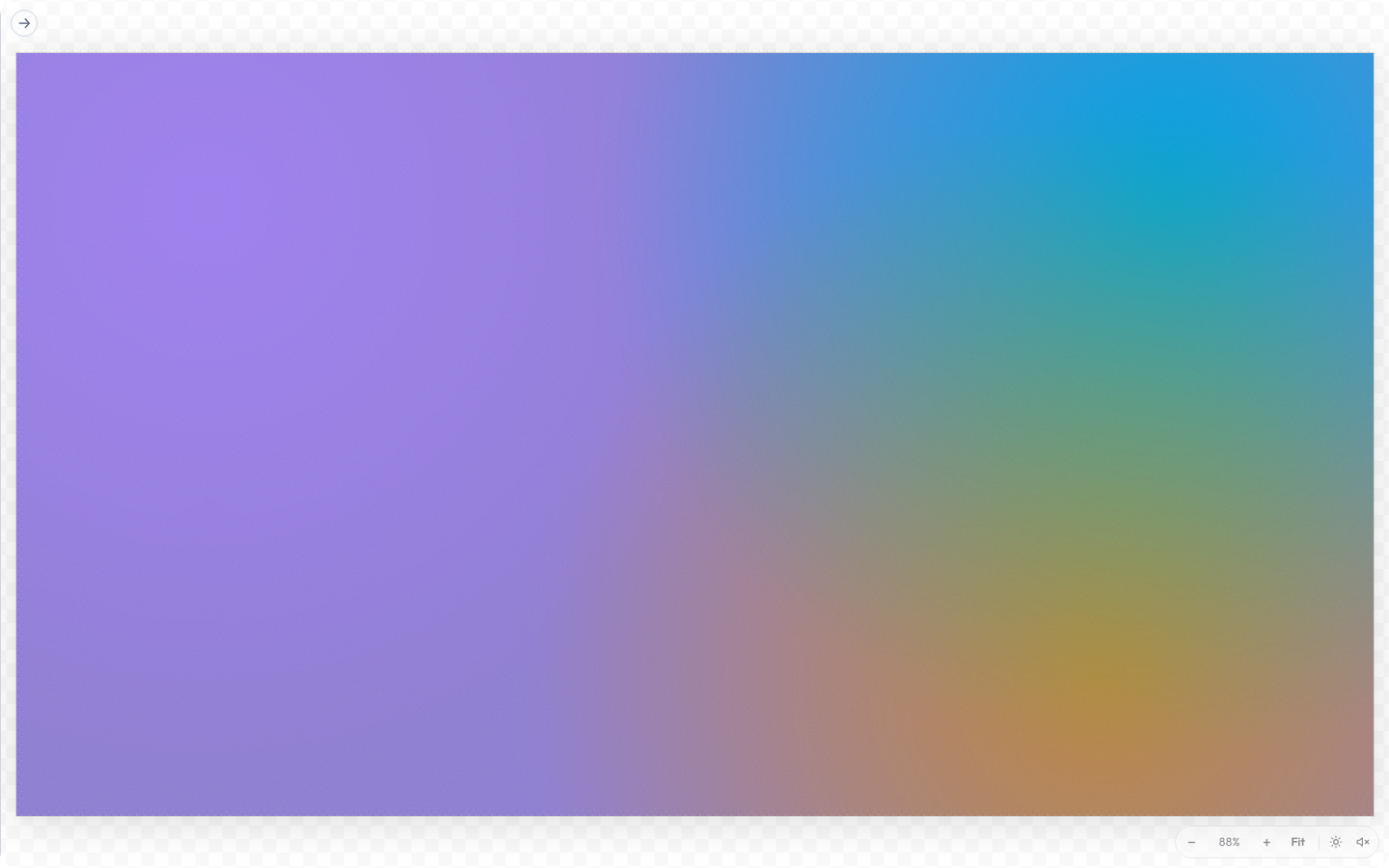
Nothing in the link below names a colour. Its three colour params are token paths ({color.spectrum.violet}, {color.spectrum.teal}, {color.spectrum.amber}), resolved at render time against whatever brand the device is carrying.
Penpot interop
- Author/generate: the brand tokens are a DTCG document - already the shape Penpot reads.
- Import/export (shipped): import a Penpot single-file, ZIP, or multifile export (
$themes.json+$metadata.json+ one file per set) in the Brand Studio or viaingest:brand, and export Lolly's tokens back as DTCG. CMYK survives Lolly→Lolly round-trips via$extensionsand is ignored by Penpot, as the standard intends.
Migration & status
The brand colours moved into tokens without changing what anyone sees: scripts/build-brand-tokens.ts derives the token document from the existing palette, so the picker shows the same colours - now sourced canonically. The shell palette remains the fallback (and, for now, the source of CMYK anchors on export). With dimension/typography tokens and user import/export now shipped, most of the app resolves from tokens and the standalone palette recedes; template-level token injection is the main piece still to land.
The corner radius is the plainest of the shipped dimension tokens: one slider writing one shape.radius value that the app chrome, the panels and every opted-in tool then follow.

Reference
- Engine model:
engine/src/tokens.ts-createTokenSet,resolveColorValue,colorToHex,isAlias,isTokenValue,TOKEN_EXT. - Tests:
tests/tokens.test.ts(model) andtests/tokens-value-path.test.ts(URL/hydration round-trip). - Schema:
schemas/tokens.schema.json. Generator:scripts/build-brand-tokens.ts. - Bridge contract:
TokensAPIinengine/src/bridge/host-v1.ts. Web impl:shells/web/src/bridge/tokens.ts.