The Brand Studio
The Brand Studio at #/start is the one place you shape your brand - its logos, colours, type, the rest of your tokens, and the files it keeps. Set it here once and every tool, page, and export follows it by construction, not by review.
Changes preview live across the whole app as you make them, so you can see a colour or a font land everywhere before you commit it. It's all on-device: your brand never leaves your machine, and it travels in a single brand pack file.
This is the editor. The dashboard is the mirror. The Design-system tab on the Dashboard (
#/d) shows your brand read-only; you edit it here at#/start. If you want to change a colour later, come back to the Brand Studio.
The five steps
The studio is a five-tab editor. Work left to right - or jump straight to any tab:
- Logos - your marks, in every orientation and treatment.
- Colours - one primary colour derives a full accessible palette; refine, generate, and add from there.
- Type - any Google Font, downloaded to this device.
- Tokens - corner radius, spacing, shadows, and the rest of the system.
- Catalogue - the image, audio, and motion files your brand keeps.
A Save & continue button appears the moment you change something and moves you to the next step (it reads Save & finish on the last one). The next tab lights up as a gentle nudge. You don't have to go in order - every step is optional and independent.
Deep-link a tab with #/start?tab=<key>, where the keys are logos, color (note the US spelling in the URL), type, tokens, and catalogue.
Logos
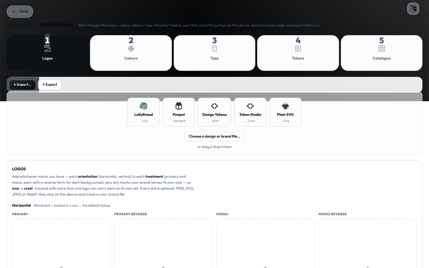
Every brand mark has a home here - a grid of orientation × treatment slots:
- Orientations: Horizontal (wordmark + symbol in a row) and Vertical (stacked, for square and tall spaces).
- Treatments: Primary, Primary reverse (for dark backgrounds), Mono (one colour), and Mono reverse.
That's eight optional slots. Click a slot to add a PNG, SVG, JPEG, or WebP; click a filled slot to replace it. Every slot is optional and everything stays on this device.
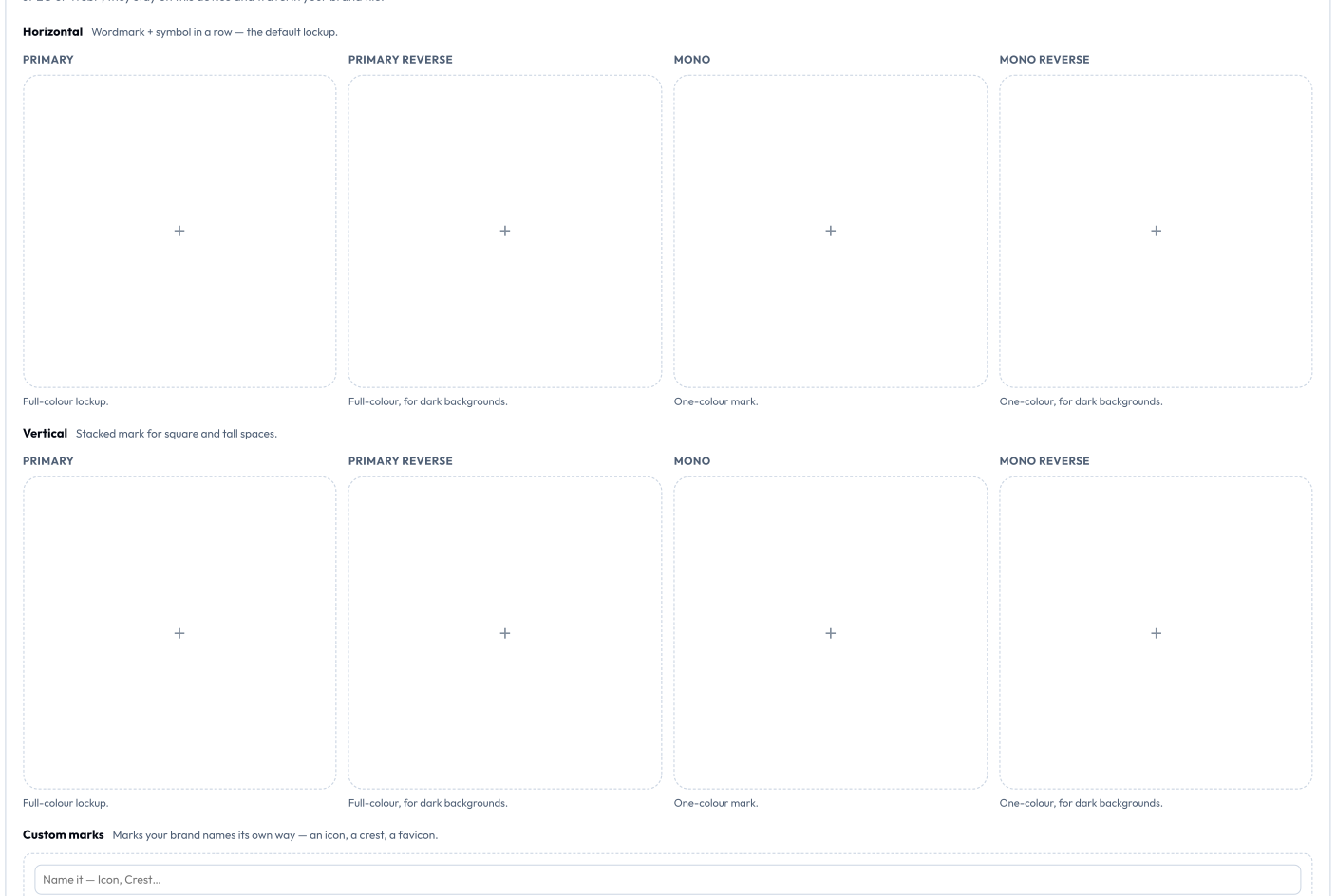
- Custom marks - add marks your brand names its own way (an icon, a crest, a favicon) under Custom marks; name it and choose a file.
- More identities - a sub-brand, product, or event can have its own full set of logos. Use + Add another logo and name it; your main set is simply "Your logo".
- Upload an SVG and Lolly reads its colours. On a brand-new install it quietly sets your primary colour from the logo. On an existing brand it offers the colour as a suggestion - "Found in your logo" - over on the Colours tab.
Colours
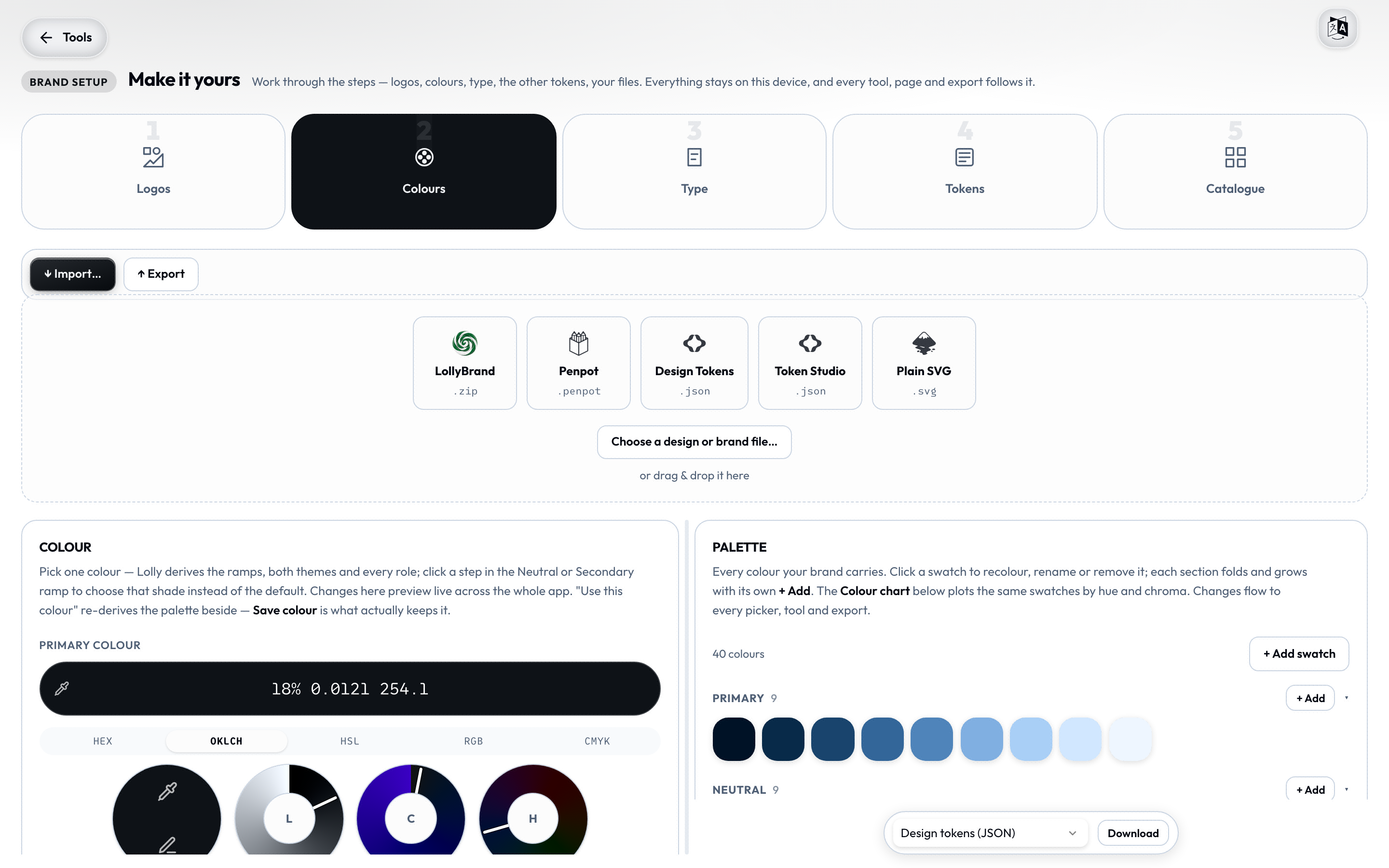
The richest step. The left pane derives and generates; the right pane is your live palette. Drag the divider to resize.
One colour, a whole palette
Pick a Primary colour and Lolly derives the complete palette - light and dark surfaces, text, accents, and full tint/shade ramps - using the same perceptual colour maths (OKLCH) the engine uses everywhere. Tune the derivation:
- Scheme - Mono, Complement, Analogous, or Triad - sets how the secondary colour relates to your primary.
- Shades - a slider from 3 to 20 (default 5) controls how many steps each ramp generates.
- Fine-tune (folded) - UI intensity (Muted / Deep), Contrast (Comfort / High), and Text on brand (Auto / Light / Dark).
Two important buttons, and the difference matters:
- Use this colour re-derives the palette into a live draft - the app updates so you can see it, but nothing is saved yet.
- Save colour is what actually keeps it.
Everything on this tab is draft-until-saved, so experiment freely; only Save colour writes it to your brand. (The other tabs - Logos, Type, Tokens, palette edits - save immediately.)
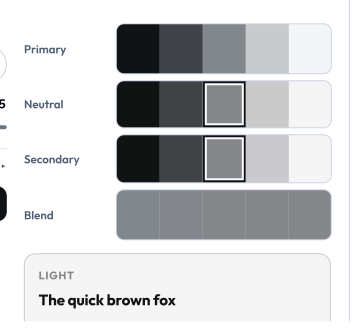
Below the primary you'll see live Primary / Neutral / Secondary / Blend ramps and light/dark specimen cards with their WCAG contrast ratios. Click a step in the Neutral or Secondary ramp to pick that shade instead of the derived default.
Build your palette (harmony generator)
Under Build your palette, generate matching accent colours from your primary. Pick a harmony - Complementary, Adjacent, Triad, or Tetrad - and each candidate comes with an auto-generated human-readable name and a + Add button. Added colours land in your palette immediately. "Your palette, applied" previews them on real graphics.

The palette, the wheel, and each swatch
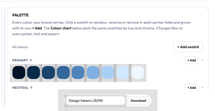
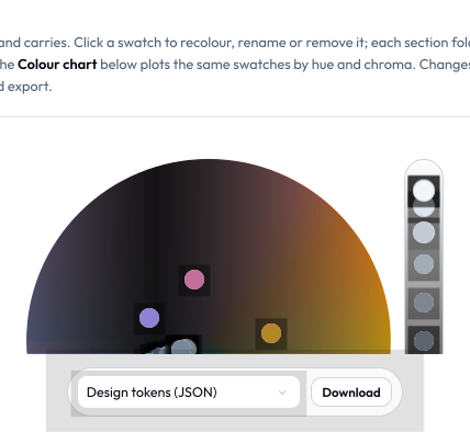
The right pane lists every colour your brand carries, grouped (Primary, Neutral, Secondary, Spectrum, Custom, Roles), each group foldable with its own + Add. Open Colour chart for the OKLCH wheel - drag a dot to recolour it, click a dot to edit it, or click empty space to drop a new swatch.
Click any swatch to open its editor:
- Rename it.
- Set by value - type a colour in Hex, RGB, RGBA, HSL, OKLCH, or CMYK. (Enter a CMYK value and it also becomes that swatch's print substitute - see below.)
- Stored as - choose how the swatch is persisted: LCH (the default - perceptual, wide-gamut, the best choice for editing), Hex, RGB, or HSL. Override it when you need to pin an exact legacy hex or match an sRGB value.
- Print substitutes (folded) - lock the colour's print behaviour:
- CMYK - check it to override the automatic sRGB→CMYK conversion with exact ink values (C/M/Y/K, 0–100).
- Spot - check it to lock the swatch to a spot colour; give it a Name (e.g.
PANTONE 186 C) and an optional Book.
These print locks are what a press uses when you export a CMYK PDF or TIFF - see Exporting.
Deleting a swatch is safe: derived ramp steps and theme roles are hidden (the underlying token keeps resolving, so nothing downstream breaks), while colours you added yourself are removed outright.
Gradients
An optional Gradients panel builds blend tokens from your palette for backgrounds and accents. Skip it entirely if your brand doesn't do gradients. Each gradient has a preview, named stops (2–8), and an angle. The key behaviour: a stop references a swatch, so recolour that swatch and the gradient follows. Interpolation runs in OKLCH for clean blends. Delete a stop to trim the run.
Take the palette elsewhere
The floating pill at the bottom of the palette pane downloads the whole palette as Design tokens (JSON), CSS variables, CSS classes, a GIMP palette (.gpl), or an Adobe Swatch Exchange (.ase) - so the brand drops straight into Illustrator, Figma, GIMP, or a stylesheet. (You can also download the palette from the Catalogue view.)
Type
Add any Google Font and it downloads to this device - rendered in the app, your tools, and every export, offline forever, and carried in your brand pack. Nothing is fetched at render time.
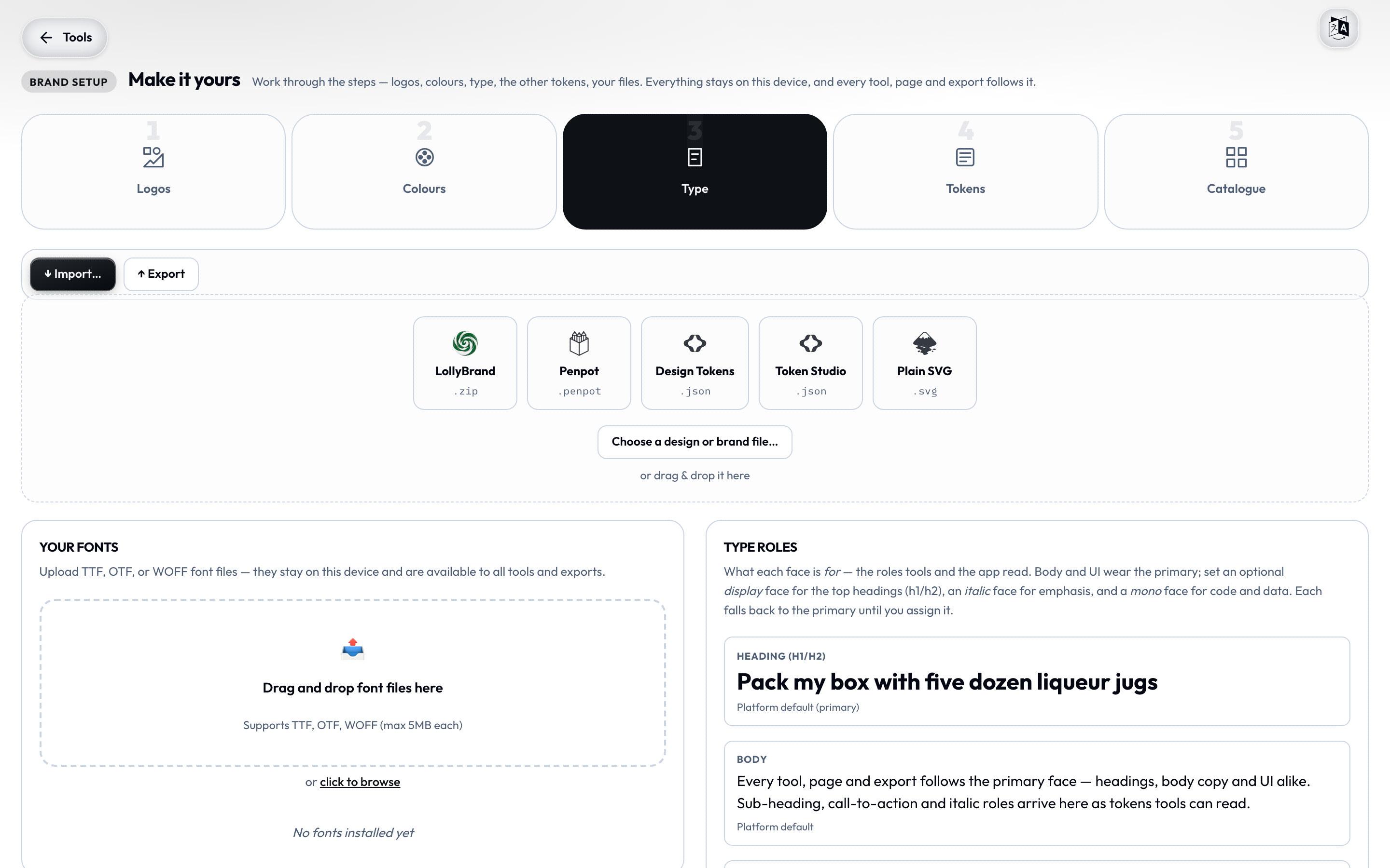
Search a family (Inter, Fraunces, Space Grotesk…), and Add font. Each font in the list can take a role:
- Primary - your main brand and body face (Make primary).
- Code - an optional monospace face for code and data (Use for code).
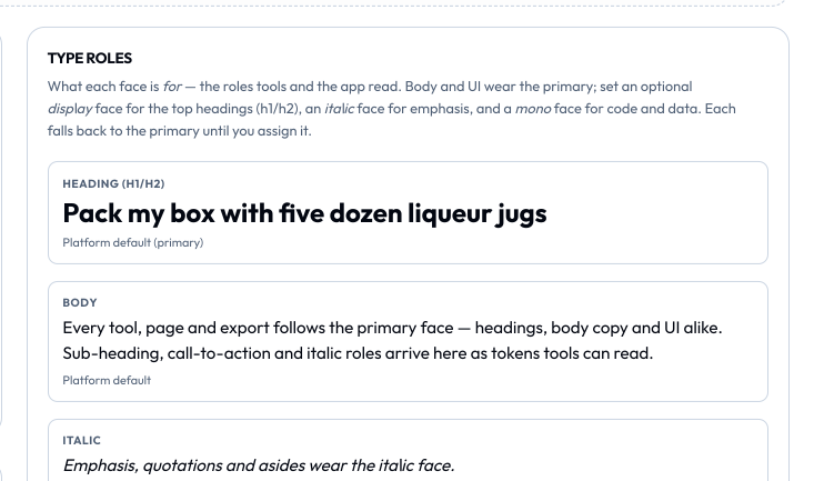
The Type roles panel shows a live specimen of Heading, Body, and Code so you can see each face doing its job. Everything on Google Fonts ships under an open licence (OFL/Apache/UFL).
Tokens
The rest of the design system, editable without touching code:
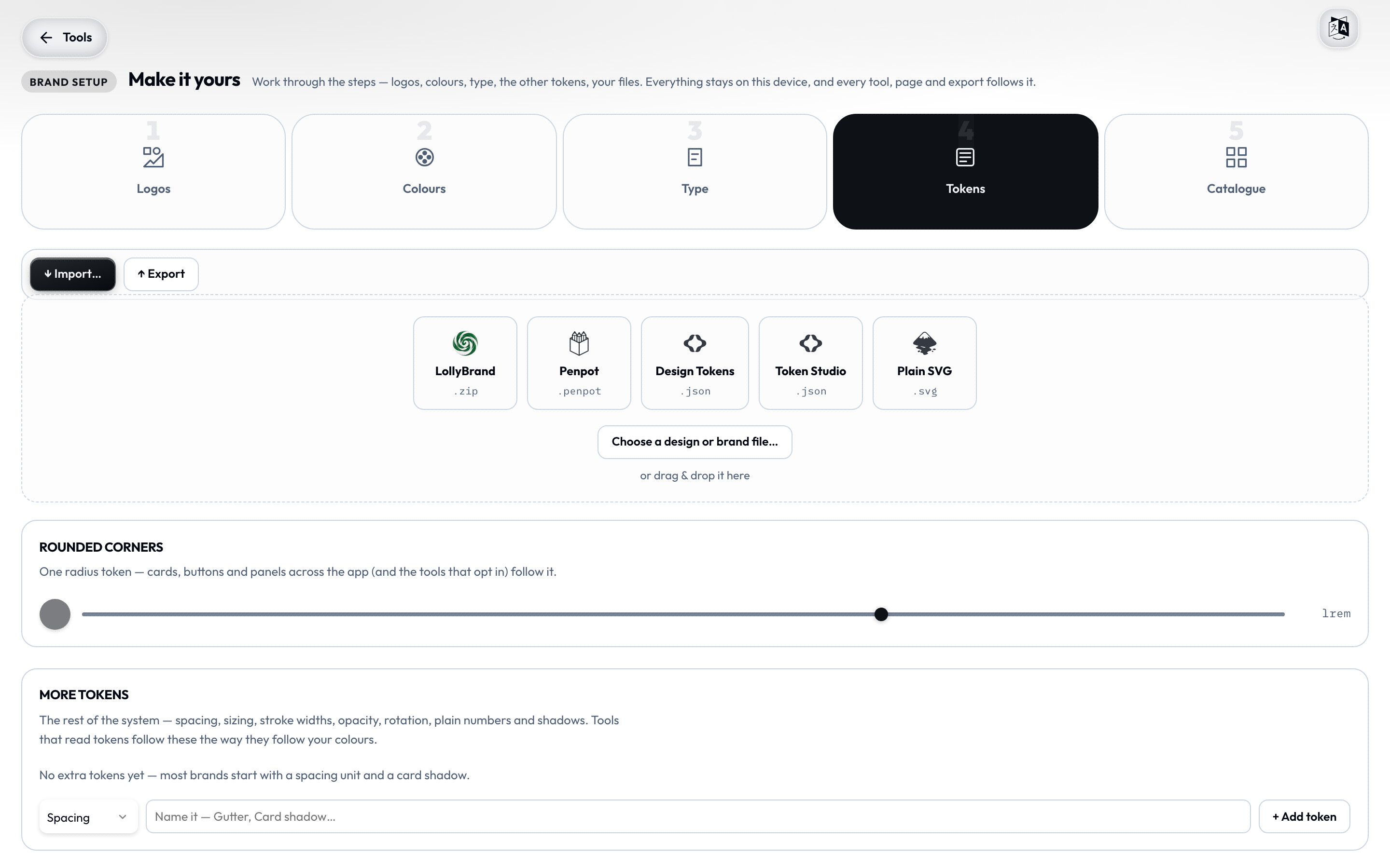
- Rounded corners - a single radius slider (0–1.5rem) that cards, buttons, and panels across the app follow.
- More tokens - add and edit spacing, sizing, stroke width, opacity, rotation, plain numbers, and shadows. Pick a type, name it (Gutter, Card shadow…), and set its value. These are stored as standard design tokens (DTCG) and travel with your brand.
Catalogue
Drop the files your brand keeps - logos aside - here: vector, image, audio, and motion (video, Lottie, animated) assets. They land in your Catalogue, sorted into sections and ready in every tool's asset picker. Everything stays on this device.
Move a brand between devices
The Export button in the top action row writes a single LollyBrand-…zip - your tokens, fonts, logos, and theme preference, with an integrity manifest. The Import… button (or a drag-and-drop onto the studio) accepts:
- a LollyBrand pack (
.zip) - installs in one step; - a Penpot export (
.penpot) - pulls in its design tokens; - a Design Tokens file (
.json) - W3C DTCG; - a Tokens Studio file (
.json) - Tokens Studio; - a plain SVG (
.svg) - Lolly scans its colours and lets you pick which to keep, the first becoming your primary.

This is how a colleague hands you a brand, or how you carry one to a second install - no account, no cloud. To bring in a brand from the command line instead, see ingest:brand.
When the brand is fixed
Some builds ship a locked brand - its colours, fonts, and tokens are what every tool and export use, and there's nothing to change. In that case the studio is replaced with a short note explaining that this build ships with a fixed brand and editing is turned off. This is deliberate: it's how an organisation guarantees everything stays on-brand.
Where to go next
- Using Lolly - the canvas, saving, projects, and the catalogue.
- Design Tokens - the token model your brand is expressed in.
- Exporting & formats - print units, CMYK, and the formats your brand renders into.