Authoring Assets
Assets are global, versioned, brand-controlled resources tools draw from. Logos and mascots, palettes, design tokens, event tiles, fonts, music beds, and video b-roll. The authoritative list of asset types is the type enum in schemas/asset.schema.json: vector | raster | video | audio | lottie | palette | tokens | font.
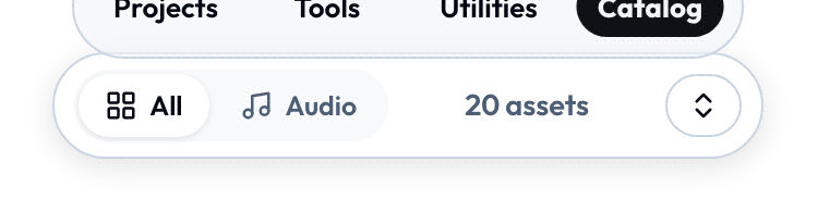
Those types are what the Catalogue's filter row is built from, and it only offers the buckets the library actually holds, so a catalogue of audio and tokens shows fewer pills than a catalogue of logos and photos.
Anatomy
catalog/assets/
├── index.json                                   # the manifest of all assets
└── <namespace>/<group>/<name>.<ext>             # the files themselves
Example:
catalog/assets/suse/logo/primary.svg
catalog/assets/suse/logo/primary.png
catalog/assets/suse/palette/brand-core.json
catalog/assets/event/kubecon-2026/badge.svg
The asset entry (in index.json)
Validated against schemas/asset.schema.json.
{
  "id": "suse/logo/primary",
  "name": "SUSE Primary Logo",
  "type": "vector",
  "version": "1.0.0",
  "tier": "core",
  "tags": ["logo", "official", "centermark"],
  "formats": [
    {
      "format": "svg",
      "url": "/catalog/assets/suse/logo/primary.svg",
      "checksum": "sha256-...",
      "size": 2048
    }
  ],
  "license": "internal"
}
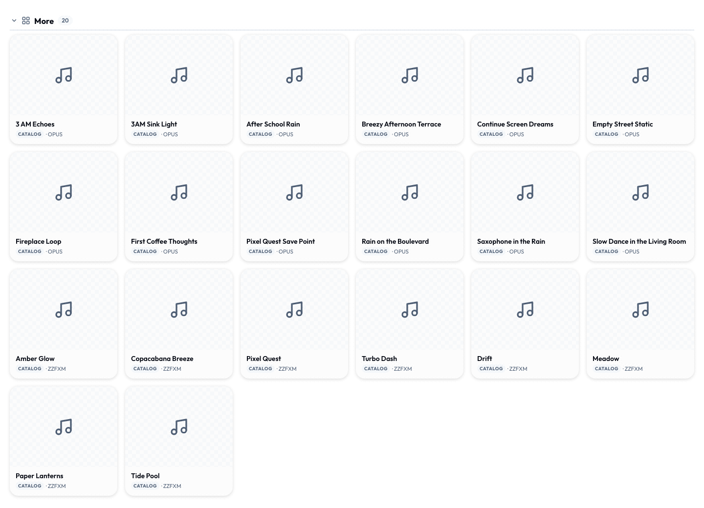
Each entry becomes one tile in the Catalogue, grouped by what its tags say it is. A pack of audio beds and token documents lands under More; logos, backgrounds and icons get their own sections once the tags are there.
Rules that don't bend
idis forever. Once published, never rename, never reuse. If you need a different logo, give it a different ID.- Bump
versionon every byte change. Tools cache by id+version. Forgetting to bump means stale bytes everywhere. - Always include a
checksum. SRI-format SHA-256. End-to-end integrity check, prevents CDN poisoning. - Deprecate, don't delete. Set
"deprecated": trueand optionally"replacedBy": "new/asset/id". Existing references continue to resolve.
Tiers
| Tier | What it means | When to use |
|---|---|---|
core | Bundled with the app. Always available offline. | Logos, primary palette, design tokens, core mascot poses |
catalog | Synced at boot, cached. Available offline once cached. | Most things - event packs, icon sets |
on-demand | Fetched when first used, then cached. Needs net first time. | Heavy items - hi-res photo, video b-roll |
The core tier is meant to stay small (target a few dozen brand essentials) - most assets ride in the catalog and on-demand tiers. Catalog-tier entries can set "prefetch": true (catalog tier only) to fetch their bytes at sync time rather than lazily on first use.
Locales
Locale-specific format variants go under locales:
{
  "id": "suse/wordmark/horizontal",
  "version": "1.0.0",
  "tier": "core",
  "formats": [
    { "format": "svg", "url": "/catalog/assets/suse/wordmark/horizontal.svg", "checksum": "sha256-..." }
  ],
  "locales": {
    "ja": [
      { "format": "svg", "url": "/catalog/assets/suse/wordmark/horizontal-ja.svg", "checksum": "sha256-..." }
    ]
  }
}
Tools and host UI resolve via BCP-47 locale matching. Falls back to the base entry if no locale variant exists.
Palettes
Palettes are a special asset type whose payload is JSON, not an image:
{
  "name": "SUSE Brand Core",
  "swatches": [
    { "name": "Jungle", "hex": "#0C322C", "rgb": "...", "hsl": "..." },
    ...
  ]
}
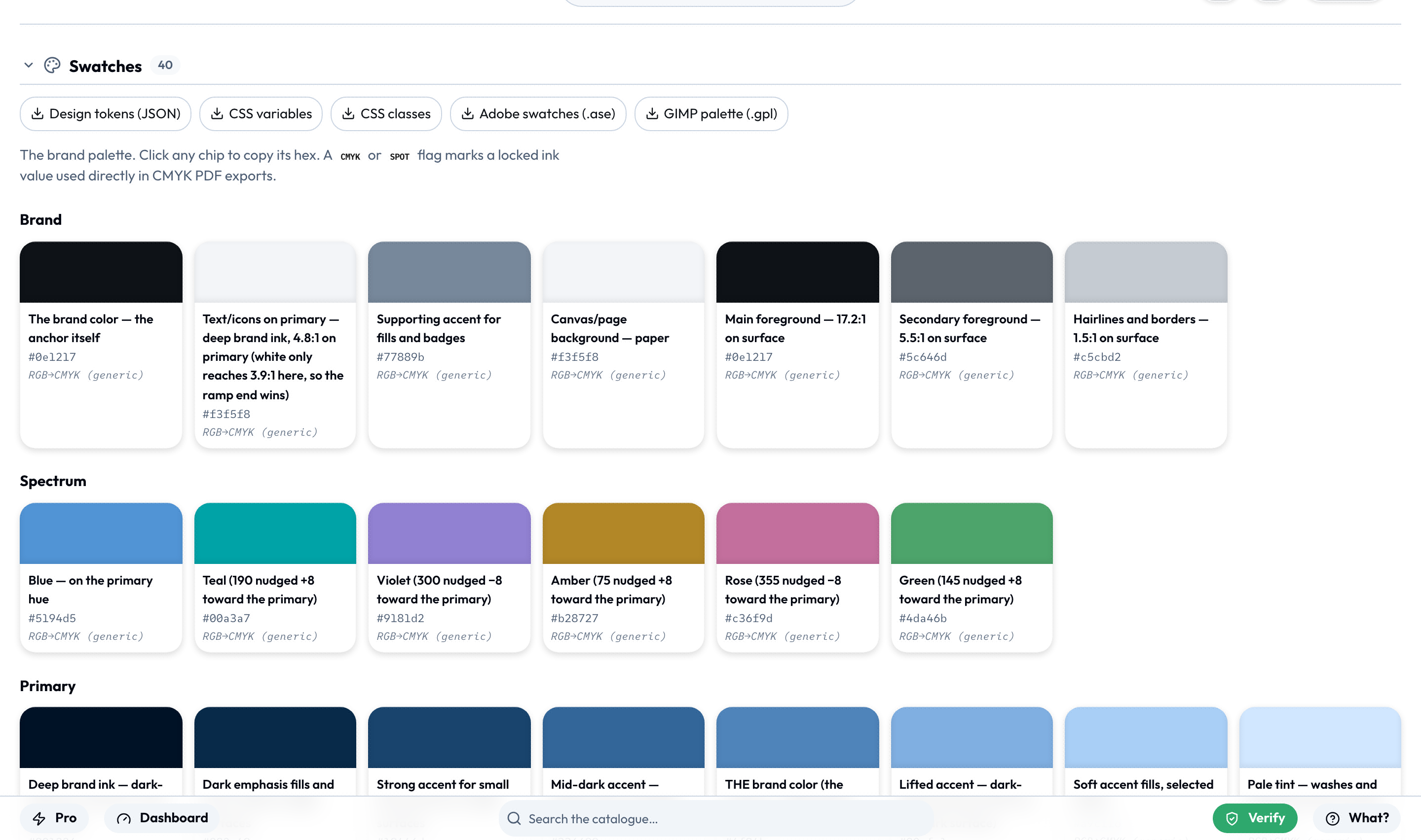
A palette asset is what the Catalogue's Swatches section renders: every ramp step as a chip, click to copy its hex.
Tools reference palette swatches through host.assets.get(id) → ref.meta.swatches. Note this is wired up in the CLI shell today (its bridge parses the palette JSON and spreads swatches into meta); the web shell's assets bridge does not yet populate meta.swatches, so don't rely on it cross-shell.
The color input type also accepts a palette field (schema-valid, mapped to a palette-picker control in engine/src/inputs.ts), but the web shell currently renders that control as a stub. For a working brand-restricted picker today, use a color input with "swatchesOnly": true - it renders the real brand swatch picker (no hex/native/alpha).
Themable two-colour icons
An icon tagged themable is an SVG that expresses its two colours only as classes, with one overridable default block and nothing else - no other fill/stroke/style anywhere:
<svg xmlns="http://www.w3.org/2000/svg" viewBox="0 0 40 40" width="40" height="40">
  <defs><style>.c1{fill:#30ba78}.c2{fill:#0c322c}</style></defs>
  <path class="c2" d="…"/>   <!-- base (majority) shapes -->
  <path class="c1" d="…"/>   <!-- accent shapes -->
</svg>.c1is the accent,.c2the base. The defaults (jungle on pine) are plain class rules, so inlining the SVG lets a page or tool override them -.c1 { fill: … !important }wins by design.- The colour pairings the picker offers come from a palette-type asset tagged
icon-themes(suse/palette/icon-themes); its first pairing must match the defaults baked into the icons. - A non-default pairing chosen in the picker travels inside the asset id -
suse/icons/ai?theme=ocean- because an asset value persists as its id alone (URL mode). Both shell bridges parse that suffix (parseThemedAssetId) and bake the pairing at resolve time (applyIconTheme: style block removed, fills inlined as attributes) so two differently-themed copies never fight over class rules inside one exported SVG/PDF. - The validator enforces the contract for every
themable-tagged SVG (exactly one default style block; classes limited toc1/c2; no inline styles or strokes).
Design tokens
type: "tokens" is a DTCG (Design Tokens Community Group) JSON document - the canonical brand-color source. The core asset suse/tokens/brand feeds the color picker's swatches and the defaults for brand-bound inputs. Beyond the normal asset checks, the validator runs a dedicated DTCG-structure validation against schemas/tokens.schema.json (scripts/validate-catalog.ts). See Design tokens for the token model and how palettes relate.
Fonts
font is a valid asset type, but the shared SUSE typefaces don't live in the asset index - they ship as static files under catalog/fonts/, a sibling of catalog/assets/:
catalog/fonts/
├── variable/    # variable TTFs (SUSE[wght].ttf, SUSEMono[wght].ttf, + italic axes)
├── webfonts/    # woff2 - the variable fonts plus per-weight statics
├── ttf/         # static TTFs
└── otf/         # static OTFs
The web shell loads them via @font-face (shells/web/src/styles/fonts.css, with the variable woff2 preloaded from index.html); tool templates reference the same /catalog/fonts/... URLs directly. The text-to-path step (host.text, used when a vector export outlines its text) reads the static TTFs from catalog/fonts/ttf/. Because they're plain static files, they aren't versioned or checksummed through index.json the way catalog entries are.
Workflow
- Drop the file under
catalog/assets/<namespace>/.... - Add an entry to
catalog/assets/index.json(thechecksum/sizecan be left
as sha256-PLACEHOLDER/0 - the next step fills them in).
- Run
npm run build:catalog-scripts/checksum-assets.tscomputes the real
SHA-256 (SRI) and byte size for every asset format and writes them into the index. npm run validate:catalog then verifies every checksum against the bytes on disk.
- PR review. Approval = brand approval.
- Merge → build catalog → deploy. Clients pick it up at next sync.
This git-reviewed flow is for a shared, governed catalog - the model where a whole organisation syncs one asset library and wants every change to carry PR review as brand approval. It's an option for that case, not how the app works day to day.
Most people never touch it: in the open app you ingest your own creative files straight into your catalogue - drag them onto the Catalogue view or the Brand Studio's Catalogue tab, and they're instantly available in every tool's asset picker, on your device.

Those user assets live under the user/ namespace and never enter a shared catalog. The git route matters only when you're curating a library many people depend on.

Composed renders - a tool that embeds another tool's output via composes (see Authoring tools) - surface as ephemeral AssetRefs through the same {{asset id}} helper, but they are runtime intermediates, not catalog assets.