
Three input patterns cover tools that need more than a list of fields. blocks repeats a group of fields, a canvas object on a blocks input turns its rows into boxes on an editor canvas and vector groups a few numbers into one control, as image framing does.
blocks - repeating groups
A blocks input is a list of records, such as team members with a name and a city each. Declare the fields of one row under fields:
{
  "id": "people",
  "type": "blocks",
  "label": "Team members",
  "fields": [
    { "id": "name", "type": "text",  "label": "Name" },
    { "id": "city", "type": "text",  "label": "City" }
  ]
}
In the template, loop with {{#each people}}…{{/each}}. The value travels in a link as a JSON array, and the shell packs a long link automatically. When a list is too long for a link, the Share dialog points to a .lolly file, and a saved slot also works. Rows are edited in a side panel. Clicking a rendered row on the canvas focuses its fields. meeting-planner is the reference for rows that all have the same fields.
 signed by Lollyvector SVG19 paths~3.1k nodes50 groups42 KBCheck it yourselfİmzalı dosyayı al
 signed by Lollyvector SVG19 paths~3.1k nodes50 groups42 KBCheck it yourselfİmzalı dosyayı al


Rows of different kinds
A row's fields can be text, color, select, asset, number or boolean. A select field can also set each row's kind:
addMenu: { field, label }turns the Add button into a menu with one entry per option of the namedselectfield. The kind is fixed when the row is created and shows as the row's label instead of an editable control. An entry already used is disabled unless its option setsrepeatable: true.showFor: ["kind"]on a field shows it only on rows of the listed kinds.multilineFor: ["kind"], with an optionalrows, turns a text field into a text area on rows of those kinds.
multi-page-pdf is the reference, with addMenu on a kind select, showFor and multilineFor; deck-studio does the same with a layout select.
Filling rows from files, Markdown and spreadsheets
- Drop files to add rows.
dropToAdd: { field, accept }adds one row per file dropped on the list and uploads each file into the namedassetfield. The row's other fields start at their defaults.acceptis a MIME filter,image/*by default.logo-wallis the reference. The CLI takes the same rows from files after the tool id, from--<id>-file=<path>and from a path list with--<id>-files=<paths|->(Pictures into a list), and checks each file againstaccept. - Paste a Markdown document.
mdPaste: trueadds a Paste Markdown button. It reads the clipboard and adds one row per heading. The heading line goes into the row'sheadingfield and the section under the heading intobody, kept as Markdown for a{{markdown}}render. The paged and document tools take Markdown in this way, as editable rows that flow across pages. - Import a spreadsheet.
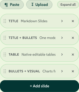
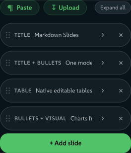
importData: { formats?, mode?, columns? }adds an Import data button that fills the list from a CSV or JSON file. An explicitcolumnsmap ({ fieldId: "Column Name" }) wins; otherwise each column header or key is matched, ignoring case, to a field'sidand then itslabel.formatslimits the accepted types (both by default), andmodeisreplace(the default) orappend. JSON may be an array of objects, an array of arrays in field order or{ "data": [ … ] }. Imported rows go into links and saved sessions like typed rows.deck-studiois the reference, with one row per slide.
Rows that point at other rows
Reference pickers (optionsFrom). A field can be a dropdown whose choices are the rows of another blocks input. A row then refers to another row by a readable name instead of a typed id:
{ "id": "parent", "label": "Reports to",
  "optionsFrom": { "input": "nodes", "value": "nodeId", "label": "label",
                   "excludeSelf": true, "excludeDescendants": true, "emptyLabel": "- Top level -" } }
The stored value is the target row's derived id: slug(value field), else slug(label), else an ordinal, made unique. A hook resolves the same id, so slug both a row's id and the reference in your hook. A stored value that matches no current row shows as a selected (unknown) option, so a stale reference stays visible.
The options are value, label and prefix (the source fields and an ordinal prefix); sources: [{input,value,label}] to merge several inputs, such as cards and layers, without duplicates; freeText: true for a combobox that also accepts a typed value, such as a new kanban column; excludeSelf; excludeDescendants, which needs nesting; and emptyLabel.
Tree rows (nesting). A blocks input can be edited as a tree. The sidebar shows the flat array as an indented outline. Drag a card's header to drop the card above or below another card as a sibling, or inside that card as a child. The drop updates the card's parent reference, and the card's subtree moves with the card. The data stays a flat array of rows that refer to each other by id, so the data travels in links and renders as before.
{ "id": "nodes", "type": "blocks", "nesting": {
    "parentField": "parent", "keyField": "nodeId", "labelField": "label",
    "activeWhen": { "diagramType": ["org", "mindmap"] } } }
activeWhen turns tree mode on only while top-level inputs hold the given values. An array value matches by membership. Leave the key out to always nest. diagram-builder is the reference for both optionsFrom and nesting: org charts and mind maps nest, while process, kanban and layercake diagrams stay flat and refer to rows through the picker.
Editor canvas: connectors, grid & fixed size (canvas.connect / grid / fixedCanvas)
A blocks input with a canvas object is the free-form artboard behind render.layout: "editor" (layouts). Its *Field keys say which field of each row holds which part of a box's geometry (xField, yField, wField, hField, rotationField, plus fill, text and image fields). The shell mounts its select, drag, resize and rotate overlay, and the data stays a flat array that fits in a link. The shell also mounts the editor rail, with add, arrange, undo and the main export actions. The manifest declares the geometry fields and nothing else.
 signed by Lollyvector SVG62 paths422 nodes42 groups42 KBCheck it yourselfİmzalı dosyayı al
 signed by Lollyvector SVG62 paths422 nodes42 groups43 KBCheck it yourselfİmzalı dosyayı al


Two keys turn a plain box canvas into a diagram editor:
grid-{ size, default }. Snap to a grid ofsizecanvas pixels while dragging and resizing, on at the start whendefaultis true. Alignment guides win over the grid. Cmd or Ctrl turns the snap off while resizing, and Alt, Cmd or Ctrl turns the snap off while moving.fixedCanvas-truelocks the canvas torender.widthandrender.height: the shell withholdssetCanvasSizeand ignores the reserved?widthand?height, so box coordinates stay one to one with the render size. Required whenever a hook draws into an overlay with a fixed viewBox, such as connector arrows in an<svg>sized to the artboard.
Connectors as bound paths
org-chart is the public reference for an editor canvas with grid and fixedCanvas: true. Its connectors are bound paths: rows of the same boxes input, each a path whose ends can attach to boxes. These canvas keys map those rows:
pathField- the text field holding the authored path: the pen tool's nodes and handles, normalised to the box frame, so moving, resizing and rotating act on the path like any box. Machine-written, so give itshowFor: [].strokeField,strokeWField,strokeDashField,strokeCapField,strokeJoinFieldandfillRuleField- the path's stroke and fill.headStartFieldandheadEndField- the decoration at the first and last point:none,triangle,open,circle,diamondorbar.bindStartFieldandbindEndField- the id of the box each end is attached to, empty for a free end. Written by the bind gesture, never typed.routeField- how a path with a bound end travels between its boxes: straight, elbow, curved or arc, or empty for automatic.pathLayerClass- the class on the<svg>layer where the hook draws the committed paths. The shell hides that layer during a drag while it paints its own preview.
The canvas object has about a hundred keys. The canvas property of a blocks input in schemas/tool.schema.json describes each one.
The older connect key, which no public tool uses
connect opts into connector authoring as a second blocks input of edges: a Connect rail button (click a source box, then targets), a live connector preview and an Auto-arrange button that tidies the canvas into a tree. The tool's hooks.js reads the edges and draws the arrows as filled paths in one artboard-sized <svg>. The *Field keys refer to fields of that edges input:
"connect": {
  "input": "connectors",
  "fromField": "from", "toField": "to",
  "styleField": "style", "arrowField": "arrow", "headField": "head",
  "colorField": "color", "dashField": "dash", "widthField": "width",
  "layerClass": "oc-connectors",
  "defaultStyle": "elbow", "defaultArrow": "end", "defaultHead": "triangle",
  "defaultColor": "#94a3b8", "defaultWidth": 2.5
}fromFieldandtoField(defaultfromandto) hold the source and target box ids.styleField- the route:straight,elbow,elbow-v,elbow-h,elbow-src,elbow-tgtorcurved.arrowField- which ends carry an arrow:none,endorboth.headField- the arrowhead:triangle,open,circle,diamondorbar.colorField,dashField(solid,dashed,dotted) andwidthField(pixels) - the line styling.layerClass- the class on the tool's connector<svg>, hidden mid-drag while the shell paints its preview.defaultStyle,defaultArrow,defaultHead,defaultColoranddefaultWidth- the values a new edge starts with.
Timelines and depth
A canvas that maps all ten time fields becomes a timeline editor: the shell mounts the timeline panel, the clock and the sequence export. Map all ten or none. A partial mapping counts as absent, because the panel could read the fields but not write them.
| Key | The field that holds |
|---|---|
startField, durField | When the box appears and how long it stays, in seconds. An empty start keeps the box visible throughout |
clipInField, speedField | Where a video, Lottie or audio box starts reading its own media, plus its playback rate |
enterField, exitField | The named animate-in and animate-out presets, such as fade, rise or pop |
enterMsField, exitMsField | How long each preset takes, in milliseconds |
muteField | Whether the box's own audio is silenced in the mix |
laneField | The lane: a free overlay lane, or the main sequence row where clips stay gapless and edits ripple |
Three more keys are optional, and each works alone:
zField- thenumberfield holding a box's depth in canvas pixels: positive in front of the stage plane, negative behind that plane. The projection, the depth ordering and the depth shadow below use this value.kfField- thetextfield holding a box's keyframe track (Keyframe tracks has the wire grammar). A track can key a box's size (w,hin pixels) as well as its pose. Size is the one pair that lays the box out again: text rewraps and a border stays one pixel wide. Hooks must parse and re-serialise this field and never pass the stored value through to a rendered attribute, because a hand-edited share link can put anything in a text field. Re-serialising keeps only clean tokens on the page.linkField- thetextfield holding the back-reference written when a clip's audio is detached onto its own lane. It holds the id of the box on the other side and is written on both sides, so reattaching works from either end. Machine-written, so give itshowFor: []. The field does not share geometry or create instances. A tool without the field keeps every time feature but never offers Detach audio.
Two more depth features are values in existing declarations, not canvas keys. A box kind of camera is an invisible marker that aims and moves the view. A camera has no footprint on the canvas and is left out of hit-testing, marquee selection, alignment and stacking. People select a camera from its timeline bar or chip, and a camera adds no pixels to the export. The shadow select can offer a depth option: a drop shadow derived from the box's zField value that falls off with depth, instead of an authored offset, blur and colour.
vector - a group of numbers as one control
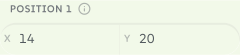
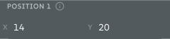
Use vector when a few numbers belong together: zoom and pan, an x and y offset, padding, margins. Separate number inputs would mean one Batch column each. A vector is one input, one control and one column. The control is a row of compact number fields: drag a label to scrub the value, or type a value. Declare the numbers under fields:
{
"id": "imageFraming",
"type": "vector",
"label": "Zoom & Position",
"fields": [
{ "id": "zoom", "label": "Zoom", "min": 100, "max": 400, "step": 1, "default": 100 },
{ "id": "x", "label": "X", "min": 0, "max": 100, "step": 1, "default": 50 },
{ "id": "y", "label": "Y", "min": 0, "max": 100, "step": 1, "default": 50 }
]
} signed by Lollyvector SVG19 paths363 nodes14 groups9 KBCheck it yourselfİmzalı dosyayı al
 signed by Lollyvector SVG19 paths363 nodes14 groups9 KBCheck it yourselfİmzalı dosyayı al


The value is an object keyed by field id, so the template reads each part with a dot: {{imageFraming.zoom}}, {{imageFraming.x}}, {{imageFraming.y}}. Each field clamps to its own min and max and falls back to its default.
In links and Batch CSV, each field is its own parameter or column, named <inputId>.<fieldId>: ?imageFraming.zoom=200&imageFraming.x=30&imageFraming.y=70, or the CSV columns imageFraming.zoom, imageFraming.x and imageFraming.y. A vector has no urlKey. frame is the reference; the filter tool carries the same control for each raster effect, with its own prefix (du_imageFraming).
imageFraming is the canonical input for any zoom-and-pan control.
Framing an image: one pattern, every tool
Placing, cropping, straightening and correcting the perspective of an image is one control in every tool. Do not write an object-position string by hand, and do not invent other ids for the same job. A different id or range loses the shared Batch column, and a hand-written recipe drifts from the export paths.
Three declarations make an image slot framable:
{ "id": "image", "type": "asset", "assetType": "image", "label": "Image" },
{ "id": "imageFraming", "type": "vector", "label": "Zoom & Position", "framingFor": "image",
  "fields": [
    { "id": "zoom",   "label": "Zoom",       "min": 100,  "max": 400, "step": 1,   "default": 100 },
    { "id": "x",      "label": "X",          "min": 0,    "max": 100, "step": 1,   "default": 50  },
    { "id": "y",      "label": "Y",          "min": 0,    "max": 100, "step": 1,   "default": 50  },
    { "id": "rotate", "label": "Rotate",     "min": -180, "max": 180, "step": 0.5, "default": 0   },
    { "id": "pitch",  "label": "Vertical",   "min": -45,  "max": 45,  "step": 0.5, "default": 0   },
    { "id": "yaw",    "label": "Horizontal", "min": -45,  "max": 45,  "step": 0.5, "default": 0   }
  ] },
{ "id": "imageFit", "type": "select", "label": "Fit", "attachTo": "image", "display": "icon-toggle",
  "default": "cover",
  "options": [
    { "value": "cover",   "label": "Fill", "icon": "fitCover" },
    { "value": "contain", "label": "Fit",  "icon": "fitContain" }
  ] }
Every field is optional: declare x and y alone for a pan-only slot, add rotate to straighten and add pitch and yaw for perspective correction, like the Geometry panel in Lightroom or Adjust in Instagram. framingFor points at the asset input the vector frames and turns the sidebar numbers into a control on the canvas.
Render the image with the {{framing}} helper. The helper writes the placement CSS and the marker the shell binds to:
<img src="{{asset image}}" {{framing "imageFraming"}}>The argument is the input's id, not its value. The helper uses the id for the marker and reads the value and the companion imageFit from the render context. A style= option adds your own declarations after the geometry, and persp= changes the viewing distance the pitch and yaw projection uses.
With no shell code and no special case in your tool:
- On the canvas, people tap the image to arm it, then drag to move it, scroll or pinch to zoom around the pointer, drag the top handle to straighten (Shift snaps to 15 degrees) and hold Alt while dragging to correct converging verticals. Double-click resets, arrow keys nudge and Escape releases. One drag is one undo step.
- Use as a new image bakes the framing into new pixels, saved to the person's library as a child of the original with the source recorded as a Content Credentials ingredient. The input then points at the new image and the framing resets. This happens only on that click. Otherwise the original stays untouched and the framing lives in the link.
- Links and the CLI take the same values:
?imageFraming.zoom=180&imageFraming.yaw=-6, or--imageFraming.yaw=-6. - Every export places the image from the same numbers: the SVG walker, the vector PDF path, the raster path and PPTX.
pitch and yaw export the image as a rasterA tilted plane needs a projective transform, which SVG and PDF do not have. Pan, zoom and roll stay vector, but a tilted image exports that element as a positioned raster. Leave the two fields out of a tool whose output must stay vector.
Tools that draw into a <canvas> call drawFramed(ctx, source, iw, ih, W, H, framing, fit) from community/_shared/framing.js instead of the helper, and mark the rendered element with data-framing="imageFraming" by hand. A fixture table keeps the two implementations equal.
Inside a blocks row a field cannot be a vector, so the same values live as sibling numbers: <prefix>Zoom, <prefix>X, <prefix>Y, <prefix>Rotate, <prefix>Pitch and <prefix>Yaw. Put framingFor: "<prefix>" on the row's asset field and use the helper's block mode:
{{#each blocks}}<img src="{{asset this.bgImage}}" {{framing "bg" block="blocks" index=@index}}>{{/each}}Whole marks are the exception: logo-wall and snippet's title icon offer scale only, because a logo is not cropped.
Clickable artwork and object menus
The web shell can connect template artwork to the declared inputs. Add data-canvas-input="title" to focus one input, data-canvas-input="nodes:2" to open the third row of a blocks input, or data-canvas-input="nodes:2:label" to focus that row's label field. A tool driven by source text should point imported artwork at the visible source editor instead of a hidden row.
Add a readable data-canvas-name and a space-separated data-canvas-settings list to offer the object's settings on secondary click or touch-and-hold. Select settings change directly in the menu, and other settings focus the sidebar. Hidden controls, unavailable fields and input policies still apply. For keyboard access, give SVG groups tabindex="0", role="button" and an aria-label: Enter opens the sidebar control and Shift+F10 opens the menu.
<g data-canvas-input="nodes:2" data-canvas-name="Design"
   data-canvas-settings="nodes:2:label nodes:2:shape nodes:2:fill"
   tabindex="0" role="button" aria-label="Design">
  <!-- Render the card here. -->
</g>
The shell owns the interaction and writes through the runtime, and hooks only emit escaped annotations. A thin connection can have a wider transparent hit path marked data-export-hide; exports remove that path and the menu affordances.