
Every control in a tool's sidebar comes from one declaration in tool.json: you give each input a type and a few properties, and the shell builds the controls. The same declarations become URL parameters, CLI flags and Batch columns.
Input types
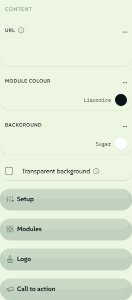
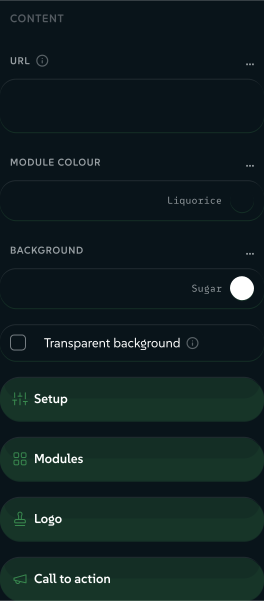
The type decides the control. qr-code declares 45 inputs, and showIf shows only those that apply to the chosen payload. A web address gets this sidebar:
 signed by Lollyvector SVG43 paths~2.6k nodes54 groups42 KBCheck it yourselfDescarcă fișierul semnat
 signed by Lollyvector SVG43 paths~2.6k nodes54 groups42 KBCheck it yourselfDescarcă fișierul semnat


| Type | What it produces | UI control |
|---|---|---|
text | string | text input |
longtext | string | textarea |
number | number | input or slider |
boolean | boolean | checkbox |
color | string (hex) | color picker; palette: "colourway-leads" offers the design system's colourway leads (see below) |
select | string (one of options[].value); an option may carry width/height/unit to set the export page size | dropdown |
asset | AssetRef object (id, url, type, etc.) | host-provided asset picker |
date | ISO date string | text input in the sidebar; native date field in the Batch grid |
time | HH:MM string | time input |
datetime-local | ISO datetime string | flatpickr datetime picker |
url | string | text input |
blocks | array of objects (repeating field groups) | add/remove/reorder row editor |
vector | object { fieldId: number } (a fixed set of numbers) | one row of zoom x/y controls |
file | a FileRef (the user's own file: name/mime/size/bytes) | file picker (on-device utilities) |
table | { columns: string[], rows: string[][] } - a user-defined grid where the column headings AND rows are data (unlike blocks, whose fields you declare) | minimal grid editor with spreadsheet paste (TSV / Markdown / CSV), copy-out and a pop-out floating window |
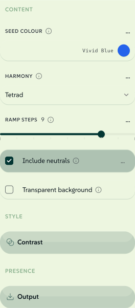
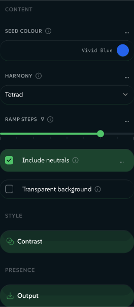
The first four inputs of color-palette are a color, a select, a number and a boolean, so the sidebar shows four different controls. Its other seven sit in the folded Contrast and Output sections.
 signed by Lollyvector SVG42 paths~2.7k nodes65 groups2 images43 KBCheck it yourselfDescarcă fișierul semnat
 signed by Lollyvector SVG42 paths~2.7k nodes65 groups2 images43 KBCheck it yourselfDescarcă fișierul semnat


The three moment types (date, time and datetime-local) have their own controls. certificate declares a date, and meeting-planner and the calendar payload of qr-code declare datetime-local.
Tables
In a table input, people decide the columns as well as the rows. A table pasted from a spreadsheet, a document, a chat message or Markdown replaces the grid. The Copy button writes TSV and an HTML <table> to the clipboard, so other apps keep the structure. Cells can hold paragraphs.
Pair a table with render.paginate and each row becomes a page. In URL mode the table travels as one compact parameter. On the CLI, --<inputId>-data=table.csv fills the table from a CSV, TSV or Markdown file.
An existing flat blocks input can use the same editor with tableColumns: ["place", "label", "annotation"]. The headings are fixed, in the order you give, with the remaining fields after them. Objects, row ids and positional URL encoding stay unchanged. Every field must be a single value; nested or conditional blocks keep their block editor. Paste accepts field ids or labels as spreadsheet headers, or a plain list of cities in the first column. timezone is the reference.
Colourway leads as swatches
A color input with "palette": "colourway-leads" offers each colourway's lead colour as a swatch, in the artefact's look, canonical first, labelled with the colourway's name. Add "swatchesOnly": true to hide the free picker; a person can then only choose a lead. A chosen lead is stored as a plain colour, not a token link.
With fewer than two colourways the field offers the design system's ordinary palette. Any other palette value is read as a palette asset id; the field does not read that asset yet and offers the ordinary palette.
showIf
Any input can declare showIf to render only while other inputs hold given values. In one object every pair must match, and a value may be a list of accepted values:
{ "id": "lineWidth", "type": "number", "showIf": { "renderMode": "vector", "chartType": ["line", "area"] } }An array of such objects renders when any one matches, for conditions such as "a vector bar, or a 3-D bar scene":
"showIf": [
  { "renderMode": "vector", "chartType": ["bar", "bar-horizontal"] },
  { "renderMode": "scene", "sceneType": "bar3d" }
]
A select option can carry its own showIf with the same shape, to hide a choice the current mode cannot honour. The selected option always stays offered, marked not applicable, so a saved session or a shared link never changes meaning when the sidebar is rebuilt.
These conditions change only what the sidebar shows. URL params, hooks, the CLI and validation see every input and every option, and a hidden input keeps its value. Lolly Chart is the reference: its render modes park the previous mode's type, so most of its controls gate on both. validate:catalog checks that every id a showIf names is a declared input.
A picker for a long select
A select with display: "picker" draws as one button that shows the current choice. Pressing the button opens a panel with every option as a tile, so a person can see the whole set at once instead of reading a list of names. Pressing the button opens a panel with every option as a tile. On a phone the panel is a sheet at the bottom of the screen. Two option fields go with the picker:
groupis a short heading. Options with the same heading sit together under that heading, in the order you list them, and the headings come in the order they first appear. Options with no group come first, under no heading.glyphis the option's picture: SVG path data for a 24 by 24 box, drawn as an outline in the text colour. It holds path commands and numbers only, at most 900 characters, and travels with the tool. An option with no glyph shows itsiconfrom the shell's icon set, and a picker where no option has either shows tiles with the name alone.
{ "id": "chartType", "type": "select", "display": "picker", "default": "bar", "options": [
  { "value": "bar", "label": "Bar", "group": "Compare", "glyph": "M5 20V11M12 20V5M19 20v-7" },
  { "value": "line", "label": "Line", "group": "Change over time", "glyph": "M4 17l5-6 4 3 7-8" }
] }
On the keyboard, the arrow keys move between tiles, typing jumps to a name, Enter chooses and Escape closes with nothing changed. A translation sidecar translates a heading as inputs.<id>.groups.<heading>, keyed by the heading in the manifest's own words. The CLI, the TUI and MCP keep a plain list of options. Lolly Chart's type, form and style controls are the reference. A tool that uses the picker must require engine 1.348.0 or later.
bindToProfile
Any input can declare bindToProfile: "firstname" (or email, headshot and the other profile fields). When the tool mounts, the input is filled from the person's profile, and they can change the value for that session.
Input properties
Every input needs id and type.
The id is the template variable and the URL parameter, and never changes once published. The same goes for a urlKey.
Any input can also carry these:
| Property | What it does |
|---|---|
label, help, placeholder | The control's label, the text behind its info button and the hint inside an empty field. |
notice | Fine print always shown above the control, to read before typing, such as a consent note on a value that triggers a network lookup. |
default | The starting value. |
required | Marks an input that should not be left empty; the export preflight warns when it is. |
section | The folded sidebar section the control sits in. |
group | A free-form grouping tag. The reserved value export moves the input out of the sidebar into the export panel. |
urlKey | A short URL alias (textColor becomes tc). Links carry it forever, so never rename or reuse one. See URL Mode. |
showIf, bindToProfile | Conditional visibility and profile pre-fill, above. |
bindToMeta | Writes the value into the export's metadata and Content Credentials as author, contact, description, copyright or license. |
sharePrivacy | "personal" keeps the value out of generated links until the person has reviewed the value. See Personal values in links. |
attachTo | Draws the control inside a sibling input's row, for a compact modifier such as a fit toggle on an image slot. |
matchExportFormat | On an asset or file input: the default export format follows the uploaded file's format until the person picks one. |
dataSource | Adds Add data: the person picks a CSV, JSON, text, Markdown or XLSX file, or a catalog text asset, and its content fills the field. |
Some properties belong to one type:
| Type | Extra properties |
|---|---|
text | minLength, maxLength, pattern; display: "curve" for a tone-curve value |
longtext | maxLength, rows |
number | min, max, step; display: "slider"; rangeWhen for slider bounds that change with another input |
color | palette, swatchesOnly (see above) |
select | options; display: "icon-toggle", "segmented" or "picker" (see below) |
asset | assetType, allowUpload, filter (see Assets and file utilities) |
file | accept, maxSize, multiple (see Assets and file utilities) |
table | columnEditors (text, url or emoji for each column); tableEditor for a full table editor with typed columns (agenda) |
blocks, vector | See Structured inputs and canvas controls |
Personal values in links
Declare sharePrivacy: "personal" on an input whose content needs review before it is shared. The web shell leaves that input out of generated links and automatic address updates, then offers a separate choice in the Share dialog. Inputs bound to profile fields follow the same policy automatically. Explicit URL and CLI values still load, and local saved sessions keep the values.
A tool that relies on this declaration must require engine 1.261.0 or later.
sharePrivacy does not doThe property does not encrypt an input, change an export or clean its content.
Canonical inputs (reuse shared ids)
Batch (#/batch) is a spreadsheet grid that renders many rows at once across one or many tools: CSV or TSV and spreadsheet paste in, a .zip of one output per row out, with collapsible export columns and saved batch sessions. It lays every selected tool's inputs out as columns.
Batch keys each column by input id. Two tools that use the same id for the same idea share one column. If they also agree on type and constraints (number min, max and step, select options, colour palette), that column becomes bulk-writable: a person types one value and it fills every row. A different id, or different constraints, gives a separate column filled cell by cell.
The shared ids and their constraints live in schemas/canonical-inputs.json. When your tool needs one of these ideas, copy the id and its constraints exactly:
| Concept | Canonical id | Type |
|---|---|---|
| First name | firstname | text |
| Last name | lastname | text |
| Headline | heading | text |
| Sub-headline | subheading | text |
| Body copy | body | longtext |
| Call to action | cta | text |
| Ink / foreground colour | color | color |
| Background colour | background | color |
| Primary image · portrait · backdrop | image · headshot · bgImage | asset |
| Background image dimming | bgOpacity | number (0–1, step 0.01) |
| Zoom + pan an image | imageFraming | vector { zoom, x, y, rotate, pitch, yaw } (declare only the fields you use) |
| How the image fills its frame | imageFit | select (cover / contain) |
| Crop rectangle that sets the output size | imageCrop | vector { x, y, w, h } (percent) |
| Window buttons on a framed window | windowStyle | select (cupertino / redmond / nuremberg) |
| Event name · location | eventName · eventLocation | text |
| Event start · end | eventStart · eventEnd | datetime-local |
| Course or award · award date | awardtopic · awarddate | text · date |
| Source author | sourceAuthor | text |
Conventions: per-element typography numbers are <element>FontSize / <element>FontWeight (weight 100–900 step 100), e.g. headingFontSize, bodyFontWeight.
Labels are advisory: use whatever label fits your tool. The Batch header shows the first non-empty one, and bulk writing depends only on id, type and constraints. To add a new shared input, add the id to schemas/canonical-inputs.json first, then use the id in your tool. pnpm run validate:catalog warns, and never fails, when a tool uses a canonical id with a different type or constraints.