Turn a finished Lolly Design document into a small tool that other people can personalise without breaking the layout. You choose the inputs, limits, imagery and layouts; recipients enter their content and export a PNG, SVG or PDF.
The shared .lolly contains one reusable tool with its fonts and images.


Sharing a tool never replaces the Lolly Design document it came from. Save the master with Save, and again after publishing, to keep its rules and publication record for later revisions.
What you'll do, in four steps:
- Bring the design Build it in Design, or drop a PDF or
.aiand choose Share with rules. - Choose the inputs Make text and images editable. Everything else stays fixed.
- Preview and share Try real content, then download one
.lolly. - Hand it over Recipients install it and change only what you allowed.
Bring the design
Open the Design tool and build the artwork, or drop a Canva PDF or a PDF-compatible Illustrator .ai onto Lolly and choose Share with rules. For an existing document, open the File menu and choose Share with rules.
When you import, choose pages from the thumbnail picker. Each selected page becomes an artboard, and the source file name becomes the tool's first name. Dropping a new source starts new rules and a new revision history; Replace source file keeps your existing rules. The import keeps the source's font names, so check the result before you expose any inputs.
Fixing an imported PDF or Illustrator file
Compare with source lines up the source page and Lolly Design at the same zoom when the imported file is at most 30 MB. The source preview is rebuilt from the PDF, so use Open original file for the final fidelity check. The original stays with your saved authoring session and is left out of the reusable tool. A larger source keeps its conversion notes but the PDF is not embedded in the master. Review the original in the app that made the file.
- Missing font: open Source and fonts → Review fonts. Choose a replacement for each source family, or use its Add font button to install a complete face. An upload replaces only the family you chose. Review the artwork before applying. A PDF's embedded subset may cover its original words but not new names.
- Fragmented text: select the runs within one artboard and choose Combine as text. Review the assembled copy; the replacement uses the first object's style. Check mixed styles and spacing in Lolly Design.
- Outlined letters: select only the letter shapes, then use Replace selected artwork with text. This removes those shapes and creates one text box. Review its font and spacing in Lolly Design; Undo restores the original objects.
- Flattened text in an image: prepare a clean background in the source app. Adding editable text over a bitmap cannot remove the old words.
- Unsupported
.ai: save with PDF compatibility turned on, or export a PDF or SVG from Illustrator. - Motion, linked tools and custom CSS: prepare still artwork and apply styles to objects before making a portable tool. The first release exports still assets.
PDF text uses the source character widths to join compatible fragments into whole words. Separate styles and distant columns stay separate objects. Clipped images, vector paths and supported effects stay inside transparent SVG artwork, with no added backing colour or padding. You can replace this artwork as a whole, but its internal paths are fixed. Cropped text may still need replacing or outlining in the source editor.
Compare with source also lists conversion notes by page and object. Review object selects the affected artwork. Approximate colours or effects, cropped text and skipped pages need a source review before sharing. After checking the original, choose Mark source reviewed to record your review in the master. The font, image and layout checks still run separately, and replacing the source starts a new review. CMYK colours are approximated for the screen, so compare them or prepare an RGB source.
Replace source file brings a corrected PDF or PDF-compatible AI into a review first. Confirm each artboard and each linked object. Lolly suggests only unique names or unchanged text; ambiguous objects need your choice. Applying keeps the public input identities, recipes and choices, and Cancel leaves the master as it was.
Start from the design system
For new artwork, choose the design system before you compose, then use its fonts, colour tokens, assets and any templates or imported components in Lolly Design. Placed text and image objects can become inputs like any other. For imported artwork, Source and fonts → Apply design system previews replacement fonts and offers an explicit colour-to-token mapping before applying. The published tool captures the finished appearance. The tool does not add a separate component editor or replace the recipient's design system.
Choose the inputs
Select a text or image object and choose Use as input from its action menu. The inspector offers the same action for text, images and supported colours. In Rules, select an object and choose Make editable. All other artwork stays fixed.
- Select several objects with Shift-click or a marquee. Alt-click cycles through overlapping objects and selects inside groups.
- Tool setup → Find content lists text and images by layer and artboard, and Editable areas shows or hides their outlines.
- Repeating the action on the same object reuses its input.
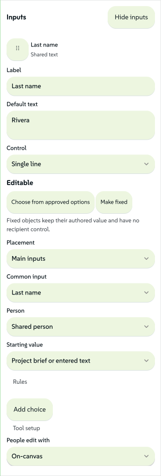
- Short text starts as a single-line field; Control switches between one and several lines and keeps the content.
- Choose from approved options limits the values, and Make fixed removes the recipient's control and keeps the authored value.
Give each input a short label and a deliberate default. Link selection, inside the input's Rules disclosure, reuses that input on another object or artboard. The link follows object identity, so renaming or reordering a layer keeps the link. Unlink detaches one target and keeps the other links, and Find matching objects offers unique matches across artboards for your approval. A removed object needs relinking before sharing.
Open a field's Rules only when you need more control:
| Input | Rules you can set |
|---|---|
| Text | Default, help, required value, character limit, wrapping and maximum lines |
| Text size | Fixed size or shrink to fit, minimum and maximum; optional reader size control with default and step, shared fitted size across linked objects |
| Typeface, weight and colour | Explicit approved choices; colour choices start from the active design system's tokens |
| Image | Replacement uploads or a list of approved images; minimum pixel dimensions and allowed upload formats |
| Image placement | Separate X/Y percentages and zoom, each with minimum, default, maximum and step |
| Image fit | Fixed treatment or an explicit Fill frame / Fit inside choice |
Preview and the recipient view show requested and fitted sizes when text shrinks. Images can be dragged and zoomed within the declared ranges, and Reset returns to the authored or selected theme position. A field that cannot fit blocks export: Lolly does not cut a shared name short or shrink it below your minimum. Test realistic content, including long names and the languages your audience uses.
 signed by Lollyvector SVG42 paths~8.0k nodes63 groups6 images163 KBCheck it yourselfKunin ang signed na file

Share common names across assets
Choose First name, Last name or another Common input meaning. The visible label can differ between tools; the meaning connects the fields. Choose Recipient, Presenter or Shared person so two different people are never connected. Organization uses text and Headshot uses an image.
Project brief or entered text is the default source. Choose The person using the tool only when you want that person's profile to fill the field. A common name never means the designer's own name by default.
For a single full-name object, choose Build text from first and last name. Pick the order and separator, then enter example values in the two new fields. Lolly does not guess how to split an existing name.
In Lolly Batch, add the related tools and choose Shared inputs to enter values once for that set of assets. The brief controls let you use a different value for one output and relink it later. Each output keeps its own layout limits, so a long value can fit a slide but need correcting on a badge.
Make themes and layouts
With several artboards, choose Add layout choice. One public choice selects an authored artboard and its size. Link the same content input to the matching objects on the other artboards so reader content stays when the layout changes.
Use Add choice for coordinated themes. In Edit options:
- Name the choice and its first option.
- Choose an artboard, set existing input defaults or capture properties from selected objects.
- Edit the captured values, including approved imagery, colours, type and image positioning.
- Duplicate the option and change its name and values. Reorder options with their handles.
- Use Add preview thumbnail to render a small visual of the selected option. Update it after changing the artwork or values.
For each existing input, choose Keep recipient content, Editable after choosing or Controlled by this choice. Editable defaults apply to fields the reader has not touched, and text a reader changed stays when they switch options. A controlled property has no reader override. Conflicting owners are reported before sharing.
Change object geometry in Lolly Design, then return to Rules to refresh the authored artboards and review their bindings. Lolly's interface theme is separate from a theme inside a published tool.
Arrange the reader experience
Choose Sidebar for a form beside the output, or On-canvas for a compact Edit inputs button, where selecting an editable area opens its control. The ordered form stays available for names, themes and controls with no artwork target.
Drag input handles to set the order. With a keyboard, focus a handle, press Space, use Up and Down, then Space to drop or Escape to cancel. Move up and move down buttons stay available inside Rules. Rules also has move up and move down buttons. On touch devices, drag from the handle; scrolling elsewhere works as usual.
Rules shortcuts
| Shortcut | In Rules |
|---|---|
| Shift-E | Make selected text/images editable |
| Shift-P | Switch Rules / Preview |
| Cmd/Ctrl-Z | Undo in the current mode; Preview samples have separate history |
| Cmd/Ctrl-Shift-Z | Redo a rule change |
| Cmd/Ctrl-F | Find editable text and images |
| Shift-H | Toggle editable-area outlines |
| ? | Open Rules shortcuts |
| Escape | Close the active overlay, return from Preview or clear selection |
Typing, input controls and open dialogs keep their normal shortcuts. To move or resize artwork, switch to Lolly Design.
Preview and share
Preview runs the compiled tool in the same isolated runtime recipients use. Try replacement text, size limits, images and every layout. Samples survive mode changes. Sample controls holds Test limits, Reset samples, Reset to theme and Use as defaults; only Use as defaults changes the master's defaults.
Choose Share .lolly, name the tool, add instructions for recipients and choose the allowed output formats. Before download, Check file shows the compiled artwork, the ordered input labels, the file size and the version. Each issue button returns to the affected rule, object or font. Closing the sheet cancels preparation. Before writing the file, Lolly checks the rules, font embedding, glyph coverage, image availability and text layout across every combination of choices. Unsupported sources need repair in Lolly Design.
Approved image credits travel with the package. For a held source, the share dialog shows the asset and asks you to confirm that you have permission to include the asset. Otherwise, replace that source before sharing. The file carries the resolved design-system values and dependencies, so another person's active brand cannot restyle the fixed artwork.
After download, Save Design master opens the usual save flow. A failed or cancelled save leaves the master open to retry. Try downloaded file runs the package in a separate preview while the master stays open.
Sharing changed content creates a new version, and an unchanged download reuses the version. Recipients choose when to install a new one. Saved outputs pin their installed revision, and resharing an older saved output carries that revision's tool files. Reusing a version number for different contents is refused.
Keep the original .lolly if you may need to restore a revision after removing the tool from the device.
Use the finished tool
Recipients drop the .lolly into Lolly, review its trust prompt and install it if they trust its source. They read the instructions and edit the declared inputs. Preview, at the right end of the title row, hides the inputs so the result fills the screen. Edit inputs brings the fields back. An allowed format sits beside Download, and More holds export options, saved variants, history and reset controls where available. An input's action menu can reset that field, with Undo. Outputs save as ordinary tool sessions. The installed tool has no Lolly Design layer editor.
Once Lolly and the tool are available offline, editing and export use local resources only. The package does not need the sender's account, project or asset cache.
On Lolly Work, a brand team can also publish the .lolly to a partner programme from its Templates card. Work keeps only the file's data and rebuilds the tool with its own Lolly Design, so no code from the file runs (Partner templates).
Other starting points
From a saved session or template. In Projects, open a saved tool session's menu and choose Share with rules. The Templates collection and the template chooser offer the same action. Lolly opens a separate authoring copy and leaves the saved source unchanged. An open tool also offers Save as → Share with rules → Choose inputs, the Share dialog offers Share as a reusable tool and a single setting's Input actions menu offers Use as a tool input. Save the authoring session to keep its rules for later revisions.
A Lolly Design session opens the object-based Rules workspace. Other supported still tools open an input list over their existing renderer:
- Select the inputs recipients may edit. Find an input locates a setting. Settings for other content types stay hidden until you ask for them, and Show editable inputs only keeps the chosen controls together.
- Open the Settings view to name a control, lower a text limit, narrow a numeric range or restrict a list of choices. Unselected settings stay fixed at their captured values. Approved choices show their default beside the allowed list. Placement → More options puts a control in a closed secondary section without changing its validation rules.
- Drag handles to arrange the inputs, or use the keyboard as in Arrange the reader experience.
- Choose a sidebar or an Edit inputs button, then Preview and Share .lolly. The share dialog checks the portable renderer and its included dependencies.
For example, start with a QR Code session, expose only the URL, label it Destination and keep the colours, code style and size fixed. The resulting tool generates a new code for each destination.
This route supports text, links, dates, numbers, switches, lists, colours and still images. Structured content and font choices stay fixed. Live tools, composition, custom file exporters and renderers that need browser code or unavailable dependencies report what needs repair. Use Lolly Design when you need object-level fitting, linked inputs or artboard choices.
Save as a template
Keeps an editable starting point for a tool. Recipients of a shared template can change any part of the design; no designer rules apply.
Share with rules
Creates a separate tool with your approved inputs only, ready to install.
Export
Makes the finished asset: a PNG, SVG, PDF or another format.
Use it for training materials
Make a course-cover tool with a course title, presenter names, an image and approved layouts. Training and enablement teams can then produce consistent covers, badges and handouts from those inputs, add the rendered files to a project and assemble the course in Learning.
The reusable .lolly produces course materials and is not a SCORM or xAPI package. The Learning export produces the static website or LMS package. See Build a course to build one and Deliver and update a course for formats, completion tracking and versions.