
Build repeating groups, editor canvases and bounded image framing.
Part of Authoring Tools.
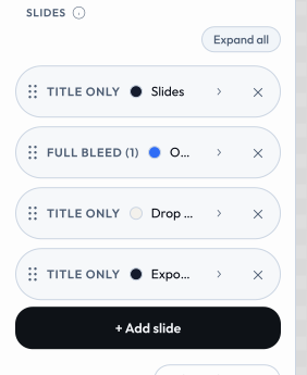
blocks - repeating groups
A blocks input is a list of repeating sub-records (e.g. team members, each with a name and city). Declare the per-row fields under fields:
{
  "id": "people",
  "type": "blocks",
  "label": "Team members",
  "fields": [
    { "id": "name", "type": "text",  "label": "Name" },
    { "id": "city", "type": "text",  "label": "City" }
  ]
}
In the template, iterate with {{#each people}}…{{/each}}. The value round-trips to the URL as a JSON array (see docs/url-mode.md); very large lists outgrow a pasteable link - the shell auto-compresses long queries (the packed z form) and warns past ~2,000 chars, so share those states via a saved-state slot instead. Blocks are edited in a side panel, and clicking a rendered block on the canvas focuses that block's field. meeting-planner is the reference implementation for the simple (homogeneous) case.
 signed by Lollyvector SVGSprawdź samodzielniePobierz podpisany plik20 paths~3.1k nodes51 groups42 KB
 signed by Lollyvector SVGSprawdź samodzielniePobierz podpisany plik20 paths~3.1k nodes51 groups42 KB


Advanced blocks (typed / heterogeneous rows). Sub-fields aren't limited to text - a field may be text, color, select, asset, number or boolean. And the row set can be discriminated by a select sub-field:
addMenu: { field, label }turns the "+ Add" button into a typed menu - each option of the named discriminator sub-field becomes a menu entry. The discriminator is fixed at creation and shown as the block's label rather than an editable control. An entry already used is disabled unless its option setsrepeatable: true.showFor: ["kind"]on a sub-field limits it to blocks whose discriminator value is listed.multilineFor: ["kind"](with optionalrows) renders a text sub-field as a textarea for those discriminator values.
color-block is the reference for typed/heterogeneous blocks (addMenu keyed on a kind select, showFor, multilineFor and the full sub-field type set).
Drop files to add rows. A blocks input may declare dropToAdd: { field, accept } - dropping one or more files onto the blocks list appends one row per file, uploading each into the named asset sub-field (the row's other fields start at their defaults). accept is a MIME filter (default image/*). logo-wall is the reference: drop many logos → one block each. (It ships with the SUSE brand pack, so it is only on disk on a profile that mounts that pack.)
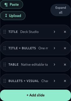
Paste a Markdown document (mdPaste). A blocks input may set mdPaste: true to add a Paste Markdown button to the blocks toolbar: it reads the clipboard, splits the Markdown into one block per heading (heading line → the block's heading field, the section beneath → its body field, kept as Markdown for a {{markdown}} render) and appends the blocks - so a whole document arrives as editable, page-flowing blocks. Used by the paged/document tools.
Import rows from a spreadsheet (importData). A blocks input may declare importData: { formats?, mode?, columns? } to offer an Import data button that fills the whole list from a CSV or JSON file - the ingest counterpart to CSV/JSON export. The engine (parseDataRows) maps columns onto the block's sub-fields: an explicit columns map ({ fieldId: "Column Name" }) wins, otherwise each column header/key is matched case-insensitively to a field's id then its label. formats limits the accepted types (default both); mode is replace (default) or append. JSON may be an array of objects, an array of arrays (positional, in field order) or { "data": [ … ] }. The imported rows are ordinary blocks - they serialise to the URL and save like any hand-entered data. chart-creator is the reference: import a two-column Label,Value sheet to chart it.
Reference pickers (optionsFrom). A sub-field can be a dropdown whose choices are the rows of another blocks input - so a row references another row by a friendly name instead of a hand-typed id. Declare optionsFrom on the field:
{ "id": "parent", "label": "Reports to",
  "optionsFrom": { "input": "nodes", "value": "nodeId", "label": "label",
                   "excludeSelf": true, "excludeDescendants": true, "emptyLabel": "- Top level -" } }
The value stored is the target row's derived id - slug(value field), else slug(label), else an ordinal, de-duplicated - i.e. exactly the id a hook resolves with (your hook should slug both a row's id and the back-reference, so the two agree). A stored value matching no current row is shown as a selected "(unknown)" option rather than vanishing, so a stale reference is visible. Options: value/label/prefix (the source sub-fields + ordinal prefix), sources: [{input,value,label}] to merge several inputs (e.g. cards and layers, de-duped by value), freeText: true for a combobox (datalist) that also accepts a typed-in value (e.g. a new kanban column), excludeSelf, excludeDescendants (needs nesting, below) and emptyLabel.
Tree blocks (nesting). A blocks input can be edited as a tree: the sidebar renders the flat array as an indented outline (pre-order) and the header drag drops a card above / below (sibling) or inside (child) another, updating its parent reference - the whole subtree travels with it. The data stays a flat reference-by-id array, so it serialises and renders exactly as before (the renderer still walks the parent pointers). Declare nesting on the input:
{ "id": "nodes", "type": "blocks", "nesting": {
    "parentField": "parent", "keyField": "nodeId", "labelField": "label",
    "activeWhen": { "diagramType": ["org", "mindmap"] } } }
activeWhen gates tree mode by top-level input values (an array value matches by membership); omit it to always nest. diagram-builder is the reference for both optionsFrom and nesting (org / mind map nest; process / kanban / layercake stay flat and reference by picker).
Editor canvas: connectors, grid & fixed size (canvas.connect / grid / fixedCanvas)
A blocks input carrying a canvas object is the free-form WYSIWYG artboard behind render.layout: "editor" (see The render block): its *Field keys map each row's geometry (xField/yField/wField/hField/rotationField, plus fill/text/image sub-fields) so the shell can mount its select / drag / resize / rotate overlay while the data stays a flat, URL-expressible array. The shell mounts the whole editor rail for you - add, arrange, undo and the primary export actions - so the manifest declares geometry fields and nothing else.
 signed by Lollyvector SVGSprawdź samodzielniePobierz podpisany plik56 paths388 nodes35 groups40 KB
 signed by Lollyvector SVGSprawdź samodzielniePobierz podpisany plik56 paths388 nodes35 groups40 KB


Three of the canvas keys turn a plain box canvas into a diagram editor:
grid-{ size, default }. Opt into snap-to-grid: the overlay rounds drag/resize to a lattice ofsizecanvas px, starting on whendefaultis true (per-axis alignment guides still win; holding Alt disables the snap).fixedCanvas-truelocks the canvas torender.width/render.height: the shell withholdssetCanvasSizeand ignores reserved?width/?height, so box coordinates stay 1:1 with the render size. Required whenever a hook draws into a fixed-viewBox overlay - e.g. connector arrows in an<svg>sized to the artboard.connect- opts into connector authoring: a Connect-mode rail button (click a source box, then targets), a live connector preview and an Auto-arrange (tidy-tree) button. Edges are stored as rows of a _second_blocksinput named byinput; the tool'shooks.jsreads that array and renders the arrows (as an SVG of filled paths - one artboard-sized<svg>per theorg-chartpattern). The*Fieldkeys name sub-fields of that connectors block:"connect": { "input": "connectors", "fromField": "from", "toField": "to", "styleField": "style", "arrowField": "arrow", "headField": "head", "colorField": "color", "dashField": "dash", "widthField": "width", "layerClass": "oc-connectors", "defaultStyle": "elbow", "defaultArrow": "end", "defaultHead": "triangle", "defaultColor": "#94a3b8", "defaultWidth": 2.5 }
fromField/toField(defaultfrom/to) hold the source and target box ids.styleField- route flavour select (straight/elbow/elbow-v/elbow-h/elbow-src/elbow-tgt/curved).arrowField- which ends carry an arrow (none/end/both);headField- arrowhead shape (triangle/open/circle/diamond/bar).colorField(color) /dashField(solid/dashed/dotted) /widthField(number, px) - the edge's line styling.layerClass- the CSS class on the tool's rendered connector<svg>, which the shell hides mid-drag while it paints its own live preview.default*(defaultStyle/defaultArrow/defaultHead/defaultColor/defaultWidth) - the values a newly-drawn edge starts at.
org-chart is the reference implementation: an editor-layout box canvas with grid, fixedCanvas: true and a connect writing to a connectors blocks input whose rows its hook turns into one artboard <svg> of arrows. It ships with the SUSE brand pack, so it is only on disk on a profile that mounts that pack.
A canvas that maps the ten time sub-fields (startField, durField, clipInField, speedField, enterField, exitField, enterMsField, exitMsField, muteField, laneField) becomes a timeline editor: the shell mounts the timeline panel, the clock and the sequence export path. All ten or none - a partial mapping gives the panel somewhere to read from and nowhere to write, so it is treated as absent. Three further keys are optional on top of that, each additive on its own:
zField- points at thenumbersub-field holding a box's depth (px above the surface). Consumed by the projection and depth-ordering math; the depth shadow (below) reads the same field.kfField- points at thetextsub-field holding a box's keyframe track (seedocs/url-mode.md's Keyframe tracks section for the wire grammar). A track can key a box's size as well as its pose (w/h, absolute px), and that is the one channel pair whose effect is a real re-layout: a size tween reflows, so text rewraps and a border stays one pixel wide. Hooks must treat this field as strict emission only: parse it and re-serialise the result, never pass the raw stored value through to a rendered attribute - a hand-edited share URL can put anything in a text field, so the re-serialise step is what keeps only charset-clean tokens on the page.linkField- points at thetextsub-field holding the A/V detach back-reference: the id of the box this one was detached from (or onto), written on both sides when a clip's audio is split onto its own lane, so re-attaching works from either end. Machine-written by the timeline panel and never typed, so it wantsshowFor: []. It is not an instancing or geometry-sharing mechanism; a tool that omits it is still fully time-capable, it just never offers "Detach audio".
Two more depth affordances are values inside existing declarations rather than canvas keys. A box kind of camera is a non-visual marker that aims and dollies the view: it has no canvas footprint - excluded from hit-testing, marquee, align/distribute and z-order, selected from its timeline bar or chip and contributing no pixels to the export. And the shadow select can gain a depth option alongside the existing choices - a drop-shadow derived from the box's zField value (falling off with depth) rather than a manually authored offset/blur/colour.
vector - a group of numbers as one control
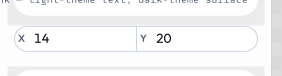
Use vector when a few related numbers belong together - zoom + pan, an x/y offset, padding, margins. Instead of separate number inputs (one column each in /pro bulk mode), a vector is one input, one control, one column: a row of compact number fields where each label can be dragged to scrub the value (Figma-style) or typed into. Declare the numeric sub-fields under fields:
{
"id": "imageFraming",
"type": "vector",
"label": "Zoom & Position",
"fields": [
{ "id": "zoom", "label": "Zoom", "min": 100, "max": 400, "step": 1, "default": 100 },
{ "id": "x", "label": "X", "min": 0, "max": 100, "step": 1, "default": 50 },
{ "id": "y", "label": "Y", "min": 0, "max": 100, "step": 1, "default": 50 }
]
} signed by Lollyvector SVGSprawdź samodzielniePobierz podpisany plik10 paths297 nodes14 groups7 KB
 signed by Lollyvector SVGSprawdź samodzielniePobierz podpisany plik10 paths297 nodes14 groups7 KB


The value is an object keyed by field id, so the template reads each part with dot access: {{imageFraming.zoom}}, {{imageFraming.x}}, {{imageFraming.y}}. Each field clamps to its own min/max and falls back to its default.
In URL mode (and /pro CSV) each field is its own flat param/column, namespaced "<inputId>.<fieldId>" - e.g. ?imageFraming.zoom=200&imageFraming.x=30&imageFraming.y=70, or CSV columns imageFraming.zoom, imageFraming.x, imageFraming.y. There is no urlKey on a vector. quotes (imageFraming) is the reference implementation; the filter tool carries the same control per raster effect (namespaced, e.g. du_imageFraming).
imageFraming is a canonical input (see below) - reuse that id and field set verbatim for any zoom/pan-an-image control rather than inventing a synonym.
Framing an image: one pattern, every tool
Placing, cropping, straightening and perspective-correcting an image is ONE control everywhere (plans/148). Do not write an object-position string by hand, and do not invent a second set of ids for the same job: a divergent id or range forfeits the shared /pro column, and a hand-written recipe drifts from what the export paths actually do.
Three declarations make an image slot framable:
{ "id": "image", "type": "asset", "assetType": "image", "label": "Image" },
{ "id": "imageFraming", "type": "vector", "label": "Zoom & Position", "framingFor": "image",
  "fields": [
    { "id": "zoom",   "label": "Zoom",       "min": 100,  "max": 400, "step": 1,   "default": 100 },
    { "id": "x",      "label": "X",          "min": 0,    "max": 100, "step": 1,   "default": 50  },
    { "id": "y",      "label": "Y",          "min": 0,    "max": 100, "step": 1,   "default": 50  },
    { "id": "rotate", "label": "Rotate",     "min": -180, "max": 180, "step": 0.5, "default": 0   },
    { "id": "pitch",  "label": "Vertical",   "min": -45,  "max": 45,  "step": 0.5, "default": 0   },
    { "id": "yaw",    "label": "Horizontal", "min": -45,  "max": 45,  "step": 0.5, "default": 0   }
  ] },
{ "id": "imageFit", "type": "select", "label": "Fit", "attachTo": "image", "display": "icon-toggle",
  "default": "cover",
  "options": [
    { "value": "cover",   "label": "Fill", "icon": "fitCover" },
    { "value": "contain", "label": "Fit",  "icon": "fitContain" }
  ] }
Every field is opt-in: declare x/y alone for a pan-only slot, add rotate to straighten, add pitch/yaw for perspective correction (the Geometry panel in Lightroom, "Adjust" in Instagram). framingFor points at the asset input the vector frames, and it is what turns the sidebar numbers into a real on-canvas control.
Render it with the {{framing}} helper, which emits the placement CSS and the marker the shell binds to, in one call:
<img src="{{asset image}}" {{framing "imageFraming"}}>The argument is the input's id, not its value - the helper needs the id for the marker, and reads the value (and the companion imageFit) off the render context. A style= option appends your own declarations after the geometry, and persp= overrides the viewing distance the pitch/yaw envelope projects through.
What the author gets for those three declarations, with no shell code and no per-tool branch:
- on the canvas - tap the image to arm it, then drag to move, scroll or pinch to zoom about the pointer, drag the top handle to straighten (Shift snaps to 15 degrees), hold Alt and drag to correct converging verticals, double-click to reset, arrow keys to nudge, Escape to release. One drag is one undo step;
- "Use as a new image" - bakes the framing into new pixels saved to the user's library as a child of the original, with the source carried as a Content Credential ingredient, then points the input at the child and resets the framing. Only ever on an explicit click; the default outcome is always that the original is untouched and the framing lives in the URL;
- URL and CLI parity -
?imageFraming.zoom=180&imageFraming.yaw=-6, or--imageFraming.yaw=-6, with no extra work; - export parity - the same numbers place the image in the SVG walker, the PDF vector path, the raster path and PPTX.
One caveat before you offer pitch/yaw: a tilted plane is a projective homography, which SVG and PDF have no transform for. Pan, zoom and roll stay fully vector; a tilted image exports through the walker's posed-raster path for that element instead. Leave the two fields out of a tool whose output must stay vector at all costs.
Canvas-drawing tools (a hook compositing into a <canvas>) call drawFramed(ctx, source, iw, ih, W, H, framing, fit) from community/_shared/framing.js instead of the helper, and mark the rendered element with data-framing="imageFraming" by hand. It is the same maths - a fixture table pins the two implementations equal - so a canvas tool and a DOM tool place the same photo the same way.
Inside a blocks row a sub-field cannot be a vector, so the same values live as sibling numbers <prefix>Zoom / <prefix>X / <prefix>Y / <prefix>Rotate / <prefix>Pitch / <prefix>Yaw. Put framingFor: "<prefix>" on the row's asset sub-field and render with the helper's block mode:
{{#each blocks}}<img src="{{asset this.bgImage}}" {{framing "bg" block="blocks" index=@index}}>{{/each}}Whole marks are the documented exception: logo-wall, logo-lockup-partner and snippet's title icon offer scale only, because a logo is not cropped.
Clickable artwork and object menus
The web shell can connect template artwork to the declared input model. Add data-canvas-input="title" to focus one input, data-canvas-input="nodes:2" to open the third block row, or data-canvas-input="nodes:2:label" to focus its label field. A source-driven tool should point imported artwork at the visible source editor instead of a hidden block row.
Add a readable data-canvas-name and a space-separated data-canvas-settings list to offer the object's relevant settings on secondary click or touch hold. Select settings can be changed directly in the menu; other settings focus the sidebar. Hidden controls, unavailable fields and input policies still apply. For keyboard access, give SVG groups tabindex="0", role="button" and an aria-label. Enter opens the sidebar control and Shift+F10 opens the menu.
<g data-canvas-input="nodes:2" data-canvas-name="Design"
   data-canvas-settings="nodes:2:label nodes:2:shape nodes:2:fill"
   tabindex="0" role="button" aria-label="Design">
  <!-- Render the card here. -->
</g>
The shell owns the interaction and writes through the runtime. Hooks only emit escaped annotations. A thin connection can have a wider transparent hit path marked data-export-hide; exports remove that path and the canvas menu affordances.