
A design token is one named brand value, such as a colour, a radius or a typeface, kept in one place. Change it once and every tool that uses it follows: the colour in a render, the swatch in the colour picker and the value you hand to Penpot all come from the same entry. This page is for the designer or developer who brings tokens into Lolly or takes them out, and for the tool author who wants to know how tokens reach a tool.


Lolly stores tokens in the W3C Design Tokens (DTCG) format, the same format Penpot imports and exports, so a brand defined in Lolly round-trips with Penpot and Tokens Studio. Tokens carry the brand's values both ways. A finished Figma or Penpot file comes in through Design's Import a design instead.
Where your tokens come from
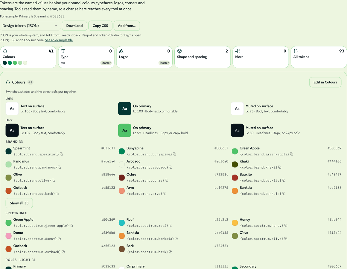
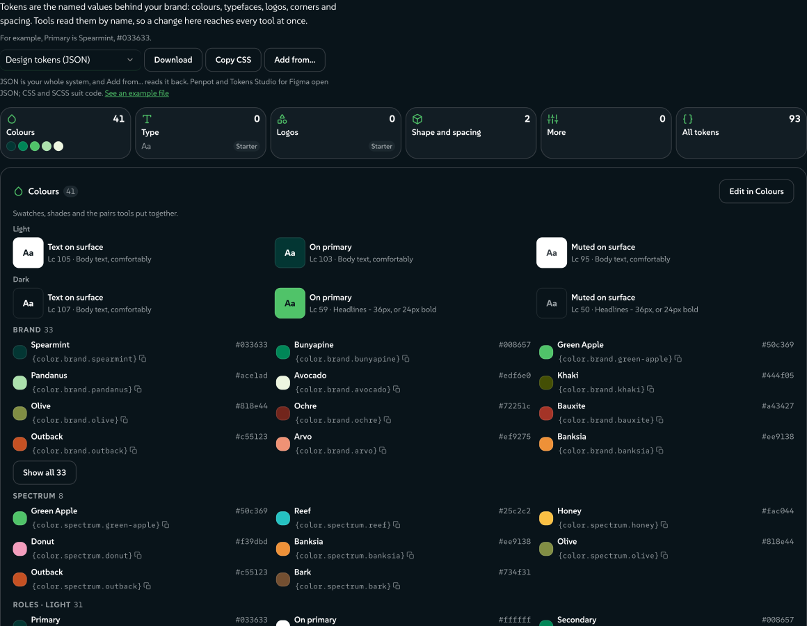
Design System Setup (#/start) is where you make and edit tokens. Its Colours, Type and Tokens rooms write colour, typography and dimension tokens (radius, spacing, sizing, stroke, opacity, rotation and shadows), and its import reads W3C DTCG, Tokens Studio and Penpot files. You can also hydrate a pack from a token file with ingest:brand.
 signed by Lollyvector SVG341 paths~38k nodes567 groups1 image490 KBПровери самВземи подписания файл
 signed by Lollyvector SVG341 paths~38k nodes567 groups1 image490 KBПровери самВземи подписания файл
Each brand pack ships its design system as a tokens asset in its catalog, and the active content profile decides which pack is in use:
- Lolly Demo (
lolly/tokens/demo) is the design system lolly.tools opens with. Its catalog also offers Lolly Starter beside it, through the index'scompanionDesignSystemsfield. - Lolly Starter (
lolly/tokens/brand) is the blank brand's design system. - Your own pack, built by
ingest:brand, uses<brand>/tokens/brand.
A pack's design system is the asset its index's brandTokens field points at, or its only tokens asset when the field is absent. The asset is core tier, so it is always available offline, and it is validated against schemas/tokens.schema.json by pnpm run validate:catalog, versioned and checksummed like any asset.
Tokens you make or import live on your device, travel as the tokens.json part of a LollyBrand pack and go into the full data backup as a user asset (Data transfer). A device can hold several design systems, and a link can name one with ds (Reserved URL parameters). Brand architectures shows how several brands can share a system or keep their own.
The corner radius is the plainest dimension token: one slider writes one shape.radius value, and the app chrome, the panels and every tool that opts in follow that value.
 signed by Lollyvector SVG8 paths~4.2k nodes12 groups47 KBПровери самВземи подписания файл
 signed by Lollyvector SVG8 paths~4.2k nodes12 groups47 KBПровери самВземи подписания файл
The format (a DTCG profile)
A token document is DTCG JSON. A token is an object with $value (required) and $type. Groups are objects without $value, and they pass their $type down to the tokens inside. One token refers to another with a curly-brace alias, {dotted.path}.
{
  "color": {
    "$type": "color",
    "brand": {
      "spearmint": {
        "$value": "#033633",
        "$description": "Spearmint",
        "$extensions": { "com.suse.lolly": { "cmyk": [100, 31, 59, 79] } }
      }
    },
    "semantic": {
      "primary": { "$value": "{color.brand.spearmint}" }
    }
  }
}
Two choices keep Lolly compatible with Penpot while serving print:
- Colours: read every form, store perceptually, resolve to hex. DTCG's newer colour object (
{colorSpace, components, alpha, hex}) is parsed, and so is every CSS Color 4 string:#hex,rgb(),hsl(),hwb(),lab(),lch(),oklab(),oklch()andcolor(<space> …)across 14 colour spaces (engine/src/css-color.ts). That covers everything Penpot writes and more. A value resolves to a hex string (#rrggbb,#rrggbbaaortransparent) for rendering, except a bare colour keyword, which comes back as written. Storage is a separate choice: a derived brand writesoklch()into$value, and a swatch's Stored as control can pinlch(the default), hex,rgb()orhsl()instead. Penpot reads all of these. - CMYK rides in
$extensions. Print anchors live under the vendor keycom.suse.lolly. DTCG keeps$extensionsfor exactly this, and Penpot passes it through untouched, so a colour stays right for print without breaking compatibility. The key is written in DTCG's reverse-domain form, and token files already carry it, so it does not change.
Sets and themes
Top-level keys can be token sets. A $themes array selects and orders sets for each theme, with later sets overriding earlier ones in the Tokens Studio way, and $metadata.tokenSetOrder fixes the order. A document with no $themes is one implicit set, and its paths keep their color.brand.x shape.
Themes with the same group are one choice, and a piece picks one option per group. A group can say what kind of choice it is, such as light and dark (mode) or a choice of lead colour (colourway). Colourways covers several lead colours in one design system.
What a theme group means
A Tokens Studio $themes group is only a name. A design system can also say what choosing between the group's options changes, so Lolly can treat light and dark differently from a choice of lead colour. The statement goes on each entry of the group, under the com.suse.lolly extension key:
{ "name": "Beach", "group": "colourway", "selectedTokenSets": { "colourway/beach": "enabled" },
"$extensions": { "com.suse.lolly": { "axis": { "kind": "colourway" } } } }| Field | Describes | Meaning |
|---|---|---|
kind | the group | mode (light, dark and similar looks), colourway (which lead colour fills the primary role), or one of expression, medium, contrast, density, campaign, brand |
rotation | the group | The rule pickColourway applies when given none: canonical, cycle, by-key, shuffle or by-date (Rules for a series) |
canonical | one option | true on the option a piece uses when it chooses none. Without it, the first option is canonical |
window | one option | { "from": "2026-12-01", "to": "2026-12-31" }, inclusive ISO dates, read by by-date |
Every entry that states kind or rotation must agree; a disagreement is reported and the first statement is used. A file whose theme entries cannot carry extensions can state the group facts once at the document root instead, as "$extensions": { "com.suse.lolly": { "themeAxes": { "colourway": { "kind": "colourway", "canonical": "spearmint" } } } }. An entry's own statement wins over the root.
Lolly gives behaviour to mode and colourway today. The other kinds are kept, shown and resolved as plain theme choices. A group with no kind, or a kind this version does not know, resolves exactly as it did before kinds existed, and the inspector reports an unknown kind. lolly system inspect --json and host.tokens.inspect() list each group with its kind and canonical option, and host.tokens.themes() gives each theme its id, when the file has one, and its group's kind.
How tools use tokens
Tools reach tokens three ways:
- Inputs, through the platform. The colour field takes its swatches from
host.tokens.colors()for the active theme, labelled and grouped by token. Choosing a token swatch stores a reference, not a frozen hex, so a later token edit reaches every linked value. - Hooks, through
host.tokens. A hook can read the token set, resolve a reference or list every colourway's lead withfamily(). Chart, Mesh Gradient, Filter and Wordmark are among the community tools that do. When the document's theme or colourway changes, the runtime runsonInputonce with the id__tokens, so a hook that keeps colours it read can read them again. - Templates and styles, through canvas variables. The canvas carries the design system's semantic colours as CSS custom properties (
--brand-primaryand the rest), plus--brand-lead-1onwards when the design system has two or more colourways. Templates and rendering lists them.
Handing the resolved token tree to a template's context, through the extras mechanism and opted into from the manifest, is not built yet. Fields other than colour link through each field's Input actions menu; Token workflows covers that.
The value model: reference + cached value
When you pick a token-backed colour, the stored value is a reference plus the hex it last resolved to:
{ "ref": "{color.brand.spearmint}", "value": "#033633" }In the sidebar, a token-backed swatch shows the swatch's name instead of a hex code, which is the visible difference between a linked value and one typed in by hand.
 signed by Lollyvector SVG4 paths179 nodes7 groups6 KBПровери самВземи подписания файл
 signed by Lollyvector SVG4 paths179 nodes7 groups6 KBПровери самВземи подписания файл
The ref keeps the value tied to the token: editing the token, or switching themes, resolves it again everywhere. The cached value is the fallback for a device where that token is absent. A plain colour string, from a custom pick or any older tool, passes through untouched.
- On load, each token-backed colour resolves again against the live token set and its cached hex is refreshed (
resolveTokenRefsinruntime.ts, which mirrors how asset references resolve).modelToValuesthen hands the template a plain hex string, so templates and data exports never see an object. - Hooks see the plain hex too (
modelForHooksininputs.ts). The{ ref, value }shape never reaches a tool'sonInitoronInput, so the common(inputs.x || '').trim()pattern keeps working. - In a link, a token colour is written as its reference (
?bg={color.brand.spearmint}), so a shared link resolves against the recipient's tokens (url-mode.ts). Parsing a{path}gives an unresolved token value that the runtime then resolves. - Editing past a token, by typing a hex or dragging alpha, writes a plain string, which unlinks the value: you have chosen a colour of your own.
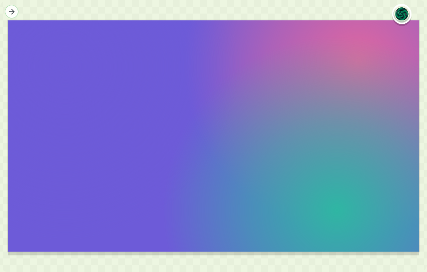
The link behind the next picture holds no colour values at all. Its three colour parameters are token paths from Lolly Demo ({color.spectrum.green-apple}, {color.spectrum.reef} and {color.spectrum.honey}), resolved at render time against whatever brand the device carries.
 signed by Lollyvector SVG54 paths378 nodes44 groups42 KBПровери самВземи подписания файл
 signed by Lollyvector SVG54 paths378 nodes44 groups42 KBПровери самВземи подписания файл
Round-trip with Penpot
- Export from Lolly. In Design System Setup, open the Colours room. The download pill at the bottom of the palette offers several formats; choose Design tokens (JSON). Faces you chose in the Type room (Primary, Headings, Code, Italic) travel in the same file as font tokens, and roles left on the platform default stay out of the file.
- Import into Penpot. Open a Penpot file, switch to the Tokens panel in the left sidebar and import the JSON. Your sets appear in the panel.
- Apply them. Apply the colours and fonts to shapes and text from Penpot's Tokens panel.
- Bring them back. Import a Penpot single file, ZIP or multi-file export (
$themes.json,$metadata.jsonand one file per set) in Design System Setup or withingest:brand.
 signed by Lollyvector SVG3 paths~1.1k nodes5 groups1 image16 KBПровери самВземи подписания файл
 signed by Lollyvector SVG3 paths~1.1k nodes5 groups1 image16 KBПровери самВземи подписания файл
CMYK survives Lolly-to-Lolly round trips through $extensions, and Penpot ignores it, as the standard intends. Two more paths go beyond the token file. Once Penpot is connected under Settings → Connected services, a finished render can be sent from Lolly into a Penpot project as an image. And the Lolly bridge plugin for Penpot, installed by URL from a Lolly instance, can place a working Lolly session on the Penpot canvas as editable shapes.
Theme the app itself
Your design system describes your brand. It can also dress Lolly's own interface, in two ways: lolly.ui.* roles that hold one value in every theme, and a color.chrome group that sets the app's surfaces separately for light and dark.
Lolly UI tokens
Lolly carries a small application UI system, so menus, fields, panels and editor chrome stay coherent even when a brand has no full component library. It travels under a reserved namespace:
lolly.foundation.*  # Lolly's compatible base scale
lolly.ui.*          # stable application roles a design system may override
brand.*             # your identity tokens
The Tokens room's App appearance (advanced) fold lists the Lolly roles, each marked Lolly default until you save a value of your own, which then reads Your value. The defaults affect the app and the Penpot UI-library export, but opening a brand document does not write them into the document. Saving one value adds only that lolly.ui.* leaf, and Reset removes the leaf again.
The supported roles are few: text, surface, action, selection, border and focus colours; control, panel and page spacing; radius by role; elevation, edge and focus effects; UI fonts and type sizes; feedback, overlay and navigation motion; and chrome, overlay and toast layers. Lolly checks each value before it reaches CSS. Unknown paths, unsafe CSS, the wrong type and unresolved aliases stay out of the live app rather than half applying.
Two foundation values are especially useful when you start from a token library:
shape.radiusdrives the derived radius scale. Set it to0pxfor square controls, or high for round ones; the pill and round roles follow the same value.space.basedrives Lolly's spacing rhythm (.25×,.5×,.75×,1×,1.25×,1.5×,2×,3×), so a system's base unit reaches panels and controls without copying each gap.
Choose Download visible collection in Components to get the components on show as one .penpot archive of editable frames, with both token layers in its tokens.json. Each card's Download as .penpot takes one component, and Download tokens.json takes the tokens alone. The components hold sample data, not your sessions or content. A property Penpot cannot bind natively stays an editable resolved value rather than claiming a live binding.
App chrome from a design pack
A design pack can set the app's room for each theme: the page, the cards and side panels, the top bar, the menus and the text on them. Put a color.chrome group inside a theme set, beside the semantic slots. Every slot is an optional colour, and an alias into your own palette is the usual way to write one.
| Slot | Sets | For | Left out |
|---|---|---|---|
page | --background | the page | the theme keeps Lolly's room, because the other surfaces need a page |
raised | --card | cards, side panels and the top bar | worked out from page |
overlay | --popover | menus, dialogs and popovers | the raised colour |
muted | --muted and --secondary | wells, tracks and quiet fills | worked out from page |
hover | --accent | hover and active surfaces | worked out from page |
edge | --border and --input | hairlines and field edges | worked out from page |
ink | --foreground and the card, popover, secondary and accent inks | body text on the chrome | Lolly's ink for the theme |
muted-ink | --muted-foreground | secondary text | Lolly's muted ink for the theme |
unsaved | --brand-warn | the colour that marks unsaved work | see "Unsaved work" below |
The app reads its colours in the canonical option of every theme group that declares a kind, apart from light and dark. A design system with colourways therefore keeps the app on its canonical lead while a piece on the canvas uses another. Lolly's blank starter brand states a warm newsprint room this way in its light and dark sets, and a design system with no color.chrome group shows Lolly's own cool room.
Lolly Demo's dark set shows the group in place:
{
  "dark": {
    "color": {
      "$type": "color",
      "chrome": {
        "page": { "$value": "{color.brand.liquorice}" },
        "raised": { "$value": "{color.brand.liquorice-raised}" },
        "overlay": { "$value": "{color.brand.liquorice-panel}" },
        "muted": { "$value": "{color.brand.liquorice-panel}" },
        "hover": { "$value": "#263239" },
        "edge": { "$value": "{color.brand.basalt}" },
        "ink": { "$value": "{color.brand.sugar}" },
        "muted-ink": { "$value": "{color.brand.pebble}" },
        "unsaved": { "$value": "{color.brand.honey}" }
      }
    }
  }
}
The slots set the same properties Lolly's own tokens.css sets, so everything in the app that reads a surface follows the pack. Four things are never set from here:
- the ink of the render canvas (
--foreground-canvas): the canvas and the export stages always take the theme's own ink back at their edge, whateverinkthe pack states, so a pack's chrome cannot move a pixel of an export; - the accent (
--primaryand--ring), which the semantic primaries own; - the destructive fills;
- the radius and spacing.
*When to use lolly.ui. instead.* The lolly.ui.color. roles hold one value in every theme and set the app's --ui-color- properties directly on the page, so High contrast does not undo them. They suit one fixed colour, such as a single canvas or border colour. Use color.chrome. when the pack has a light room and a dark room, since each theme reads its own set, and when High contrast should still bring back Lolly's measured room.
Slots you leave out
State a page and Lolly works the other surfaces out from it, in the page's hue. The steps are lightness in OKLCH, measured from the page:
| Slot | Light page | Dark and brand page |
|---|---|---|
raised | 0.009 darker | 0.037 lighter |
muted | 0.032 darker | 0.117 lighter |
hover | 0.048 darker | 0.155 lighter |
edge | 0.131 darker | 0.155 lighter |
An edge also carries more of the page's tint than the other surfaces: one and a half times the page's chroma, at least 0.01 and at most 0.04. Lightness stays between 0 and 1, and a colour that falls outside sRGB has its chroma reduced until it fits.
The checks a theme must pass
Each theme is checked whole. If any check fails, that theme keeps Lolly's own room and the browser console reports the first pair that failed. The other theme is judged on its own, and a value that does not parse counts as left out.
- Every surface keeps the theme's lightness band in OKLCH: 0.85 to 1 for light, 0 to 0.4 for dark and 0.2 to 0.42 for brand.
- The ink, yours or Lolly's, reads 4.5:1 or better on the page,
raised,overlay,mutedandhover. - The muted ink reads 4.5:1 or better on the page,
raised,overlayandmuted. - For the brand theme only, the inks and edge of Lolly's High contrast brand room still clear their bars on your surfaces.
Each applied theme also restates the error text colour, adjusted until it reads 4.5:1 on the pack's surfaces and on a danger wash over them.
High contrast, the brand theme and unsaved work
High contrast. The light and dark chrome steps aside while High contrast is on, and Lolly's own High contrast room shows for every pack. That room is measured against Lolly's own page, and keeping a pack's page under it would let cards sink into the page. The brand chrome stays in force, and the High contrast brand inks and edge win over the pack's own, which is why the fourth check exists. The unsaved colour is not a surface, so it applies under High contrast too.
The brand theme. Brand chrome is read only when the document's $themes declares a theme named brand, and then from that theme's set. Asking the token engine for a theme a document does not declare answers with its default sets, which would hand the brand theme the light values. Without a brand theme, the brand theme stays as Lolly builds it from the pack's primaries. Two High contrast measurements still use the brand room Lolly builds rather than a pack's brand chrome: the repair of the accent and the error text red. The checks above do not measure the accent in any theme either, because the semantic primaries own the accent. No shipped pack states brand chrome, and a pack that does should check its accent and its error text in the brand theme with High contrast on.
Unsaved work. When any theme states unsaved, the colour moves out of the app's automatic pick into a block for each theme. The brand theme takes the brand set's colour, else the dark set's, and a theme that states none takes the automatic pick. That pick is the colour in the pack nearest red to yellow, and when the pack has none Lolly's own amber stays. The label on it is black or white, whichever reads better.
How the token engine is built
Four layers carry a token from a file to a tool:
- Engine:
engine/src/tokens.ts. Platform-agnostic, likeunits.ts.createTokenSet(doc, { theme })parses a document, passes group$typedown, resolves{}aliases (chains included, safe against cycles), applies the theme and returns a flat lookup withget,resolve,query({type}),colors()andthemes(). It knows DTCG and nothing else: no DOM, no storage and no brand. - Catalog: the pack's
tokensasset, described above. - User tokens: the device-local store for tokens you create or import.
- Bridge:
host.tokens, an optional v1 capability:get,colors,resolveandthemes, plus the optionalinspect,axes,family,list,activeandsnapshot(Host API lists them). Each shell implements it over the engine model and its sources; a shell that does not is simply not token-driven. Loading works offline: it prefers the prefetched core asset, then a direct fetch, then the built-in palette.


Token workflows covers inspecting tokens, choosing themes for one document, linking fields and reviewing changes.
Reference
- Engine model:
engine/src/tokens.ts:createTokenSet,resolveColorValue,colorToHex,isAlias,isTokenValue,TOKEN_EXT. The format contract is pinned bytests/tokens.test.ts. - Tests:
tests/tokens.test.ts(model) andtests/tokens-value-path.test.ts(URL and hydration round trip). - Schema:
schemas/tokens.schema.json. The SUSE pack's document is generated byscripts/build-brand-tokens.ts. - Bridge contract:
TokensAPIinpackages/core/src/host-v1/tokens.ts, re-exported throughengine/src/bridge/host-v1.ts. Web implementation:shells/web/src/bridge/tokens.ts.