
Choose input types, visibility, profile prefills and common meanings.
Part of Authoring Tools.
Input types
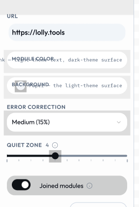
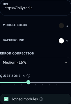
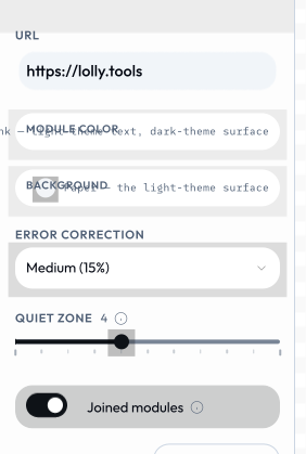
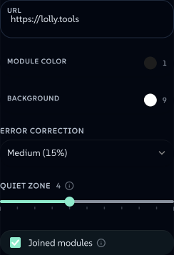
Each declaration becomes a real control, built by the shell from the input model - you never write the UI. Six lines of inputs in qr-code's manifest produce this entire sidebar.
 signed by Lollyvector SVGCompruébalo tú mismoDescarga el archivo firmado39 paths~3.1k nodes58 groups2 images46 KB
 signed by Lollyvector SVGCompruébalo tú mismoDescarga el archivo firmado39 paths~3.1k nodes58 groups2 images46 KB


 signed by Lollyvector SVGCompruébalo tú mismoDescarga el archivo firmado39 paths~3.1k nodes58 groups2 images46 KB
 signed by Lollyvector SVGCompruébalo tú mismoDescarga el archivo firmado39 paths~3.1k nodes58 groups2 images46 KB


| Type | What it produces | UI control |
|---|---|---|
text | string | text input |
longtext | string | textarea |
number | number | input or slider |
boolean | boolean | checkbox |
color | string (hex) | color picker, or constrained to a palette asset via palette: "asset/id" |
select | string (one of options[].value); an option may carry width/height/unit to set the export page size | dropdown |
asset | AssetRef object (id, url, type, etc.) | host-provided asset picker |
date | ISO date string | text input in the sidebar; native date field in the /pro grid |
time | HH:MM string | time input |
datetime-local | ISO datetime string | flatpickr datetime picker |
url | string | text input |
blocks | array of objects (repeating field groups) | add/remove/reorder row editor |
vector | object { fieldId: number } (a fixed set of numbers) | one row of zoom x/y controls |
file | a FileRef (the user's own file: name/mime/size/bytes) | file picker (on-device utilities) |
table | { columns: string[], rows: string[][] } - a user-defined grid where the column headings AND rows are data (unlike blocks, whose fields you declare) | minimal grid editor with spreadsheet paste (TSV / Markdown / CSV), copy-out and a pop-out floating window |
For existing flat blocks inputs, tableColumns: ["place", "label", "annotation"] opts into this same editor, with fixed headings in the requested field order (remaining fields follow). Objects, row ids and positional URL encoding stay unchanged. All fields must be scalar; nested or conditional blocks keep their block editor. Timezone is the reference. Paste accepts matching field ids or labels as spreadsheet headers, or a plain city list in the first column.
A table input is the batch-creation primitive: paste a table copied from Excel / Google Sheets / Notion / Slack / Markdown and it replaces the whole grid; the Copy button writes TSV and a real HTML <table> back to the clipboard so the round trip into collaboration tools is lossless. Cells can hold whole paragraphs. Pair it with render.paginate and each row becomes a page. In URL mode the entire table is ONE compact param; in the CLI, --<inputId>-data=table.csv fills it from a CSV/TSV/Markdown file.
Four declarations of four different types are four different controls. color-palette declares exactly that and nothing else: a color, a select, a number and a boolean.
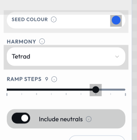 signed by Lollyvector SVGCompruébalo tú mismoDescarga el archivo firmado34 paths~2.6k nodes61 groups2 images40 KB
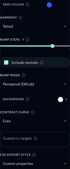 signed by Lollyvector SVGCompruébalo tú mismoDescarga el archivo firmado34 paths~2.6k nodes61 groups2 images40 KB


text and longtext differ only in the declaration, and the shell picks the control: a single-line field for one, a sized textarea for the other. prompt-card's prompt is a longtext.
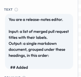 signed by Lollyvector SVGCompruébalo tú mismoDescarga el archivo firmado44 paths~19k nodes12 groups198 KB
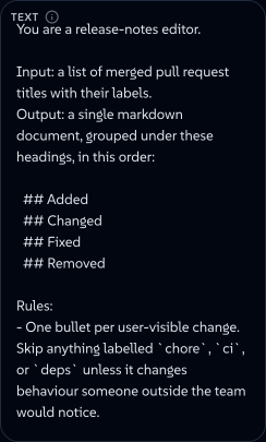 signed by Lollyvector SVGCompruébalo tú mismoDescarga el archivo firmado44 paths~19k nodes12 groups198 KB


The three moment types (date, time, datetime-local) are real input types with real controls, but no tool in the open community set declares one, so there is no screenshot of them here.
showIf
Any input can declare showIf to render only while other inputs hold given values. One object is every pair required, and a value may be a list of accepted values:
{ "id": "lineWidth", "type": "number", "showIf": { "renderMode": "vector", "chartType": ["line", "area"] } }An array of such objects renders when any one of them matches, for the conditions a single map cannot say ("a vector bar, or a 3-D bar scene"):
"showIf": [
  { "renderMode": "vector", "chartType": ["bar", "bar-horizontal"] },
  { "renderMode": "scene", "sceneType": "bar3d" }
]
A select option can carry its own showIf with the same shape, so a choice the current mode cannot honour is not offered. The option that is currently selected always stays offered, marked not applicable, so a saved session or a shared link never changes meaning when the sidebar is rebuilt.
All of this is a visibility overlay on the sidebar. URL params, hooks, the CLI and validation see every input and every option regardless, and a hidden input keeps its value. Chart is the reference: its render modes park the previous mode's type, so most of its controls gate on both. validate:catalog checks that every id a showIf names is a declared input.
bindToProfile
Any input can declare bindToProfile: "firstname" (or email, headshot, etc). When the tool mounts, it pre-fills from the user's profile. They can override per-session.
Canonical inputs (reuse shared ids)
/pro (the web shell's batch mode) is a spreadsheet grid that renders many rows at once across one or many tools - CSV/TSV round-trip and spreadsheet paste in, a .zip of per-row outputs out, with collapsible export columns and saved batch sessions. Because it lays every selected tool's inputs out as a grid, the id/constraint choices you make below directly shape that grid.
/pro batch mode lays every selected tool's inputs out as a grid. It keys each column by input id - so two tools that call the same concept by the same id collapse into one column, and if they also agree on type + constraints (number min/max/step, select options, color palette), that column becomes bulk-writable: the user types one value and it fills every row. Diverge on the id (or the constraints) and you get a separate, cell-by-cell column instead. So picking a shared id is a real UX decision, not a style preference.
To make this the default path, the blessed ids and their constraints live in schemas/canonical-inputs.json. When your tool needs one of these concepts, copy the id (and constraints) verbatim:
| Concept | Canonical id | Type |
|---|---|---|
| First name | firstname | text |
| Last name | lastname | text |
| Headline | heading | text |
| Sub-headline | subheading | text |
| Body copy | body | longtext |
| Call to action | cta | text |
| Ink / foreground colour | color | color |
| Background colour | background | color |
| Primary image · portrait · backdrop | image · headshot · bgImage | asset |
| Background image dimming | bgOpacity | number (0–1, step 0.01) |
| Zoom + pan an image | imageFraming | vector { zoom, x, y } (zoom optional) |
Conventions: per-element typography numbers are <element>FontSize / <element>FontWeight (weight 100–900 step 100), e.g. headingFontSize, bodyFontWeight.
Labels are advisory - show whatever label fits your tool; the /pro header just uses the first non-empty one, and bulk-write only cares about id + type + constraints. Adding a genuinely new shared input? Add it to schemas/canonical-inputs.json first, then adopt it - pnpm run validate:catalog emits a warning (never an error) when a tool uses a canonical id with a divergent type or constraints, so drift stays visible.