
tool.json tells Lolly what a tool is: its name, what people can change, which files it can export and how it appears in the gallery. This page is the field reference; Build a tool shows a complete small manifest first.
The manifest (tool.json)
Every manifest is validated against schemas/tool.schema.json. Seven fields are required:
| Field | What it holds |
|---|---|
id | Lowercase and hyphen-separated. It never changes once published, because links, saved sessions and the CLI all address the tool by its id. |
name | The name people see. |
version | SemVer. Bump it on every change. |
engineVersion | The SemVer range of engines the tool runs on, such as "^1.0.0". An engine outside the range refuses to load the tool. |
status | official, community or experimental. Experimental tools watermark their exports by default; the caller can turn the watermark off, and on-device tools never get one. |
render | At minimum { width, height, formats }. See The render block. |
inputs | The input declarations. See Tool inputs. |
The schema does not require description, category and tags. Give every tool all three: the gallery's About card reads the description, and search and filters use the other two.
The About card shows the manifest to people deciding whether to open the tool: name, category and status, the export chips and canvas size from render, the version and a capabilities line when the tool declares any.
 signed by Lollyvector SVG41 paths~12k nodes78 groups130 KBCheck it yourselfDescarga el archivo firmado
 signed by Lollyvector SVG41 paths~12k nodes78 groups130 KBCheck it yourselfDescarga el archivo firmado


Listing and identity
listed- boolean, defaulttrue. Whether the tool appears in the gallery grid, search, favourites and the featured and utility strips. Setfalsefor a tool reached only from context, such asasset-export, which opens from Download on an asset in Assets. An unlisted tool still loads through#/tool/<id>, URL mode and the CLI.featured-{ blurb?, order? }. Its presence, even as{}, puts the tool in the gallery's Featured row.blurbis the one line shown over the tile.ordersorts the row ascending; tools without one follow in catalog order.new- boolean. Keeps the gallery's New badge on the tool. Without it, the most recently added tools in catalog order get the badge, and it expires as later tools ship.deprecatedandreplacedBy- retire a tool. The id stays a permanent contract, so saved links and sessions still open the tool. A deprecated tool must also belisted: false; the validator checks this.replacedBygives the successor's id, which must exist in the same profile.a11yLabel- the accessible label of the rendered output. Screen readers meet the preview canvas as onerole="img"with this label. It is a Handlebars string filled with the current input values:"QR code linking to {{url}}". Use{{default x "fallback"}}for empty inputs. Without it the label is"<name> preview". Keep the label short and factual: a screen-reader user hears it in place of the canvas contents.
templates and galleryArt are on Tool templates, extends on Composition and brand overlays and designTool on Design tool contract.
What the tool needs from the host
requires- the optionalhost.*APIs your hooks call without checking for them first, such as["text", "tokens"]. On a shell that lacks one, the runtime refuses to mount the tool before any hook runs, and the gallery greys the tool out. An API you check for (if (host.text)) is a progressive enhancement and must not be listed.node scripts/tool-requires.ts --writereadshooks.js, writes the list and raisesengineVersionto the release that added the newest API you depend on;validate:catalogwarns when the manifest and the hooks disagree.capabilities- device abilities, fromnetwork,filesystem,clipboard,camera,microphone,ffmpeg,wasm,capture,composeandscreen. The host exposes the matching APIs only to tools that declare them, and shells use the list to label or disable a tool they cannot serve. A tool withoutnetworkcannot callhost.net.fetch; a tool that usescomposesdeclarescompose; a tool that records throughhost.recorderdeclaresmicrophone.network-{ "allowlist": [...] }, the https URLshost.net.fetchmay reach. No allowlist means no fetch. See Network access.hooks- boolean flags foronInit,onInput,onFrame,onLevel,beforeExport,afterExport,exportFileandexportStill. Anytrueflag meanshooks.jsmust define that function. The schema rejects any other hook name. Tool hooks and host capabilities covers each hook.privacy-"on-device"marks a utility that processes the person's own file only on the device. The tool shows the Runs on your device - nothing is uploaded badge, may never beexperimentaland exports no provenance metadata and no watermark. Assets and file utilities has the details.isolate- boolean. Asks the shell to run a built-in tool's hooks in a Worker. See Run hooks in a Worker.singleInstance- boolean. Settruewhen only one copy of the tool can run on a page, for example a tool that holds a WebGL context or keeps a handle onwindow(the 3D viewers,spatial-photo,synth). Lolly Multi-edit then shows its cells as still previews, one after another, instead of live copies. The single-tool view, URL mode and the CLI are unaffected.composes- embed another tool's render as an image. Requires thecomposecapability. See Composition and brand overlays.renditionOf-{ "input": "image", "action": "c2pa.color_adjustments" }, for a tool whose output is a changed copy of one picture the person gives it, such as a colour grade, a filter or a format conversion.inputis the id of a top-levelassetinput, andactionis one ofc2pa.color_adjustments,c2pa.filtered,c2pa.converted,c2pa.resized,c2pa.croppedorc2pa.edited. When that picture carries a Content Credential of its own, the export's credential records the picture as its parent and opens it first, andactionreplaces the step that says the file was made new. Every other picture stays a component. A picture with no credential changes nothing.unlessSetlists inputs that, while they hold any value, replace the picture as the source, as Darkroom's layer stack does ("unlessSet": ["layers"]); the export is then not recorded as a rendition. A live camera frame or a recording also replaces the picture, without being listed. The field needs engine 1.341.@lolly-tools/core/rendition-v1holds the action list and the reference check the validators share. Darkroom, Filter and Asset Export declare the field.
Design-system behaviour
designVersion- a published design-system version slug, orlatest, that the tool renders against. UnlikeengineVersionit is not enforced at load: a version this device does not have falls through to the active version, then to the newest.?designv=overrides it for one render.tokenAxes- keeps the tool on the canonical option of a kind of theme group, for a tool whose colours are its content. See Colours that are the content.
The render block
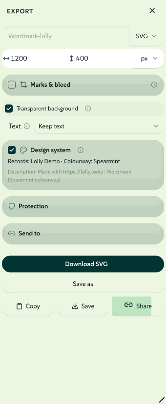
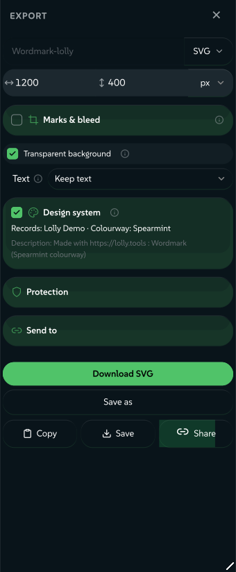
Most render keys show up in the export popup: formats, page size and unit, the Convert paths toggle and the Content Credentials card.
 signed by Lollyvector SVG77 paths~6.0k nodes87 groups4 images88 KBCheck it yourselfDescarga el archivo firmado
 signed by Lollyvector SVG77 paths~6.0k nodes87 groups4 images88 KBCheck it yourselfDescarga el archivo firmado


render carries width, height and formats. The render.formats enum in schemas/tool.schema.json is the source of truth for the format ids, which cover vector, raster, print, document, motion, audio, data and font output. URL Mode says what each id produces. The optional keys follow, grouped by what they change.
Export controls
actions- the action buttons to show, fromcopy,download,saveandshare. Default['copy','download','save'].export- setfalsefor a utility or interactive tool with no export. The download, copy, format and size bar disappears, and Save shows only when the tool has inputs.filenameFrom- input ids whose current values name the exported file, slugified in order (ana-kovac, or a URL's host and path). When every listed value is empty, the tool name is used. The Batch grid builds each row's file name from the same inputs.qr-codeandcertificatedeclare one.dims- setfalseto hide the export size fields.units- defaulttrue. Setfalseto offer pixels only: the physical unit selector (mm,cm,in,pt) and the DPI field disappear, and one on-screen pixel is one exported pixel. Use it for screen assets and favicons, where a print size would contradict the true raster resolution. Use it for screen assets and favicons.convertPaths- defaulttrue. A tool that exports a vector format gets a Convert paths toggle that outlines text to paths in SVG, PDF and PDF CMYK, so the file renders the same without the fonts installed. Setfalseto never outline, as a capture tool that outlines its text while capturing (url-shot) or a camera effect (filter) does.transparentBg- defaultfalse. Adds a No BG toggle to the export bar. The engine adds it to the input model, so hooks can react inonInitandonInput(chart).c2pa- defaulttrue. The card in the export popup starts ticked for every format that can carry one (pdf,png,apng,jpg,gif,svg,tiff,cmyk-tiff,webp,mp4,webmand zip members). The file is signed on the device, so viewers report an unverified credential unless the person has enrolled an identity. Setfalseto opt the tool out;privacy: "on-device"tools are always off. A?c2pa=link or saved value overrides this for one export.aspectWarning-{ min?, max?, message }. An amber caution in the export popup when the chosen page aspect (width ÷ height) falls outside the bounds, warning of a size that breaks the layout. The caution never appears in the output.multi-page-pdfdeclares{ "max": 1, "message": "…" }for portrait only.followsCanvasSize- defaultfalse, engine v1.293. The tool lays itself out for the canvas size. When someone picks another export size, the runtime runsonInputwithid: '__canvasSize'and repaints, so the canvas shows the layout the export writes. Hooks read the size asctx.canvasSizeand templates as@canvasSize(When the canvas size changes). RaiseengineVersionto^1.293.0with it (logo-wall).preview-{ format?, auto? }. For a tool whose live canvas is a placeholder until an explicit, expensive render runs, such as a capture tool that screenshots a page inbeforeExport. The shell adds a[data-preview]control, andauto: truerenders one frame on load.url-shotdeclares one.video-{ wait?, duration? }in seconds, default1and5. Capture timing whenwebm,mp4,giforapngis among the formats (lottie-digi-ad).
Layout and sidebar
layout decides what surrounds the canvas.
layout | What people see | Reference |
|---|---|---|
sidebar (default) | The input sidebar beside the canvas. | qr-code |
canvas | No sidebar: the tool fills the working area. A single file input becomes a drop zone on the canvas. | strip-data |
editor | No sidebar. A free-canvas editor where boxes are selected, dragged, resized, rotated and snapped. The render canvas and export controls stay. | design, org-chart |
document | No sidebar. A multi-page rich-text editor with a formatting ribbon on the canvas. The render canvas and export controls stay. | doc-studio |
deck | Keeps the sidebar and adds an on-canvas slide editor with a thumbnail rail. | None in community/ yet; deck-studio uses the default layout with paged |
In all five, the data stays flat and expressible as URL parameters, so the CLI and URL mode render what the editor shows.
How the editor, document and deck layouts work
editordrives oneblocksinput whose rows carrycanvasgeometry (x, y, width, height and rotation). The shell provides the pasteboard: boxes dragged past the artboard stay visible and selectable, faded outside the frame. The frame's shadow marks the export boundary. Exports stay bounded by the canvas in every format, with no opt-in in the template. Thecanvaskeys are on Structured inputs and canvas controls.documentdrives oneblocksinput (content) of content blocks: heading, text, lolly and table. The editor offers paragraph styles H1 to H4, bold, italic, lists and colour, per-block width, alignment, move and delete, click-to-edit text and rich HTML paste that becomes headings, lists and tables. Pagination lives in the tool's hook: blocks flow into fixed-size[data-pdf-page]boxes, which the paged exportmulti-page-pdfalso uses, so the CLI and URL mode render the same document with no editor.deckmounts a live overlay over oneblocksinput whose rows are slides, so a slide's text, colour and images can be edited in place. Edit mode renders one active slide plus small thumbnails. The overlay restores a full-deck render before export.
sidebar- defaulttrue. Setfalsewhen the template edits its own inputs on the canvas (sandbox). The inputs stay in the synced input model (URL, saved sessions, collaboration, CLI) but get no sidebar, and a tool that exports keeps its export controls.webPreview- defaultfalse. For a web-page tool with no export: the preview becomes a viewport that fills the pane's width, reflows when the pane resizes and scrolls, instead of a scaled artboard (jump,scan-code).urlSync- defaulttrue. Setfalseto keep live edits out of the address bar. Explicit URL inputs and generated share links still work, and local recovery uses the session slot.denseSections-input.sectionlabels whose short controls the web sidebar lays out two to a row. The input model, URL encoding and every headless render are untouched. The grid falls back to one column on a narrow panel or with large text.sectionIcons- maps aninput.sectionlabel to a shell icon name, drawn before the label on the folded section head. A tool with many sections (chartdeclares seventeen) can then be scanned by glyph. Same contract asdenseSections: an unknown icon name draws nothing, and the CLI and TUI ignore the map. Give each section an icon from the shell registry, keep a section's fields consecutive and put primary content before secondary settings. Translated section captions keep their icon and density.themeChoicesAfter- the id of an input. The web sidebar draws the design system's choices for the piece (colourway, mode and any other theme group) after that input's row, inside its section, instead of in the separate Design system section. It is keyed by input id, so a translated section caption cannot move the choices. Same contract assectionIcons: an id that matches no input leaves the separate section in place, and the CLI and TUI ignore the key (snippet).
Live camera
These keys apply only to tools with an onFrame hook; others ignore them.
liveMaxEdge- the longest edge, in pixels, of the camera frame handed to the hook. The shell scales the camera down to a small default suited to a vector trace. A raster effect (thefiltertool's pixel-stretch) raises the value for sharper output. The shell never upscales past the native camera frame, and caps the value at its own ceiling.liveMaxEdgeInputpoints at a number input whose value overrides it, so resolution can be a slider that re-applies to the live stream.liveDefault- an animated SVG catalog asset the shell plays as a moving subject when no camera is in use (filter).liveFacing- the camera that opens first:user(front, the default) orenvironment(rear).liveCameraWhen-{ input, value }. Starts the camera while that input holds that value and stops it otherwise (scan-codein camera mode).
Print and pages
width and height are in the export's unit, and physical units come with a DPI. Reserved URL parameters covers unit, dpi, bleed and marks in links. PDF exports a true page size. The CMYK formats (pdf-cmyk, cmyk-tiff) pair with Convert paths for print files that need no installed fonts. A select option can carry width, height and unit to set the export page size from a dropdown, as wayfinding-signage's Sign size does.
printMarks- unset by default. The print-finishing card (crop marks, registration marks, bleed) is offered for print-capable formats; its master toggle starts off for RGB vector output (pdf,svg,eps) and on for the separating press formats (pdf-cmyk,cmyk-tiff,eps-cmyk). Settrueto declare print intent, which turns the card on by default for every print-capable format. Setfalseto remove the card, the usual choice for a multi-page document. Physical units alone never turn marks or bleed on: an explicitbleed=ormarks=link, a toggle or declared print intent does.paged- defaultfalse. Marks a multi-page tool that lays out several[data-pdf-page]boxes. The gallery shows each page as its own preview slide instead of example looks.paginate-{ "source": "<tableInputId>" }. The engine fills your template once per row of the namedtableinput and wraps each in its own[data-pdf-page]box. Author one page.battlecardsis the reference: a hook-free, one-card template that turns any pasted table into a multi-page PDF.filmstrip-"left"(default) or"bottom": the edge the page thumbnail rail of apagedtool runs along. Usebottomfor a few wide pages, such as cards or slides.battlecardsusesbottom.pages-{ count, width, height, gap?, min?, max? }. Turns aneditortool into a multi-page canvas, the social-carousel pattern: a horizontal strip of same-size page frames, with boxes placed across all of them. Box coordinates stay one flat, global array. The hook works out which page each box belongs to and emits one[data-pdf-page]frame per page, so headless renders match and export gives a multi-page PDF or one still per page. Requireslayout: "editor"andpaged: true. Each property holds the id of the number input its value comes from.
What paginate gives each page
Each filled page gets a page object:
page.index,page.numberandpage.count.page.first: the row's first cell, usually the page title.page.cells:[{ column, value, col }]for every column.colis the cell's original column index, stable even when the template shows only some columns.page.fields: the cells after the first, labelled with the person's own column headings.page.byColumn: the trimmed, lower-cased column name mapped to the row's cell, for lookups such as{{lookup page.byColumn "icon"}}.
A template can make any cell editable on the canvas by stamping it data-cell="{{page.index}}:{{col}}". Add data-cell-md when the cell holds Markdown rendered with {{{markdown value}}}, so edits go back into the table as Markdown; without it the cell edits as plain text. A click-to-pick image slot takes data-cell-pick="{{page.index}}" plus data-pick-column="Icon" for the column it writes to (created if absent) and an optional data-pick-tag="icon" catalog tag filter. Pair paginate with paged: true for the scrolling all-pages canvas and filmstrip.
How a multi-page PDF is built
A template marks its page boxes with data-pdf-page. Each marked element becomes one PDF page, sized to its own CSS box. A cover, content that flows across pages and a back page render as separate pages, not one tall image. Pages are drawn as vectors with text outlined to paths, and the document can carry an open password. Without any [data-pdf-page] box the export falls back to the single-page renderer. The multi-page path skips print finishing, so pair it with printMarks: false. multi-page-pdf is the reference layout: a cover, flowing blocks content and a back page.
The recording key (capture) and the speech-to-text key are on Tool hooks and host capabilities, and portable is on Templates and rendering.
Opening catalog assets (openWith)
An optional openWith array lets Assets offer your tool as a place to edit an asset. Each entry has a permanent id, the asset types it accepts, optional lowercase formats and a binding. The whole selection must match. Leave out multiple for one source; set it to true only when the tool can receive the selection in one session. Animated rasters need animated: true, a promise to keep their animation.
For an ordinary tool input, bind its id:
{
  "openWith": [
    {
      "id": "source-photo",
      "types": ["raster"],
      "formats": ["png", "jpg", "jpeg", "webp"],
      "binding": { "kind": "input", "input": "image" }
    }
  ]
}
The binding must point at an asset, file, text or longtext input, and file limits and acceptance filters still apply. A multiple binding must point at a file input that declares multiple: true. Opening creates a fresh tool session. Asset references keep their names, versions and attribution, and file bytes stay transient under the normal file-input rules.
Editor bindings use adapters the shell supports: canvas places image references on a blank canvas, timeline places timed media and opens Sequence and text uses the Text editor's source-aware handoff. The declarations hold no route strings or executable methods. A tool without openWith stays valid and never appears through a guessed binding, and the web shell checks the loaded manifest again before opening.
Declaring an export format in render.formats does not claim the tool can convert any file into that format. Conversion in Assets is a separate feature.
What Convert in Assets offers
Assets also offers Convert, which lists the transformations the source and the device support before showing their settings. That list comes from file operations, not from openWith or render.formats. An on-device utility conversion keeps its watermark and provenance policy. PDF page splitting produces a ZIP of static single-page PDFs, and PDF page rendering produces a ZIP of PNG images. Their fidelity notes and refusal conditions appear before conversion.
Colours that are the content
A person picks one colourway per piece in the tool sidebar's Design system section, and every colour a tool links to the design system follows that choice. A tool whose colours are its content, such as a tonal ramp or a palette pinned to a dataset, can opt out:
{ "tokenAxes": { "colourway": "ignore" } }The keys are the kinds of theme group in What a theme group means: mode, colourway, expression, medium, contrast, density, campaign and brand. The only value is "ignore". For each kind it ignores, the tool renders in that group's canonical option whatever a link, a saved session or the design system's stored choice asks for, and the sidebar does not offer that group in this tool.
The pin covers every colour the render reads, so a print export uses the CMYK or spot build the design system authored for the canonical option. "mode": "ignore" keeps a print piece in the canonical look; in a design system with no mode group, its light and dark themes with no group count as the mode.
When a link or the CLI asks for an option the tool ignores, lolly run prints a THEME_CHOICE_IGNORED warning and an MCP render adds the same sentence to its warnings.
engineVersion with tokenAxesEngines older than the field refuse a manifest that declares tokenAxes, so raise engineVersion to the release that added the field, as listed in engine/CHANGELOG.md.
A switch redraws the mounted tool without a reload. Linked colours and var(--brand-*) variables follow automatically. A hook that keeps colours it read from host.tokens reads them again when onInput runs with id: '__tokens', as When the theme or colourway changes shows.
How Lolly decides which theme groups a tool offers
The sidebar offers a group only when switching the group changes what the tool draws. A tool that never reads a colour a group changes needs no field. Lolly works this out from the tool's own files and current values.
The colours a tool reads are the canvas variables its template, styles, hooks and portable presentation use (var(--brand-primary) and the rest), the token references its inputs link and the references its hooks pass to host.tokens.resolve. A reference a hook finishes at run time, such as '{asset.logo.' + variant + '}', counts every token under its fixed start.
A hook that reads the colour list or the token set, a reference built from no fixed start, module hooks and a tool that composes another tool all count as reading every token, so every group that changes a token stays. A treated picture counts as changing with every choice, because a photo look can keep a variant per theme. Declare tokenAxes when the tool does read the colours a group changes and must still keep its own.
Example looks (examples)
examples lets a tool's gallery tile show range: an array of example input values, each rendered live on the device through the same off-screen path an export takes, as a horizontally scrolling preview strip. Each look is cached, and a featured tool also cross-fades the looks in the hero row. Each look is cached, so later visits are instant. Leave examples out when one preview says enough.
"examples": [
  { "label": "Launch teal",  "values": { "heading": "Ship today", "background": "#0c322c" } },
  { "label": "Reverse mark", "theme": "dark", "values": { "ink": "mono" } }
]- Key
valuesby inputid, never byurlKey. Example values seed the runtime the way batch rows do, by input id only. AurlKeyis for URL transport only; a value keyed by one renders the tool's default look. When you copy a compact share link into an example, translate each short key back to its input id. labelrecords the look's intent and is not shown to people.theme(lightordark) is only for looks that draw ink on a transparent background, such as a reverse logo; the clashing theme leaves that look out of the strip. Leave it out when the look draws its own background.widthandheightinvaluesset that example's preview size, even when the tool declares no such inputs.- An
assetvalue must be a reference object, never a bare string:{ "source": "library", "id": "your/asset/id", "_unresolved": true }, optionally with a?theme=suffix on a themable icon id. Ablocksvalue is an array of row objects keyed by the block's field ids. - A look that needs pictures of its own, such as placeholder logos, can ship them in the tool's
assets/folder and name each one by its path:{ "source": "remote", "id": "/tools/your-tool/assets/sample.svg", "_unresolved": true }. The file must sit directly in that folder and end in.svg,.png,.jpgor.webp. Every shell reads it from the tool's own files, and the catalog index carries only the path. Adata:URL works too, but its bytes then travel in the catalog index, the gallery's first-paint index and the preview bundle. Lolly Logo Wall's example look is the reference.
pnpm run validate:catalog checks every look. values keys must be declared input ids; when a urlKey is used, the error gives the right id. Catalog asset references must exist, a tool asset path must name a file in the tool's own assets/ folder, and a ?theme= suffix must be a real icon theme. Blocks row keys must be declared fields. The validator also warns when a tool declares looks but no format the gallery can show (svg, png, jpg, jpeg, webp), and when a strip has more than 8 looks: each look is a live render, so keep to a handful of different ones.
The older alias featured.variants still renders but is deprecated. Write examples.
What a tool is for (intents.json)
An optional intents.json beside the manifest says which purposes a tool serves, so someone can start from what a piece has to do rather than from the tool's name. A tool with no such file is not offered for an intent, and everything else about the tool works as before. Declare a purpose only where the tool serves that purpose well; a tool with no such file is not offered for an intent.
{
  "version": 1,
  "intents": [
    {
      "purpose": "offer",
      "needs": ["data", "recipient", "currency"],
      "roles": { "data": "lines", "recipient": "customer" },
      "set": { "number": "", "notes": "" }
    }
  ]
}purposeis one of the closed list on that page. One entry per purpose.needslists the roles the tool cannot serve the purpose without. A request missing one is answered with a gap, so the tool's sample content never replaces the missing value. List anything the reader would take as fact, such as the currency on a quote, because a default there reads as a claim.rolesmaps a role to an input, where the input's id is not the role's own. An input calledheadingalready takes theheadingrole. A role can only fill the input types it accepts, listed in therolessection ofschemas/canonical-inputs.json.setgives input values this purpose starts from. Use it to blank sample wording the caller did not supply, or a claim such as "Most popular", or to pick a mode, as QR Code does with"payload": "event"forinvite. Content in the request overrides these values.surfacesmaps a named surface to the input values that draw it, for what the tool's own options cannot say. Deck Studio uses this because itssizeoptions state a shape but no pixels. An empty object means the tool lays itself out at that size.
Most tools need no surfaces entry. A select option that states width and height already gives the size, and a tool that declares render.followsCanvasSize fits any size. A tool whose own size has the same shape as a surface fits that surface too.
Loading a tool never reads intents.json. Adding one needs no new manifest key and no change to engineVersion, and an older app ignores the file. A brand overlay can carry its own intents.json, which wins over the community file like any other overlay file. Signing covers the file with the rest of the tool.
validate:catalog checks every intents.json: the shape (schemas/tool-intents-v1.schema.json), then what the schema cannot check, through checkToolIntents. That catches an input that does not exist, a select value that is not on offer, a repeated purpose, a required input no role can fill and an intents.json in a folder with no manifest.
Render each declaration through lolly intent --render and look at the file as well: an input that takes plain text only sometimes, or falls back to a sample, passes every check here.
A short walkthrough (guide)
guide gives a few steps for work that comes after the render, such as pasting an email signature into the mail app's settings. The shell shows them in a dialog behind a help button beside the tool's name, and opens the dialog once by itself the first time a device opens the tool.
"guide": {
  "title": "Put it in Gmail",
  "tracks": [
    {
      "id": "desktop",
      "label": "On a computer",
      "steps": [
        "Open **Export**, set the format to **HTML** and press **Copy**.",
        "In Gmail, open **Settings** and choose **See all settings**.",
        "Paste into **General → Signature**, then press **Save Changes**."
      ],
      "note": "Outlook and Apple Mail take the same paste."
    },
    { "id": "mobile", "label": "On a phone", "steps": ["…"] }
  ]
}- One track per route someone might take, such as a computer and a phone. One track renders as a numbered list; two or more render as tabs. Up to four tracks of eight steps each.
- Steps are plain text.
boldis the only markup, for the control a step points at; everything else is escaped. Link to the docs from a step when people need the long version. - A track
idis a contract, like an input id. Translation keys are built from it (guide.tracks.<id>.label,.noteand.steps.<index>, plusguide.title), so renaming one orphans its translations. - Point at controls the shell has. If a step says "set the format to HTML", keep
htmlinrender.formats.