
Your logo, colours and typefaces belong in one place, so every tool, page and export draws with them. That place is Design System Setup, at #/start, and its tagline says what it is for: Make it yours.
Start with whatever you have. Drop in a logo and Lolly reads its colours. Choose a typeface, or drop the font file your company licenses. Each change shows across the whole app straight away. Your logo, fonts and tokens stay on this device. Picking a Google Font is the one step that reaches out: Lolly asks first, then fetches the family once.
When it looks right, give the design system a name and press Export. You get one .lolly file to keep, to open on another device or to hand to a colleague. Settings shows the active system read-only, and its cover links back here for editing.
Make it yours in five minutes
- Drop your logo on the drop zone in Logos. Lolly reads its shape and its colours.
- Use these colours. The logo's main colour becomes your primary, and a dark neutral from the logo becomes your text colour.
- Choose a face in Type: a Google Font, or a font file you own.
- Name the system. Your first edit makes a design system of your own, and Lolly asks once for its name.
- Export writes the whole system as one
LollyBrand-….lollyfile.
The header shows which design system you are Editing, and its name is a field you can change at any time. When your first edit asks What is this design system called?, the words from your logo are filled in if the logo spells them out. Save name keeps the name; Not now keeps a placeholder until you type one in the header. The name labels the system in Settings and when you switch, and it becomes the name of the file Export writes.
The rooms
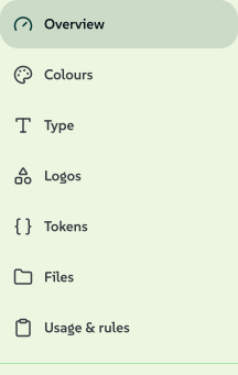
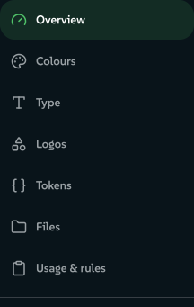
The studio is a set of rooms in a rail down the side, in no fixed order: nothing is numbered and nothing waits on anything else. On a phone the rail becomes a strip of chips under the header.
 signed by Lollyvector SVG18 paths~1.2k nodes40 groups20 KBCheck it yourselfGet the signed file
 signed by Lollyvector SVG18 paths~1.2k nodes40 groups20 KBCheck it yourselfGet the signed fileTry it in the app


| Room | What you do there | Link key |
|---|---|---|
| Overview | See what the system holds, with a door into each room | overview |
| Colours | Add colours, give them roles, build shades and a palette | color |
| Type | Choose the four faces the app, the tools and every export read | type |
| Logos | Place your marks in every orientation and treatment | logos |
| Tokens | Corners, spacing, shadows and every other named value | tokens |
| Files | The images, audio and motion files your brand keeps | catalogue |
| Usage & rules | The rules your brand applies, checked on real examples | usage |
Link to a room with #/start?area=<key>. The Files room keeps the key catalogue, because a room key is a permanent contract, and ?tab= still works as an older alias. An unknown key opens Overview.
The foot of the rail holds the actions for the whole system rather than one room. Add from… brings a brand in (Bring a brand in), and the Tray holds what a scan found that you have not added yet. Export, Tokens (.json), Fonts for Linux (.rpm), Versions and Restore brand settings keep and move the system (Keep and move your design system). Each appears once there is something for it to act on.
Overview
With nothing chosen yet, Overview offers four ways to start. Start from a reference opens the source picker for a logo, screenshot, web page or design file, and Pick a colour, Choose a face and Add a logo open those controls directly. Opening one writes nothing, and Explore the tools is there from the start.
Once anything is your own, Overview shows what you have, with your own counts leading. Colours gives the number of colours, with a muted · N starter where inherited colours show; its strip puts your colours first, then a hairline, then the faded starter ones. Type reads by role (Inter for headings, with Starter for the rest on the line below). Logos says how many slots are filled (or Not set), Tokens shows the corner radius and Files says Nothing yet while the library is empty. Every block opens its room.
Starter and yours
Starter is the word for anything that came with the app rather than being chosen. A fresh install carries no colour at all, only one neutral ramp from ink to paper, so surfaces, text and hairlines can render before anybody decides anything. The same word marks inherited material in every room.
Starter
- Came with the app: the ink-to-paper neutrals, the starter faces, the default corner radius.
- Muted, with a Starter tag and no tint.
- Not counted as your colours. The neutrals live in Tokens as Neutrals · starter · 9, and Open shows them in Colours as one folded group (
#/start?area=color&group=neutral). - A role standing on a starter colour reads "Starter Paper stands in", with Choose… on its picker.
Yours
- Chosen or installed by you.
- Full strength, and a tinted card where you installed a face.
- Counted on Overview and in Tokens.
- A role that follows another reads ↳ follows Primary rather than repeating the primary's name.
Inherited material is never drawn with a dashed border, because here a dashed border means a drop target.
Logos
Empty your folder of marks into the drop zone at the top: "Drop marks here, or choose several at once" takes as many files as you have. Each file is read for its shape and its ink, then waits under Waiting for a slot as a chip that says what it looks like, such as "Looks like the Horizontal primary", with the measurement it used and a Place button (Replace where the slot is filled). Where it is unsure, the chip says so and offers Change slot, listing all eight. Nothing is placed until you press something.
A mark with surplus empty margin gets a trim offer first; answer it or press Escape and the original goes in untouched. Where a mark can fill an empty sibling slot, the room offers the derived mono or reverse version as a chip marked Generated.
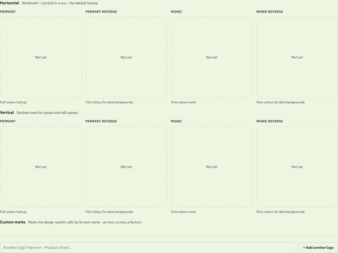
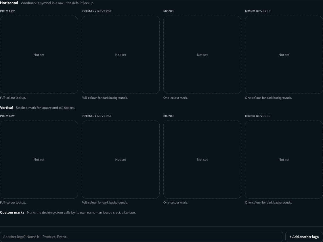
Every mark ends up in a grid of eight optional slots, one per orientation and treatment:
- Orientations: Horizontal (wordmark and symbol in a row) and Vertical (stacked, for square and tall spaces).
- Treatments: Primary, Primary reverse (for dark backgrounds), Mono (one colour) and Mono reverse.
A group with no marks yet folds to one line; open it to see its slots. Click a slot to add a PNG, SVG, JPEG or WebP, or click a filled slot to replace the mark. Everything stays on this device.
 signed by Lollyvector SVG32 paths~12k nodes69 groups123 KBCheck it yourselfGet the signed file
 signed by Lollyvector SVG32 paths~12k nodes69 groups123 KBCheck it yourselfGet the signed file


- Custom marks are marks your brand calls by its own name, such as an icon, a crest or a favicon.
- More identities. A sub-brand, product or event can have its own full set: + Add another logo and give the set a name. Your main set is "Your logo". Brand architectures shows when a logo identity is the right block.
- Lolly reads the logo's colours. A card under the drop zone, and again at the top of Colours, lists the logo's colours and asks Which is the main colour?, with the strongest colour already selected (never the white it was exported on). Use these colours adds them to your palette, makes the main colour your primary and, when the logo has a dark neutral that reads on paper, makes that the text colour. Not now leaves them in the Tray. On a brand-new install the likeliest answer is applied at once, and the card offers Undo or another main colour. An SVG gives exact colours; a PNG, JPEG or WebP gives the colours that cover a real share of the mark.
Colours
The room grows with the design system: a first visit is one decision, and the rest arrives as the palette does.
The first colour
A system with no colours of its own opens on one large chip and one field, with a line saying that roles, shades and print settings arrive as the system grows.
- The chip is the picker. Press Pick a colour and the studio's OKLCH card opens, seeded with whatever the field holds: a name, the wheel, the four dials, alpha and Stored as, with Cancel and Add colour at the foot. Nothing reaches the system until you press Add colour.
- The field takes any notation:
#e0452b,rgb(224 69 43),oklch(58% .19 32)or a colour name. Paste a list and it becomes a row of chips to add one at a time or with Add all. - Two more ways in. Pick a colour from the screen uses the eyedropper where the browser has one, and Take colours from an image reads a screenshot or photo on this device.
- Add is never disabled. With nothing in the field it opens the picker; text it cannot read gets a line under the field saying so.
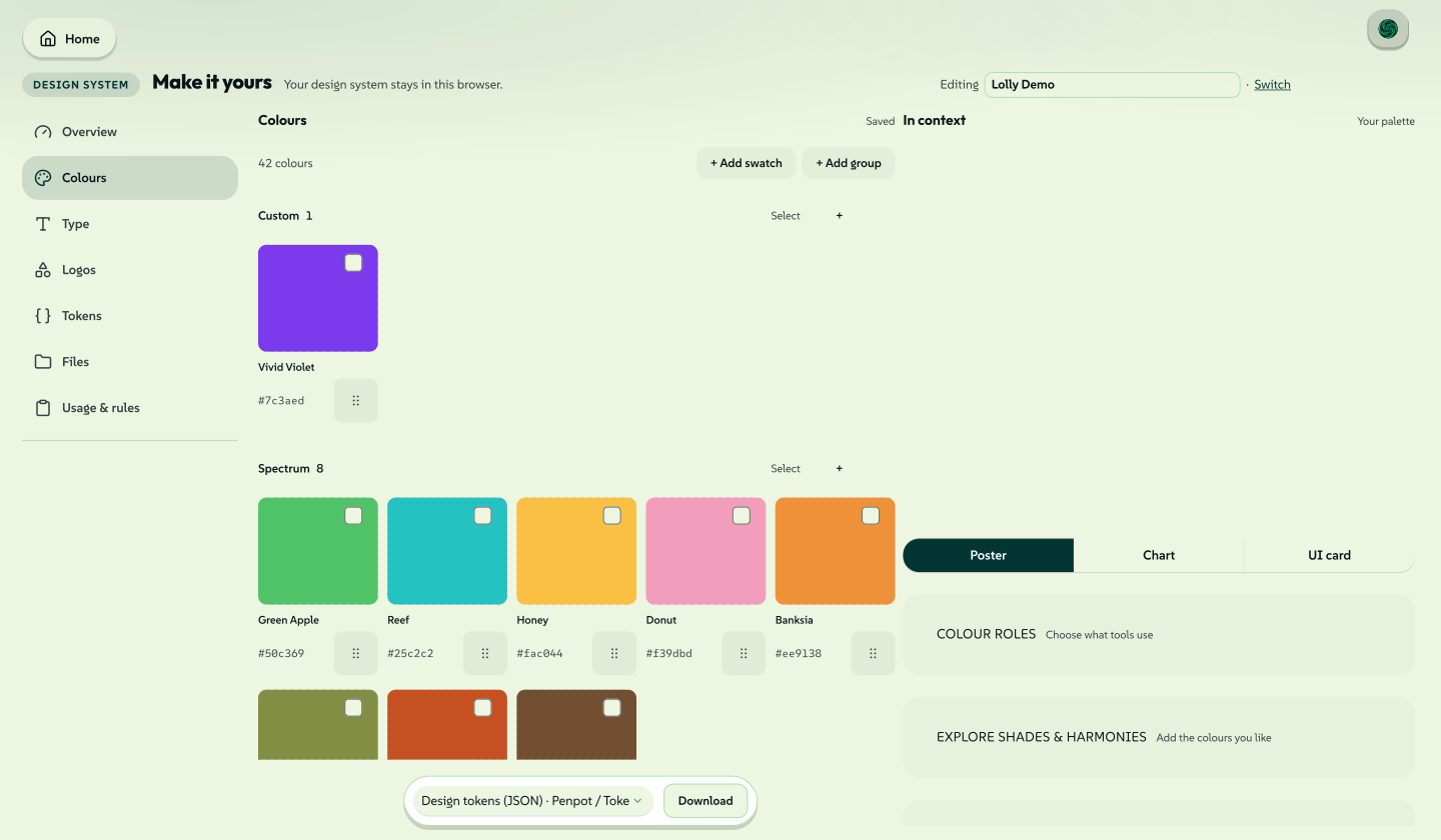
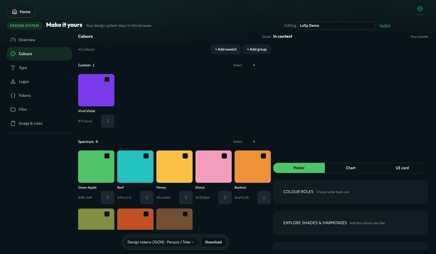
Your first colour becomes the primary, and a chip confirms it, such as "Primary is now Vivid Violet", with Fine-tune to adjust the colour.
As the palette grows
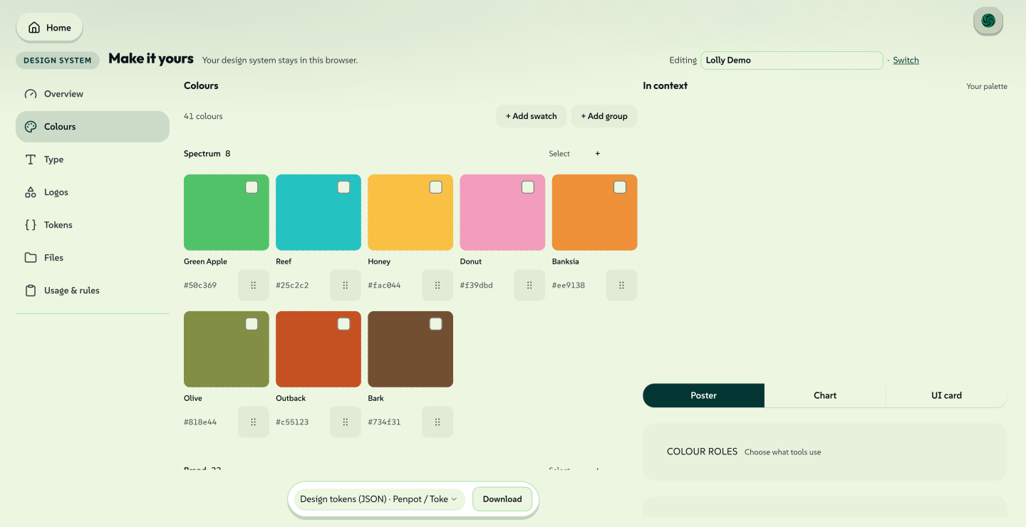
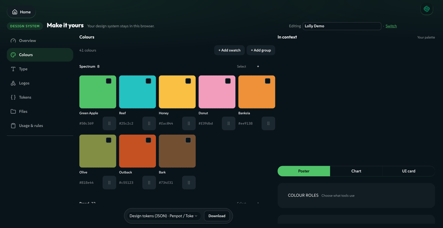
Your colours sit beside an In context preview on a wide screen, and above it on a smaller one. The preview shows a poster, chart or interface card in your palette. Starter colours stay in their own folding group.
 signed by Lollyvector SVG167 paths~11k nodes243 groups1 image191 KBCheck it yourselfGet the signed file
 signed by Lollyvector SVG167 paths~11k nodes243 groups1 image191 KBCheck it yourselfGet the signed file


 signed by Lollyvector SVG171 paths~12k nodes245 groups1 image198 KBCheck it yourselfGet the signed file
 signed by Lollyvector SVG171 paths~12k nodes245 groups1 image198 KBCheck it yourselfGet the signed file


Roles: what tools read
Roles say which colour plays each part in every tool and export. They are optional (three loose colours and no roles is a perfectly good system), any colour can take one and the contrast readout is measured against the surface, APCA first. Each role row shows an own colour at full strength, a starter colour standing in, or ↳ follows Primary.
Once the palette has shades, the strip shows all seven roles a tool can read: Primary, Secondary, Surface, Text, Muted, Edge and On primary. On primary is derived from the primary, reads Derived and has no picker.
The app's own accent follows the design system by default. That is the Interface follows the design system setting in Settings → Appearance; turning the setting off leaves the app's chrome neutral, while tools, canvases and exports follow the design system either way.
Colourways. A design system can hold several lead colours, each chosen per piece. Lolly keeps every colourway, but this room cannot author one yet: a colourway is written in the token file. On a system with colourways, every colourway needs its own primary and secondary, and its own surface when the colourways tint the background, so those roles stay set in the swatch editor. Lolly Demo in use shows colourways on real work, and Add colourways to a design system has the format.
Find more colours
Three tools build on your primary. The first two only suggest, and the third replaces the palette after you review the change.
Explore shades & harmonies
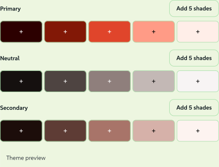
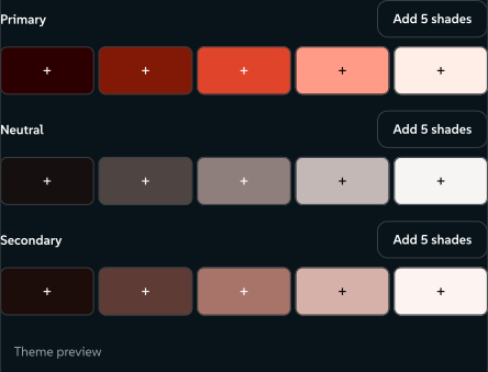
Choose a Starting colour, a Scheme (Mono, Complement, Analogous or Triad) and how many Shades (3 to 20, default 5). Fine-tune sets UI intensity, contrast and text on brand. Click a shade to add it, or Add 5 shades for a group. Your colours and roles stay.
Find matching colours
Pick a Harmony: Complementary, Adjacent, Triad, Tetrad or Analogous (with Accents from 2 to 5 and an Angle from 10° to 45°). Each candidate has a generated name and + Add, one press per colour.
Rebuild the whole palette
Replaces the palette from one starting colour, after a review of what changes and what stays. A checkpoint is taken first, and Undo is offered afterwards.
All three use the same perceptual colour maths (OKLCH) as the engine. In Explore shades & harmonies, the Primary, Neutral and Secondary rows show the suggested shades, and Theme preview shows light and dark examples with their contrast readings.
 signed by Lollyvector SVG22 paths~1.9k nodes49 groups27 KBCheck it yourselfGet the signed file
 signed by Lollyvector SVG22 paths~1.9k nodes49 groups27 KBCheck it yourselfGet the signed file


 signed by Lollyvector SVG8 paths936 nodes14 groups15 KBCheck it yourselfGet the signed file
 signed by Lollyvector SVG8 paths936 nodes14 groups15 KBCheck it yourselfGet the signed file


Committing a generated palette
Open Rebuild the whole palette… and press Preview full rebuild. The review counts how many roles stay as you assigned them, how many of your own colours are kept and how many shade curves, print locks, hidden shades and gradient stops are re-anchored or kept. Apply rebuilt palette commits; Cancel changes nothing. Afterwards the card offers Undo with focus on it, and the checkpoint taken before the swap restores the whole system.
A system with colourways keeps every colourway through a rebuild. The canonical colourway follows the new starting colour, and every other colourway keeps its own colours, name, order and settings. The review lists which colourway follows and which keep their colours. Lolly does not rebuild a system that encodes its colourways in a way it cannot edit; the card says why, and nothing changes.
The expert sections
Four folded sections sit below the preview and the roles. Each opens directly with #/start?area=color&focus=<name>:
- Explore shades & harmonies (
focus=generate), described above. - Shade curves (
focus=curves) reshape a ramp point by point, with separate lightness, chroma and hue curves (L / C / H) and the shades redrawing as you drag. - Contrast (
focus=contrast): Contrast-lock retones a ramp to hit APCA targets against a background you pick, and Rotate hue turns the whole ramp around the wheel. - Print (
focus=print) sets what the primary becomes on press: its automatic value, a pinned CMYK build or a named spot ink.
The palette and each swatch
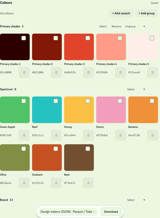
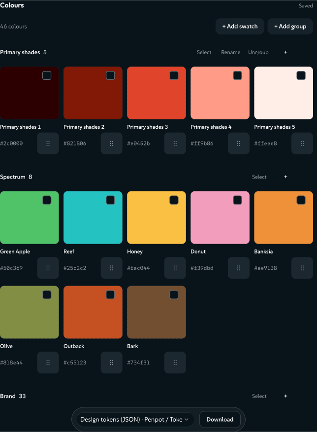
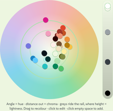
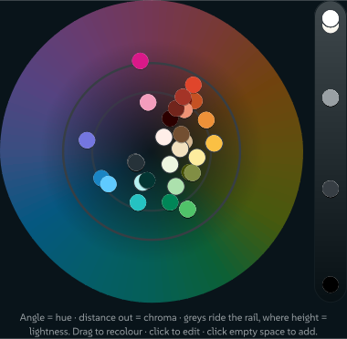
The palette lists your colours in folding groups, each with its own + Add. Create and rename groups as you like. A role never makes a second tile: a tile a role points at wears a small mark instead (P, S, Su, T). Colour chart below the tiles shows the same colours on the OKLCH Wheel (drag a dot to recolour, click empty space to add a swatch) and the Gamut chart, which shows where the displayable range ends. #/start?area=color&focus=chart opens the chart directly.
 signed by Lollyvector SVG113 paths~9.3k nodes231 groups1 image133 KBCheck it yourselfGet the signed file
 signed by Lollyvector SVG113 paths~9.3k nodes231 groups1 image133 KBCheck it yourselfGet the signed file


 signed by Lollyvector SVG529 paths~4.9k nodes161 groups149 KBCheck it yourselfGet the signed file
 signed by Lollyvector SVG529 paths~5.4k nodes165 groups174 KBCheck it yourselfGet the signed file


Click a swatch to open its editor:
- Rename the swatch.
- Set the colour on OKLCH sliders, or in Hex, HSL, RGB or CMYK. The value field reads and writes in the active space. CMYK here sets the screen colour by conversion; to pin exact inks, use Print substitutes.
- Stored as chooses how the swatch is saved: LCH (the default, perceptual and wide-gamut), Hex, RGB or HSL.
- Use as gives the swatch a role directly. Press a highlighted role again to clear the role.
- Print substitutes (folded): lock CMYK from Auto to exact ink values, or set a Spot colour with a Name (such as
PANTONE 186 C), an optional Book and a Finish for foil, emboss, deboss, spot varnish, soft touch or a die cut, crease or perforation. A press uses these locks when you export a CMYK PDF or TIFF; see Colour profiles. - In other spaces (folded): a value per colour space, derived or authored by you, and an authored one wins at export.
Deleting a swatch is safe. Derived shades and theme roles are hidden, so nothing that reads them breaks, while colours you added are removed.
Working with many swatches
Each swatch has a drag handle. Drag to reorder within a group, or focus the handle, press Space, use the arrow keys and press Space again to drop; Escape cancels. To move colours between groups, use the editor's Group control or select several and use Move to.
Selection needs no mode. The bar appears with the first selected tile and leaves with the last.
- Drag on empty space to draw a rectangle; every tile it touches joins the selection, across groups. A folded section adds nothing.
- Shift-click takes a range in reading order, Cmd/Ctrl-click toggles one tile, and a plain click opens the editor.
- Each group header has Select all, and Cmd-A with a tile focused takes every colour you own, never a starter one.
- The grid has one tab stop: arrows move, Shift-arrows extend, Space toggles, Delete removes and Escape clears. To nudge a channel, press
l,corhfirst. - On a touch screen, press and hold a tile to start a selection, then tap to add.
The bar reads {n} selected, then Move to, Give a role (each colour takes the next role in turn), Download (the selection in any of the six palette formats), Duplicate (a copy of each, placed after the original), Copy values and Delete. One copy opens straight in the editor; several stay selected. One Cmd/Ctrl-Z undoes a whole bulk action.
Gradients
The optional Gradients panel builds blend tokens from the palette. Each gradient has a preview, 2 to 8 named stops and an angle. A stop points at a swatch, so recolour the swatch and the gradient follows. Blends run in OKLCH.
The palette downloads (design tokens, CSS, SCSS, GIMP and Adobe Swatch Exchange) sit in a pill at the foot of the palette once there are shades. Take your palette and fonts anywhere describes each format.
Type
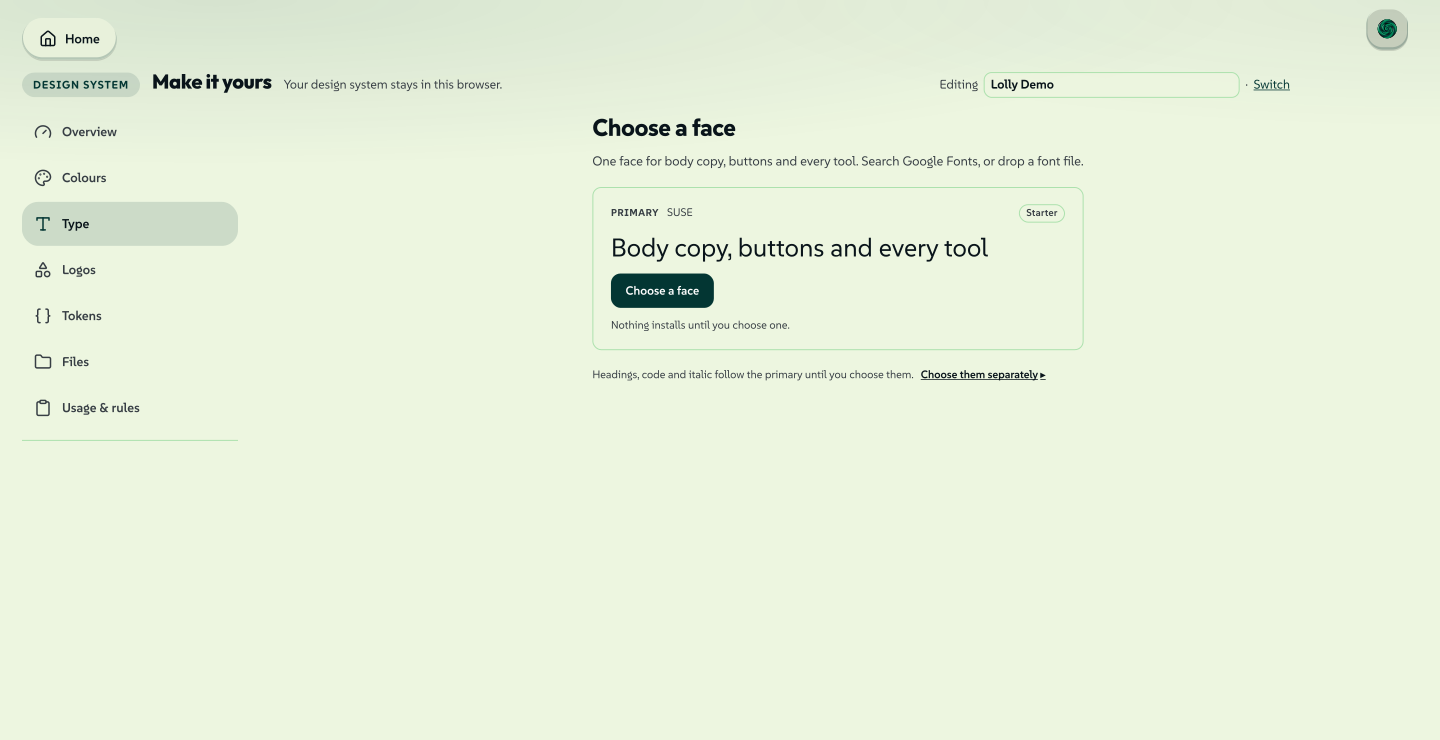
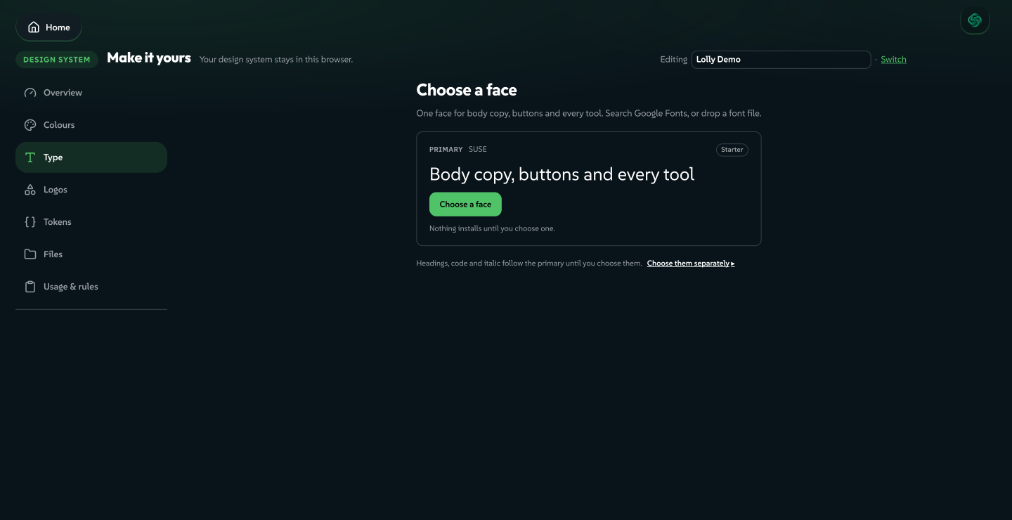
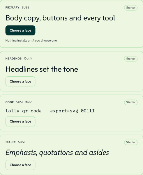
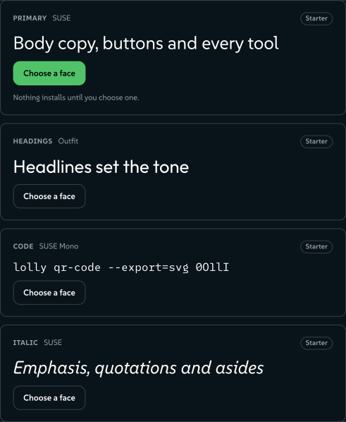
With no face of its own, the room is one card: Primary, set at reading size in the face serving it today, with a Starter tag, a Choose a face button and the line "Nothing installs until you choose one." Headings, code and italic follow the primary until you choose them; Choose them separately shows their cards.
 signed by Lollyvector SVG87 paths~9.9k nodes91 groups151 KBCheck it yourselfGet the signed file
 signed by Lollyvector SVG87 paths~9.9k nodes91 groups151 KBCheck it yourselfGet the signed file


Choose one face and the room opens into four role cards, the Fonts list and a live specimen:
- Primary: body copy, buttons and every tool.
- Headings: the display face for
h1andh2. - Code: a monospace face for code and data.
- Italic: a true italic for emphasis, quotations and asides.
A card is tinted only where you installed that face, and its button says Change on a face of your own and Choose a face everywhere else. Nothing on a card commits anything: the button opens the compare stage for that role.
 signed by Lollyvector SVG21 paths~6.1k nodes31 groups73 KBCheck it yourselfGet the signed file
 signed by Lollyvector SVG21 paths~6.1k nodes31 groups73 KBCheck it yourselfGet the signed file


The compare stage
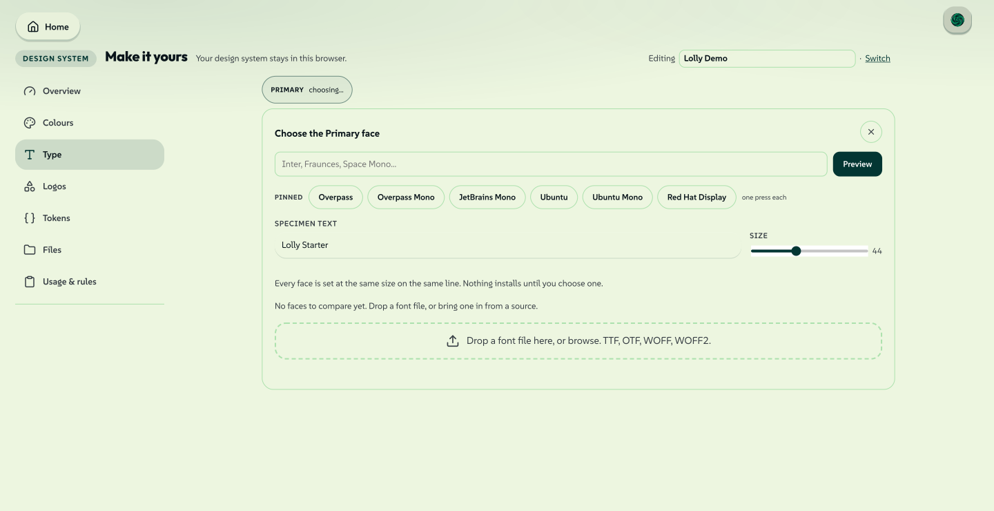
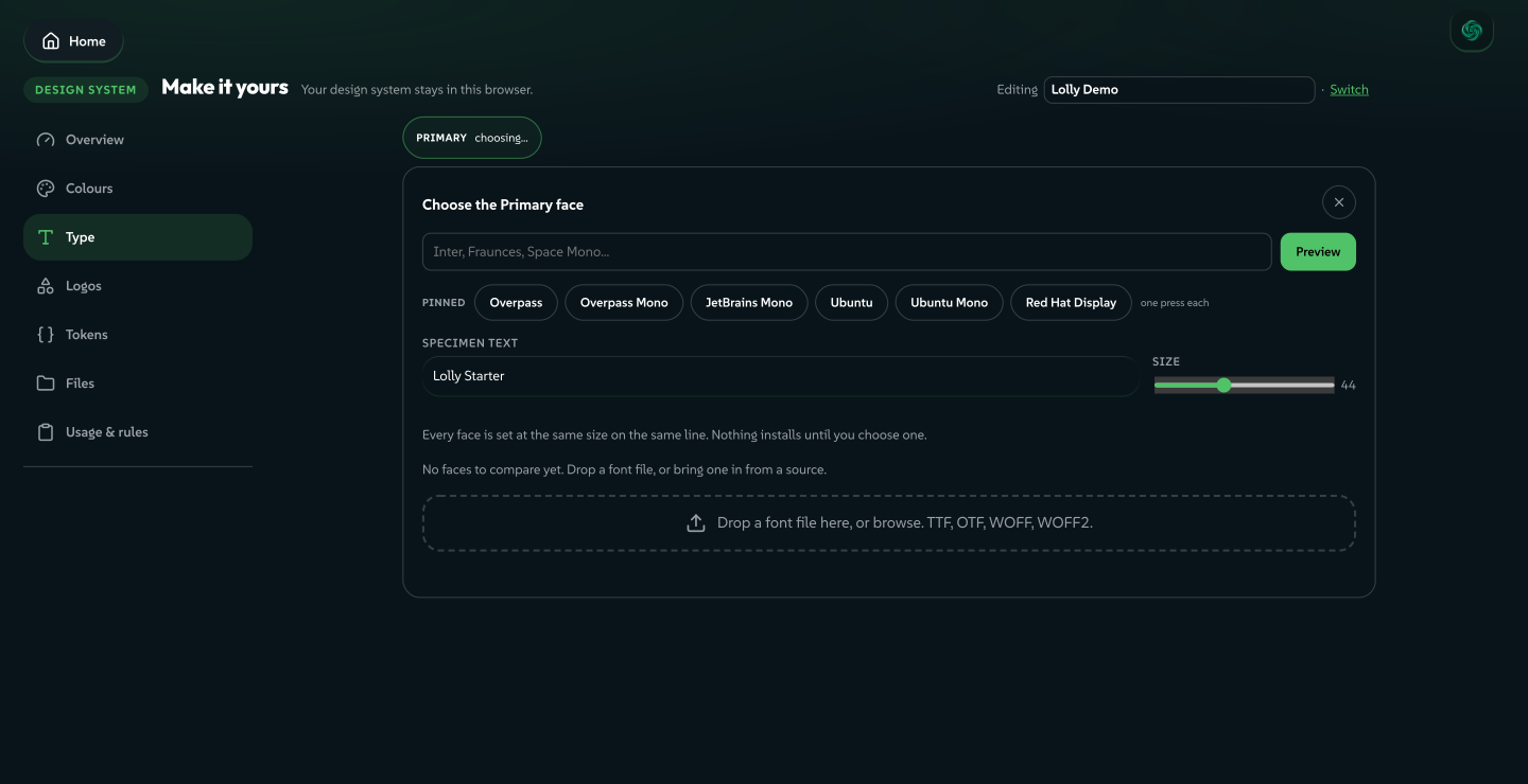
The stage opens inside the room, under the card you pressed, and the cards fold to a one-line strip so the stage shows on a phone's first screen. Escape cancels and returns focus to the card.
- Press Choose a face on the card.
- Type a family name and press Preview, or press one of the six Pinned families under the field.
- Press Use this face.
 signed by Lollyvector SVG102 paths~12k nodes117 groups177 KBCheck it yourselfGet the signed file
 signed by Lollyvector SVG102 paths~12k nodes117 groups177 KBCheck it yourselfGet the signed file


Consent is asked once. The first time a preview reaches Google Fonts, a dialog explains: Google learns the family name and your IP address. The file is then kept on this device and used offline. This is the one step in the studio that reaches a third party. Fetch from Google goes ahead and is remembered. Cancel leaves the card reading "Not fetched. Nothing was sent to Google.", with its own Fetch from Google.
Drop a font file on the stage (TTF, OTF or WOFF) to preview a licensed typeface you already own. Either way the face stays on this device, renders offline in the app, the tools and every export, and travels in the design system file. Everything on Google Fonts ships under an open licence (OFL, Apache or UFL).
Fonts on this device
The Fonts panel lists every face on this device and the role it serves. Faces you added lead under In the design system, each with its roles and a delete. The starter faces follow in one muted, folded row. Add a face opens the compare stage for any role. The Type roles panel shows a live specimen of each role with its family and state, such as Inter or Inter · follows Primary.
Tokens
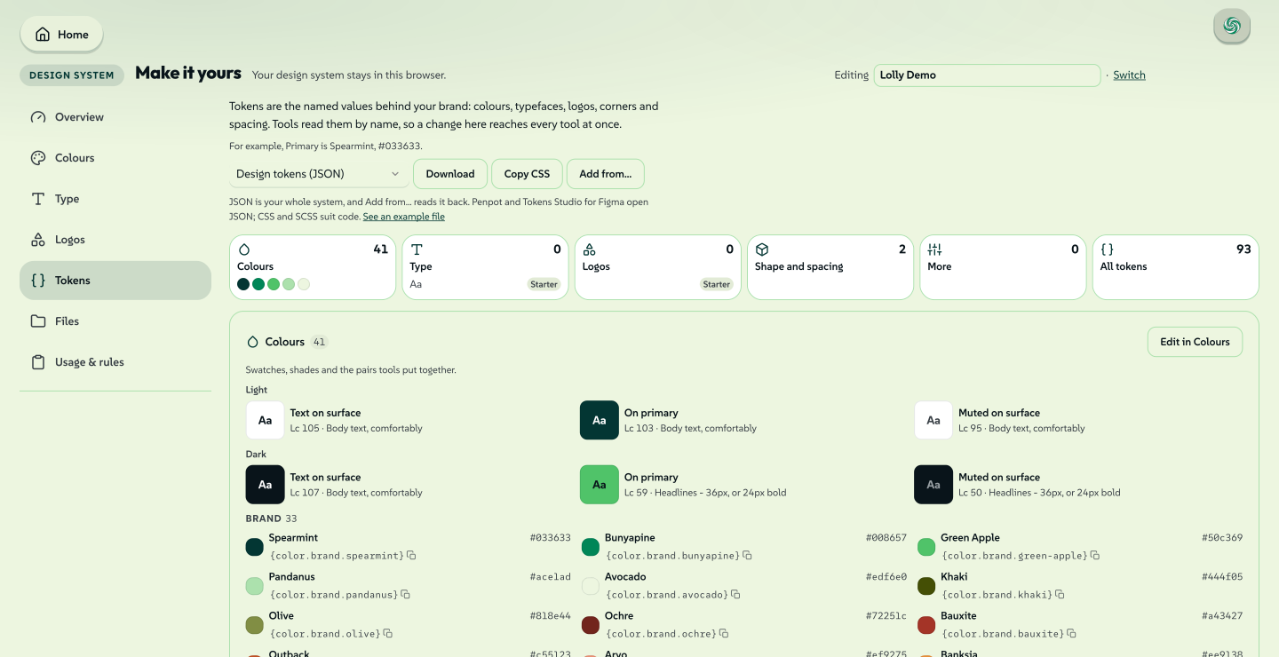
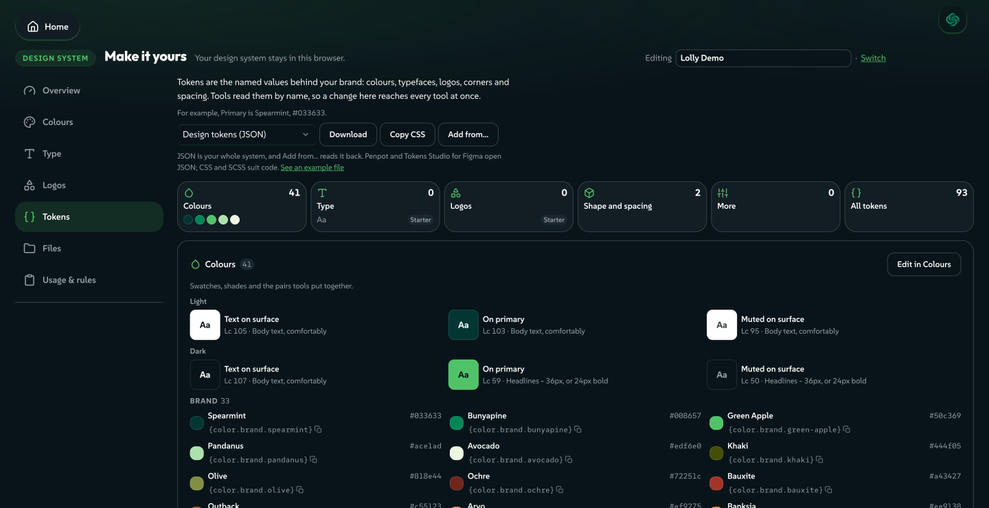
Tokens are the named values behind the design system: colours, typefaces, logos, corners and spacing. Tools read them by name, so a change here reaches every tool at once.
 signed by Lollyvector SVG336 paths~32k nodes575 groups1 image490 KBCheck it yourselfGet the signed file
 signed by Lollyvector SVG336 paths~32k nodes575 groups1 image492 KBCheck it yourselfGet the signed file


- The head gives an example from your own system (Primary is Spearmint, #033633) and the file actions: Download (the whole system as design tokens, or the palette in five other formats), Copy CSS and Add from… to read a JSON file back in.
- Tiles count each kind of token and jump to its section: Colours, Type, Logos, Shape and spacing, More and All tokens. They count what is your own, as Overview does. On a phone the tiles scroll sideways.
- Colours starts with the pairs tools put together (text on surface, on primary, muted on surface) with an APCA readout in light and dark, and flags Weak contrast where a pair falls short. Then every colour group: a ramp as one row of chips, other colours with their value and the reference tools use, such as
{color.brand.spearmint}. Press a reference to copy the reference. Edit in Colours opens a group in the Colours room. - Type and Logos list the face for each role and each logo slot, with Edit in Type and Edit in Logos once you have your own.
- Shape and spacing holds Rounded corners (
shape.radius) and Spacing rhythm (space.base). Each reads Lolly default until you move the slider and Yours after, saves at once and can be undone. - More tokens adds spacing, sizing, stroke width, opacity, rotation, plain numbers and shadows, stored as standard design tokens.
- App appearance (advanced) lists the colours, sizes and shadows Lolly's own screens use, and Inspect every token (advanced) searches and edits any stored value, showing each change for review first.
A section with nothing in it offers the way to fill the gap: Pick a colour, Choose a face or Add a logo.
Files
Drop the files your brand keeps, apart from logos: vector, image, audio and motion files (video, Lottie and animations). They appear in Assets, sorted into sections and ready in every tool's asset picker, and they stay on this device.
Usage & rules
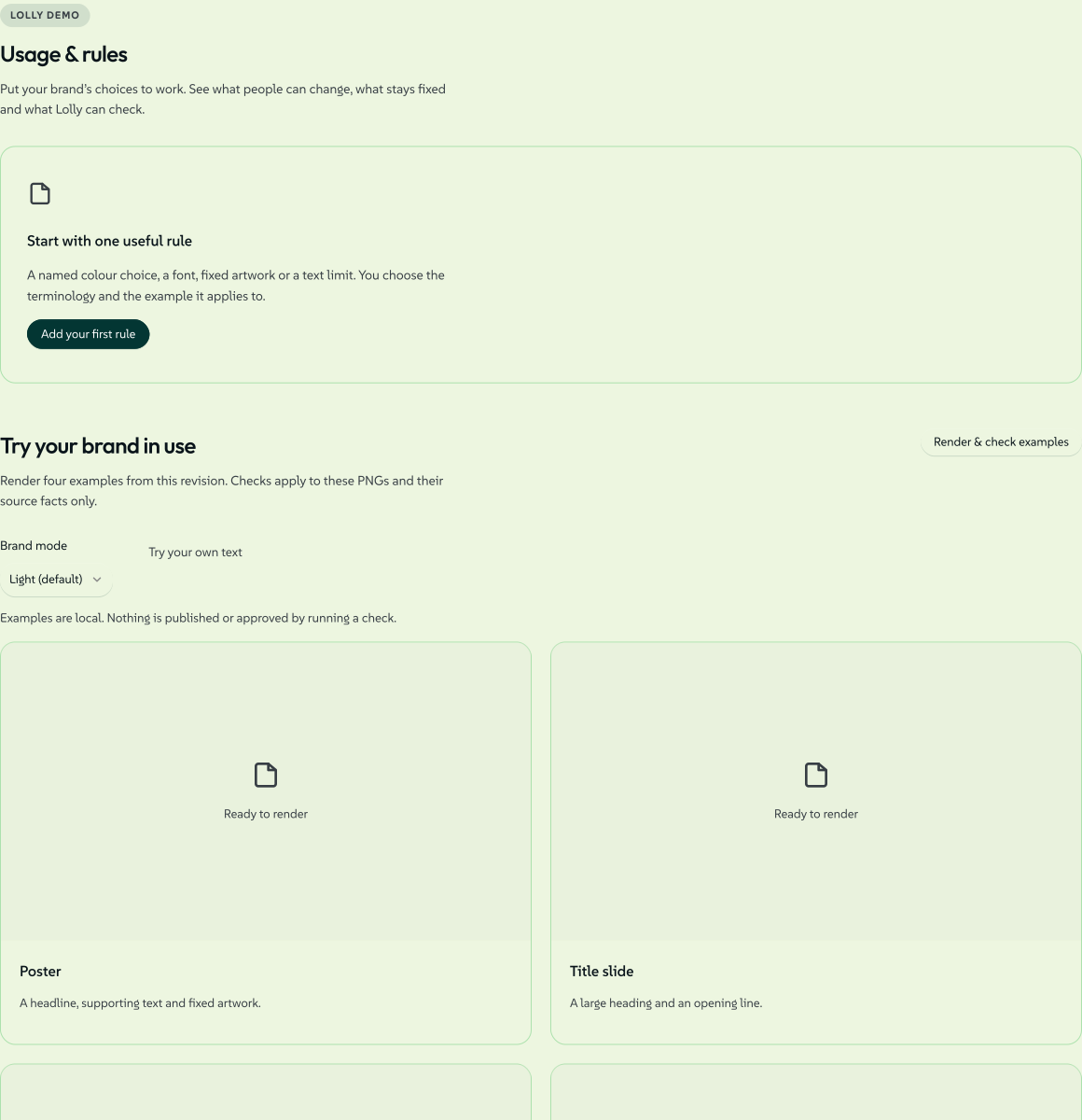
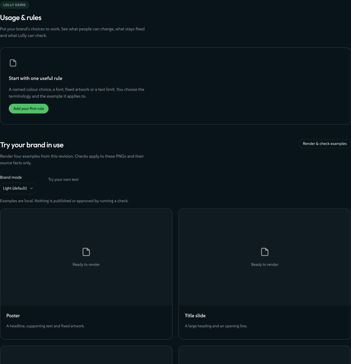
Usage & rules puts your brand's choices to work: what people can change, what stays fixed and what Lolly can check.
 signed by Lollyvector SVG31 paths~13k nodes58 groups1 image150 KBCheck it yourselfGet the signed file
 signed by Lollyvector SVG31 paths~13k nodes58 groups1 image150 KBCheck it yourselfGet the signed file


Brand rules lists your rules. Add rule (or Add your first rule) opens a short form:
- a Rule name in your own words, such as Beacon accents;
- the Check: Colour choices, Font choices, Fixed artwork or Text length, with the brand role it uses, under your own name for the role;
- the Example it applies to (Poster, Title slide, Content slide or Chart), the Mode and whether it is Required or Advisory;
- Reviewed by, then Save draft or Approve & save.
Approval records your own decision on this device. Approved required rules constrain the reusable poster, and checks cover the example PNGs only; they change no other tool.
Rules a design system brings with it in its token file, such as approved colour pairings, text weight and alignment or a logo per surface, are listed here as Checked in Design. Today lolly check applies them to a saved Design document, layer by layer; the app's own export panel does not check them yet. A rule this build has no checker for is kept as supplied and marked Unchecked.
Try your brand in use renders four examples from the current revision with Render & check examples. Choose a Brand mode and Try your own text for the heading, supporting text and slide text. Each example reports what was measured, with See checks & sources and Download check report, and Make reusable poster downloads a .lolly whose fixed layout and approved input choices travel with the file. Examples are local: nothing is published or approved by running a check.
A build that ships with a fixed brand shows the same rules and examples read-only, under This brand is set.
Bring a brand in
Add from… at the foot of the rail opens a picker that asks what you have, not what format it is:
- Design tokens or a design file: DTCG or Tokens Studio JSON, a Penpot project, a zip of token sets, a Lolly design system pack or an SVG.
- PDF: a deck or a guidelines file, read on this device for its colours, marks and embedded typefaces.
- Logo or screenshot: an image becomes a suggested palette, read on this device. It reads colours, not the typeface or layout.
- Saved web page: one HTML file and its CSS files, or pasted HTML or CSS, up to 20 files and 2 MB. Only the text you supply is read: linked resources are not fetched and scripts do not run.
- Font file: TTF, OTF or WOFF. Opens the Type room, where the face installs.
- Website: one page, read for its colours and type. This tile appears only on a device that can read a page, and says which reader it uses: the app on this device, or the browser extension in a background tab, signed in as you. Naming a URL only fills in the field; pressing fetch is the consent.
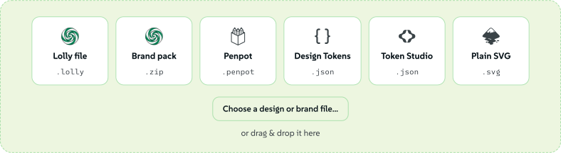
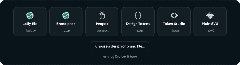
Choose the design-file source and the next card lists the accepted formats as icon tiles, with the whole card as one drop target. You can also drop a file straight onto the studio.
 signed by Lollyvector SVG20 paths~3.1k nodes35 groups2 images173 KBCheck it yourselfGet the signed file
 signed by Lollyvector SVG20 paths~3.1k nodes35 groups2 images174 KBCheck it yourselfGet the signed file


- A Lolly design-system pack (
.lolly, or a legacy.zip) installs in one step. - A Penpot export (
.penpot) brings its design tokens. - A Design Tokens (W3C DTCG) or Tokens Studio file (
.json) brings its tokens. - A plain SVG is scanned for colours you pick from, the first becoming your primary.
Review a reference
A logo, screenshot, website or saved page opens Try these colours: an example in the proposed colours, a Main colour you can change and a name for a new system. A box spells out what applying does: it replaces the active token settings with the generated palette and default styles, keeps your fonts and library files and the previous system can be recovered. Apply suggested settings applies the light and dark palettes, after a checkpoint, and Restore brand settings can bring the old settings back. Change reference picks another source.
Palette, source details and individual choices shows what was read, any font names found and the preview's contrast. Font names are suggestions only; Type is still where you install a face. The source details can include typography, gaps, padding and corner values where observed, labelled Not observed otherwise. A saved page or a native website read reports declared styles, which the page may not use, and the browser extension can report measured styles from a sample of visible elements. These are observations: nothing is installed, and source spacing never replaces your own. Choose individual items in the tray keeps single items, and Download design context saves a JSON report of observations, proposed tokens and source information (with a SHA-256 of any supplied HTML or CSS). The report holds no raw page text and is not a signed Content Credential.
PDF and design-file imports keep their own review controls. Items in the Tray change nothing until you add them in the room that owns that kind of material. #/start?source=<kind> opens the picker on a source (file, pdf, image, font, url, page), and ?import opens the plain list.
Find and compare a look
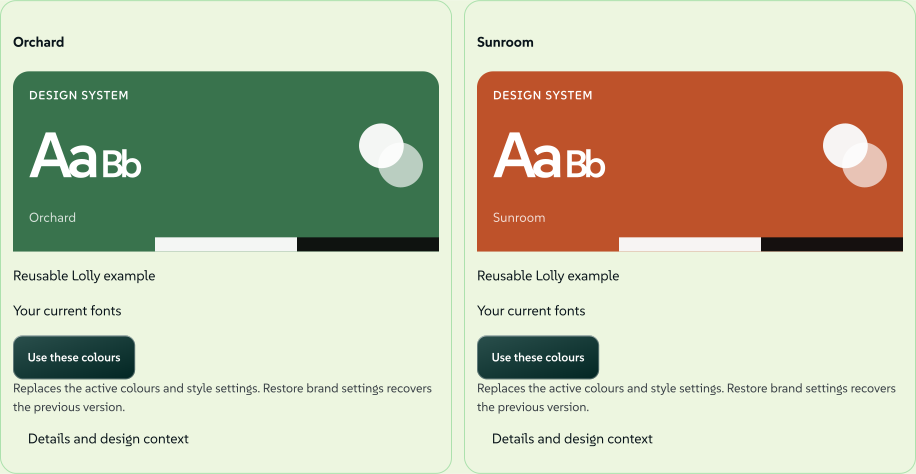
Open Find a look from Overview or from the design-system list in Settings. Browse systems saved on this device and a few reusable Lolly examples, and search by name, colour tag or declared font. Closest to my current palette sorts by measured colour similarity, with matching fonts breaking ties; it is not a quality score.
Select one look to review it, or two to compare side by side. Selecting changes nothing. Use this saved system switches to it, and Use these colours applies an example's colours through the usual checkpoint, keeping your fonts. Restore brand settings recovers the previous look. Saved systems have editable Search tags under Details and design context. The examples are original Lolly colour recipes, with no scraped collection and no account.
 signed by Lollyvector SVG30 paths~9.3k nodes44 groups106 KBCheck it yourselfGet the signed fileTry it in the app

Keep and move your design system
Move a brand between devices
Export writes one LollyBrand-….lolly file: your tokens, fonts, logos and theme preference, with an integrity manifest that is checked on the way back in. Web releases before 1.0.7 named the same file .zip, and that spelling is still accepted. Tokens (.json) writes the plain design-tokens document on its own, with no fonts or logos, for a repository, a build step or another tokens tool.
To bring one back, use Add from… → Design tokens or a design file, or drop the file on the studio. That is how a colleague hands you a brand, or how you carry one to a second install, with no account and no cloud. To bring a brand in from the command line, see ingest:brand.
Fonts for Linux (.rpm) packages the fonts you added into an installable RPM. If you uploaded any of them yourself, Lolly asks you to confirm that you may redistribute them first.
Restore earlier settings
Choose Restore brand settings, select a dated checkpoint and press Restore. It restores colours, type settings and other tokens for the active brand; font and image files stay as they are. Lolly saves your current settings as Before restore first, so you can reverse a restore even after closing the browser. The latest 20 checkpoints are kept on this device.
Versions
A published version is a permanent, named copy kept on this device. It never changes, so a tool or a link that pins it (with designv) keeps drawing the same thing. A system with something of your own shows a quiet Versions & publishing link at the foot of the rail; after your first publish it becomes the Versions entry. #/start?area=versions opens it directly.
- A version is permanent. There is no delete yet, and the panel says so.
- Removals lead the compatibility card, because a removed token is what breaks a tool.
- Publishing cannot be undone; restoring can. Restore latest from this version is an ordinary edit, with Undo offered straight away.
Publish only keeps a version without changing what tools follow; Publish and make active makes tools and the app follow that version. Follow the latest again puts every edit live the moment you make the edit.
Manage your design systems
Open Settings → Preferences → Design systems to switch, add or remove systems. Open selects a system and opens it here; Make a new one creates a local system and opens it with its name field ready. One system is active at a time, for the whole device. Brand architectures helps decide when a brand needs a design system of its own.
Where a system comes from. The system a deployment's catalogue supplies reads Came with this app, or From this instance in an app connected to one. Expand Catalogue source to see who supplies it, its tokens asset and namespace and its known version or checksum; if a refresh fails, cached material is labelled.
Managed systems are read-only. A system reads Managed by this instance (or Managed by this app in the desktop app with no instance) when its catalogue locks the system. You can use and download it, and opening it here shows a read-only note with Make an editable copy and Switch. Your own local systems stay editable, even when the managed one came first. A build with one fixed brand opens Design System Setup on This brand is set, with the brand's tokens and usage rules to read.
Every other supplied system is yours to hide, edit and reset, including Lolly Demo and Lolly Starter on lolly.tools. Editing one keeps its name and marks the row Edited here, and Reset to original in its menu discards the changes made on this device. The blank starter is the exception: a first change there starts a design system of your own, so Lolly asks once what to call the new system. Lolly Demo in use shows what your own system replaces.
Removing a design system
Choose Remove from a system's menu; the confirmation says which system will be active afterwards. Saved sessions, uploads and material shared with another system stay.
Removing a supplied system only hides it: its catalogue assets stay, Bring back shows it again and it returns by itself if you remove everything else. Removing an imported or edited copy does not remove the supplied system, its logos or its fonts, and if the copy was active, the supplied system becomes active again. Removing an active hosted copy clears only that copy's connection; a separately chosen instance stays selected.
Changing what a server supplies is an administrator's task: its operator changes the source catalogue and redeploys, or a Lolly Work administrator reviews and applies a server change. Edits here stay local. See Removing a catalogue design system and Configuration.
Use design context outside the app
Download design context saves the token document, resolved colours, declared font families, asset ids, source evidence where recorded, coverage and explicit rules, with no font files and no proof of ownership. The command line reads the file with no server: lolly system import makes it the terminal's design system and lolly system check checks Design inputs against the saved context. Bring your design system covers the import and Which design system a command uses covers the check, and an MCP client reads the same brief from lolly://design-context (MCP Server).
Where to go next
- Using Lolly: the tools, saving, sharing and Assets.
- Brand architectures: how divisions, products, endorsed brands, clients and seasons map onto design systems, colourways and logo identities.
- Design Tokens: the token model your brand is written in.
- Export a file: print units, CMYK and the formats your brand renders into.