
You have Lolly open and want to make something, keep it and send it on. This page walks that loop: open a tool, change what it lets you change, save the result and share it as a link or a file.
Everything here runs on your device, with no account, and keeps working offline once the tools and assets you need are downloaded. The app needs a browser or app with WebGPU to start; Supported environments lists the tested ones.
Find your way around
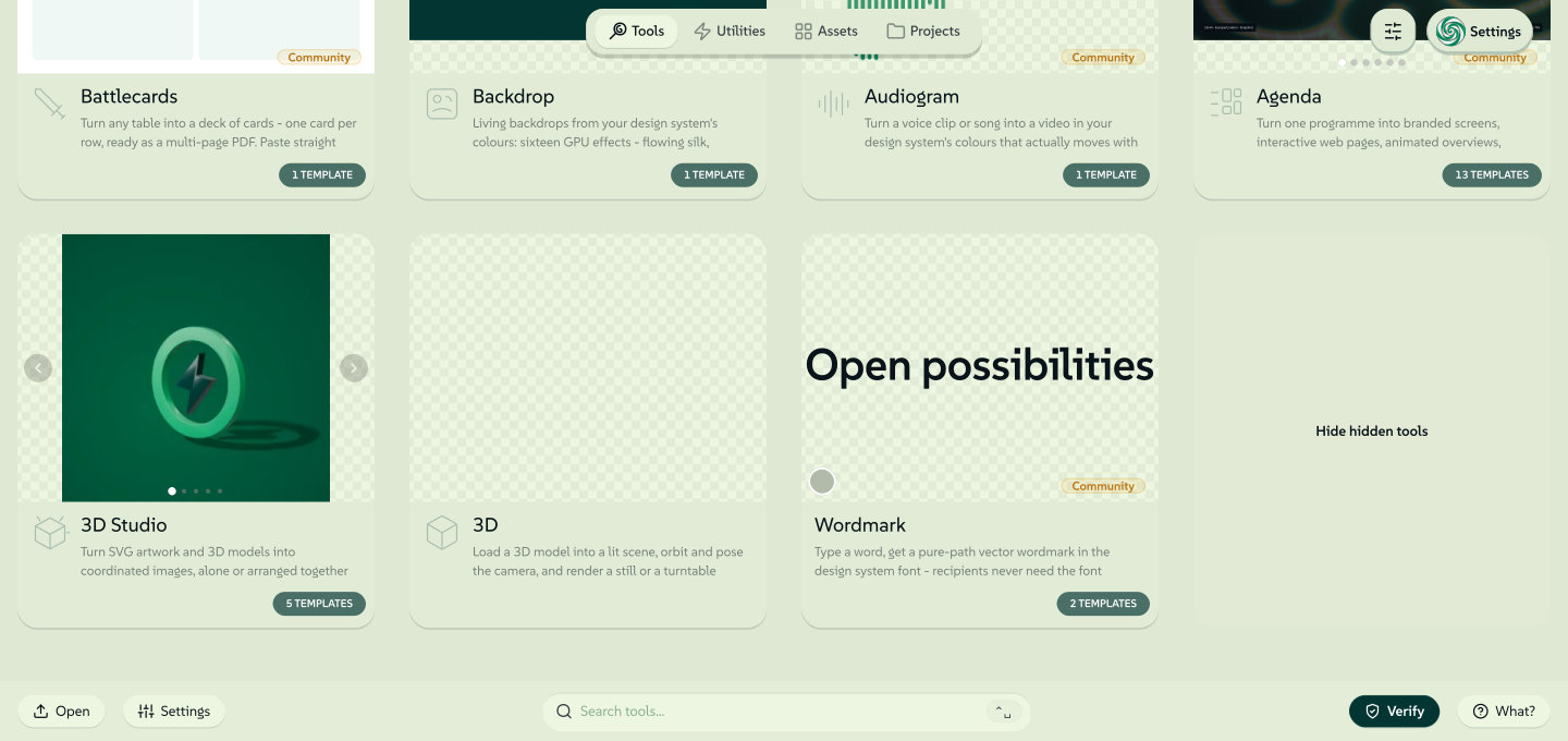
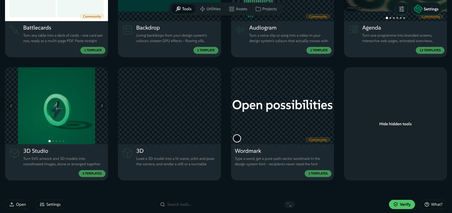
1The home screen
ToolsUtilitiesAssetsProjects
- ATabs: tools to make with, utilities for jobs such as converting a file, your library of assets, and the projects you saved.
- BCards: click one to start something new in that tool.
- CThe bar: open a file, reach Settings, search everything, check a file's credentials or read the guides.
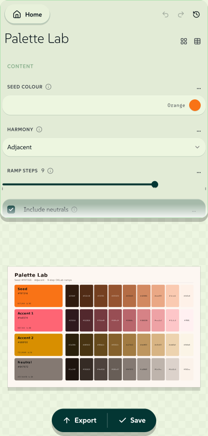
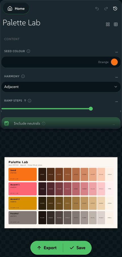
2A tool, open
↑ Export✓ Save
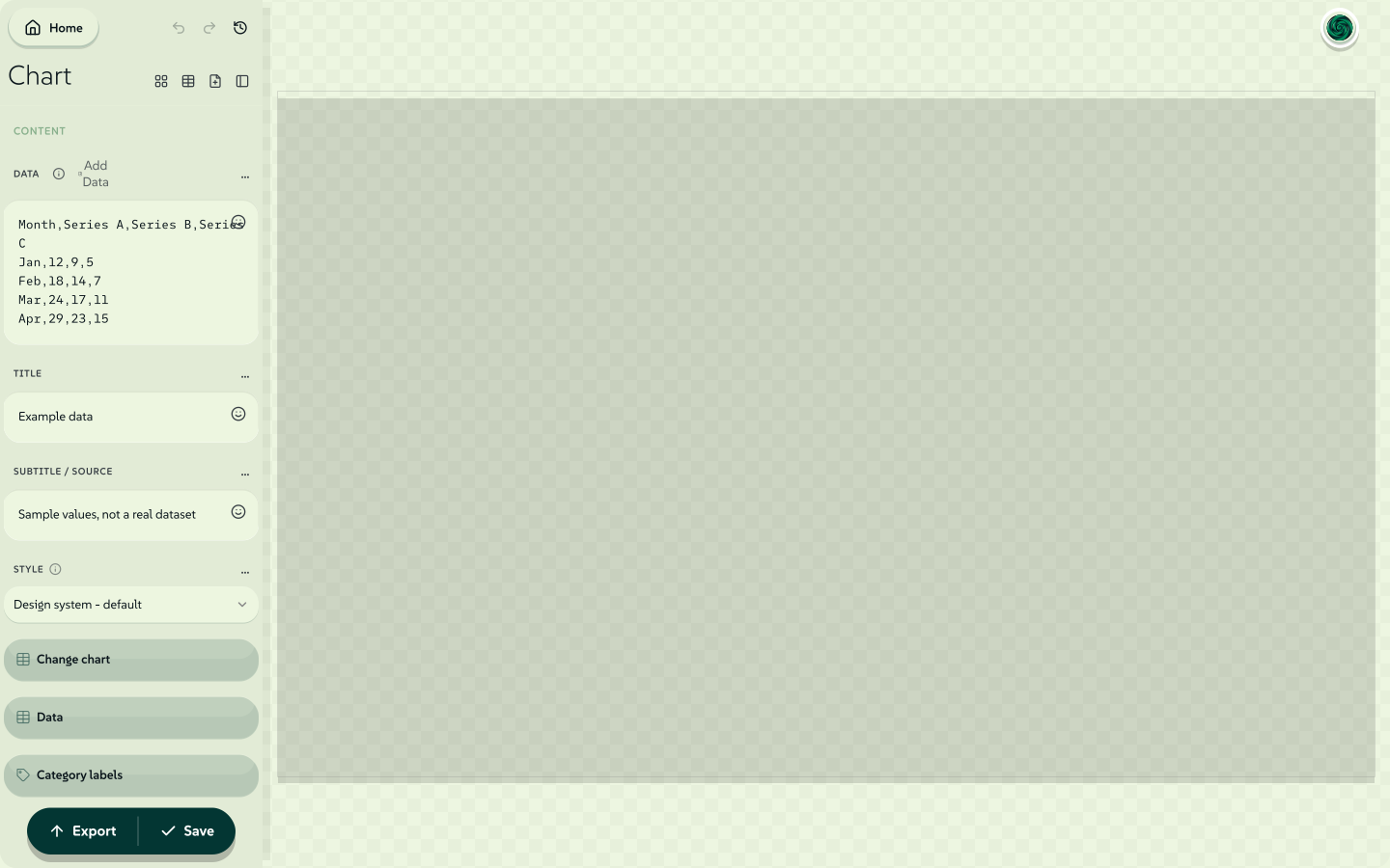
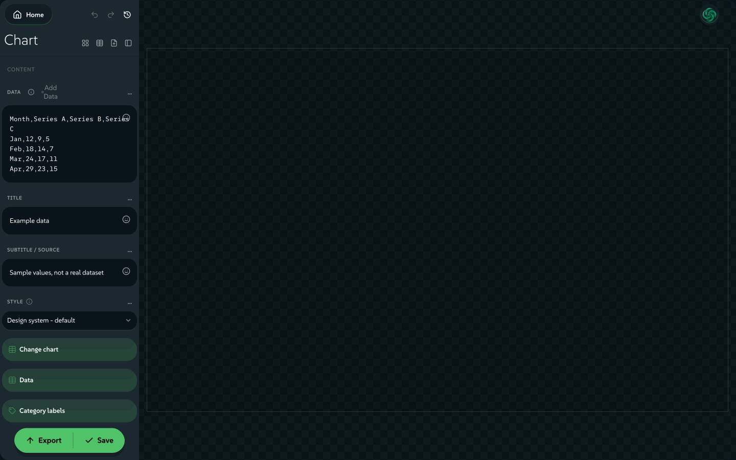
- DControls: only the inputs the tool's author lets you change.
- EPreview: updates as you change a control, and is exactly what exports.
- FExport and Save: make the file, or keep the design to reopen from Projects.
The home screen: four tabs along the top and the bar at the foot. A tool, once open, shows its controls beside a live preview.
signed by Lollyusing-app-map.htmlHTMLpixels, not shapes12 KBAI editedgenerated by Claude Opus 5.5Check it yourselfGet the signed fileFour tabs run along the top of the home screen: Tools, Utilities, Assets and Projects. Tools are what you make with, Utilities are workbenches for jobs such as converting, checking or cleaning up a file, Assets is your library and Projects holds what you saved.
The bar at the foot holds Open, Settings, a search field, Verify and What?. It shows on Tools, Utilities, Assets, Projects, Settings and the guides you read in the app, and steps aside once a tool is open. Search reaches your tools, saved work, assets and settings from that field. Ask Lolly answers a typed question with the matching section of these guides.
Click a card to start something new in that tool. Saved work reopens from Projects instead.
 signed by Lollyvector SVG20 paths~4.5k nodes31 groups59 KBCheck it yourselfGet the signed file
 signed by Lollyvector SVG20 paths~4.5k nodes31 groups59 KBCheck it yourselfGet the signed fileTry it in the app


Each tool is a split view: controls on one side and a live preview on the other. Change a control and the preview follows straight away, and what you see is what exports.
 signed by Lollyvector SVG129 paths~6.3k nodes157 groups1 image142 KBCheck it yourselfGet the signed file
 signed by Lollyvector SVG129 paths~6.3k nodes157 groups1 image142 KBCheck it yourselfGet the signed file


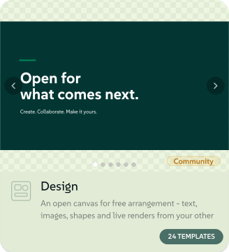
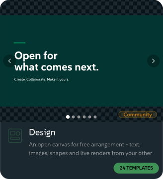
Design is the exception. It opens as a free canvas of boxes you drag, resize and type into, with its own top bar, timeline and deck controls. Design: the free canvas is its guide.
Change what the tool lets you change
A tool shows only the inputs meant to vary. Its author has already fixed the colours, layout, type and logic, so whatever you make keeps to their rules. Inputs include text, sliders, colour pickers, dropdowns, dates, image pickers and repeating row groups, and some sit in folding sections.
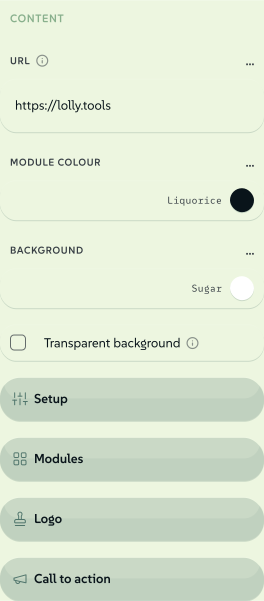 signed by Lollyvector SVG44 paths~2.9k nodes55 groups45 KBCheck it yourselfGet the signed file
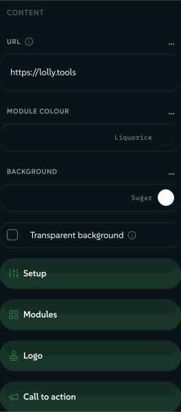 signed by Lollyvector SVG44 paths~2.9k nodes55 groups45 KBCheck it yourselfGet the signed file


Click the design to find its control. Click any element in the preview and the matching control gets focus and scrolls into view. In a repeating row group, the exact row you clicked folds open.
Clear changes, above the controls, returns every input to its default.
Design system choices. When your design system offers more than one colourway, a light and a dark look or another theme choice, a Design system section under the controls holds them. A choice appears only when it changes this tool, so a file utility shows no section at all. Each colourway is a dot in its own colours, light and dark are two buttons and any other choice is a list.
The choice belongs to this piece. It travels in the link and the saved session, every colour linked to the design system follows it and the app's own colours stay as they are. Design shows the same choices in the Inspector's Canvas tab. A tool whose colours are its content can stay on the canonical colourway, and then offers no colourway dots. Lolly Demo in use shows colourways on real work.
Zoom and pan the preview
The preview always shows exactly what will export.
- Zoom: Cmd/Ctrl-scroll or pinch on a trackpad, centred on your pointer. On the keyboard,
0orShift+1fits all,1orShift+0is 100%, andShift+2fits the selection.+/−zoom about the pointer when it is over the stage, or about the centre otherwise. - Pan: hold Space and drag, or drag with the middle mouse button. Plain clicks stay free for clicking parts of the design.
- Touch: pinch to zoom, drag to pan and double-tap to fit.
- Zoom HUD: press and hold the Lolly swirl in the corner to unfold
−, Fit and+. A short tap on the swirl still opens your profile menu.
In Design, Fit all includes artboards and loose layers. Manual zooming can go below 20% until the whole page fills half the view. The hard stop is the lower of 5% of the plain Fit scale and 2% absolute zoom.
A change of output size always snaps the view back to a clean fit.
 signed by Lollyvector SVG62 paths420 nodes36 groups42 KBCheck it yourselfGet the signed file
 signed by Lollyvector SVG55 paths407 nodes36 groups41 KBCheck it yourselfGet the signed file


Undo and redo
Cmd/Ctrl-Z steps back and Cmd/Ctrl-Shift-Z (or Cmd/Ctrl-Y) steps forward. The same pair sits as Undo and Redo buttons above the controls (in Design they are in the top bar), and each greys out when there is nothing left to take back. A message says which input each undo restored, with a Redo button in the message.
- A drag is one step. Repeated changes to one control within half a second merge, so pulling a slider across its range is a single undo.
- The last 100 steps are kept. A fresh edit after an undo clears the forward stack.
- In a text box, Cmd/Ctrl-Z belongs to the field, character by character. Lolly takes over for sliders, dropdowns, colours and switches.
- Choosing a file in a file input is not a step, because those bytes are held for this session only.
In a live collaboration your history stays yours: a change from the other device never goes onto your stack. Undo lasts until you leave the tool or reload. For anything older, tools that save as you work keep earlier versions under History; see Go back to an earlier version.
Live camera
The Filter tool's effects (Halftone, Scanline, Posterize, Voronoi, Duotone, Stretch, Misprint, Dither, ASCII art and Glitch) show a Go live button where a camera is available. Turn it on and the effect follows your webcam frame by frame, and a motion export records the result as a GIF, WebM or MP4. Frames are processed on your device, and the camera is released the moment you stop or leave the tool. Any image picker also has Take a photo for a single frame.
Saving & continuing
To keep your work, press Save, the tick beside Export on the render pill. New work goes to My library, work you saved before is updated where it is and nothing downloads. The export panel has the same Save button.
To choose where it goes, press Save as, beside Download in the export panel. Under Save to a project, leave My library selected or choose a project (+ New project… makes one), then press Save; Save as a template keeps the design as a template, a starting point for new documents. In Design, Save as is in the Lolly menu; on a phone, press •••, then File menu, then Save as.
 signed by Lollyvector SVG2 paths240 nodes10 groups7 KBCheck it yourselfGet the signed file
 signed by Lollyvector SVG2 paths240 nodes10 groups7 KBCheck it yourselfGet the signed file


- Press Save on the render pill, or Save as to choose a project.
- The item goes to My library, or to the project you chose.
- Later, press Home at the top left and open the Projects tab.
- Open the item. Every setting is back, ready to change and export again.
Items are named after the file name you typed in the export panel, or else after their tool, such as QR Code. A file you get with Download is a finished copy; to change it later, open the saved item in Projects.
Personal saves stay on this device, in the browser or app you saved from, unless you turn on Sync. If something is not where you expect, Find and recover your work covers every case, from a closed tab to cleared browser data.
Team projects with Lolly Work (optional)
If your organisation uses Lolly Work, sign in to its instance and open Projects → Team projects for sessions shared with you. The organisation sets access and retention, and its Lolly Work service stores those sessions. A shared session joins its live collab as it opens when your organisation allows live editing; Working together explains the steps.
Your personal library stays separate. Signing in on another device gives you team work, while personal saves still need Sync or a backup to move across.
Sharing your work
A design goes out as a link or as a file. Share in the export controls opens a dialog that offers both, and Share link on a saved session in Projects opens the same dialog for that session.
A link
- Carries every input in the address, so the link reproduces the design.
- Leaves behind images and files you added from this device, very long text and very large lists.
- Opens in any browser, so you can bookmark, paste or commit the link.
A .lolly file
- Carries the saved session with the images and files on this device, and can carry the tool and the design system too.
- Holds back licensed catalogue art unless you choose to include the files.
- Opens in Lolly: double-click it, use Open or drop it on the app.
The link
The ready-to-copy link sits at the top of the dialog, with Copy and a QR button that opens the QR Code tool on the link. Below the link, Link options holds:
- Open in the installed app switches the link to a
lolly://address for Shortcuts, launchers and automation, with every parameter unchanged. - Shortest link packs a long design into a compact token and shows the saving in characters. The readable form is always there too.
- Password-protect this link encrypts the link on your device with AES-256. The password is never part of the link.
- Pin this tool version adds the
_vflag, so a later tool update cannot change what the link renders. - When the recipient opens the link… chooses fullscreen, the export panel already expanded, a download on open (
&export) or a copy to the clipboard (©). - Copy credit copies a "Made with Lolly" caption with the link, for a post or a slide.
When a tool holds personal fields, such as your name, Review personal fields keeps each one out of the link until you tick that field. URL mode covers everything a link can carry.
The dialog says what a link cannot carry. An image or file you added from this device, a very long text value and a very large list do not fit in an address. Each is counted as the link is built. If anything had to be dropped, the dialog lists it and points you at the file option, rather than handing you a link that opens with a picture missing. A link that is only long gets a milder note with its character count.
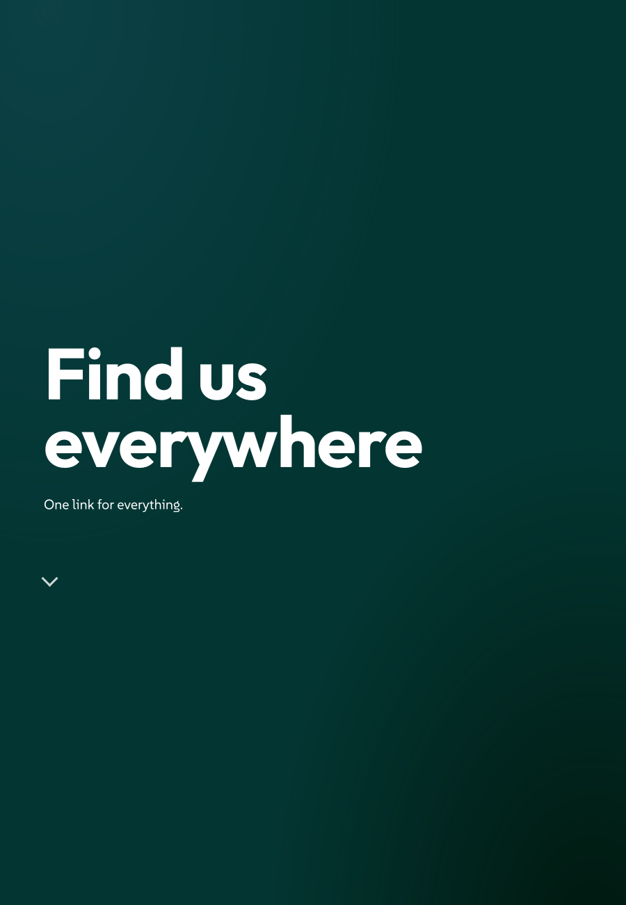
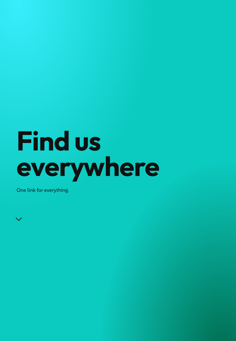
Some tools make the link the whole product. Jump Page gathers your links into one page to hand out: a bio link, a talk, a shop front. Nothing is hosted and no account sits behind the page, because the page is the link. A visitor gets it full width, one link per scene as they scroll.
 signed by Lollyvector SVG4 paths755 nodes13 groups14 KBCheck it yourselfGet the signed file
 signed by Lollyvector SVG4 paths755 nodes13 groups14 KBCheck it yourselfGet the signed file


Organisation-managed links with Lolly Work
For sharing that needs an expiry, revocation or a password, Lolly Work offers managed links to shared sessions, tools and catalogue assets. They resolve through the organisation's service and follow its access rules. They are separate from the self-contained links above, and revoking one cannot recall a file someone already downloaded. Rendering and sharing lists the link types and permissions.
The .lolly file
Download .lolly, in the Share dialog's Editable file section, writes the current design as one file. It carries the saved session with the images and files on this device, and ordinary catalogue art rides along too. A stale or unavailable file stays an external reference rather than disappearing. Before it saves, the dialog shows the file's size, how many files it embeds, how many it references and whether the tool is included. Where your device has a share sheet, Send to… hands the file straight to it (AirDrop, an Android share).
Download project (.lolly), in a folder's menu in Projects, writes a whole folder, so someone else can carry on with every session in the folder. Batch sessions stay behind, and the notice says how many. Download originals, in the same menu, writes a plain zip of each item as its own file.
Three things are yours to decide before a file goes:
- Whether your name goes in. Your name, email and organisation are written only when Use my details to create is on in your profile. With it off, the file records only that it was made with Lolly, and when.
- Whether held-back art goes in. Licensed art, brand-locked art and catalogue works whose licence was never recorded stay out by default. If the design uses any, the dialog says how many and offers Download without them or Include and download, because including them hands the files to whoever opens the
.lolly. The file'sCREDITS.txtlists what travelled and what did not, with the reason; Creative rights and credits explains the rules. - Whether the tool goes in. Include the tool packs the tool's own files, so the design opens on a device without that tool. It starts ticked for a custom tool, such as a fork, and unticked for a tool the signed catalogue lists. On a build with no signed catalogue, every tool counts as custom.
Opening one. In the desktop and mobile apps, double-click or tap a .lolly, choose Open with Lolly or send it to Lolly from the share sheet. In the web app, press Open or drop the file on Lolly. Every route reads the file's manifest first and shows its size, contents and what will happen, before anything is written.
If the file carries a tool you don't have, Trust this tool? shows the tool and its author, and says that opening it runs the tool's own code on your device. Trust & install goes ahead. Decline and the work is still saved to Projects, waiting for the day you add the tool. A tool whose code ships as a module cannot be installed this way yet, and is turned away the same way.
What a .lolly holds, and how opening one works
.lolly is Lolly's bundle extension, and the format in its manifest.json says what is inside:
- A shared design (
lolly-share) holds one saved session, its embedded files and a receipt for anything that still resolves by reference. It may also carry the tool and the design system. Opening it adds a new Project and never overwrites a session. - A shared project (
lolly-share, kindproject) holds a folder from Projects: its sub-folders, every session in them with its tile and the pictures filed there. Opening it adds a copy of the whole folder. Each session travels assessions/<key>.jsonwith its tile underthumbs/. A Lolly from before project files existed asks you to update. - A design-system pack (
lolly-brand) holds tokens and may hold fonts, logos, published versions and retained resources. Opening the pack adds a separate named design system and makes that system active. - A workspace or instance pack is a
lolly-brandwith declared tools, catalogue assets and optionally an instance address. Loading one replaces the single workspace overlay loaded before, and the preview lists those device-wide effects.
A full device backup is not a .lolly. It stays a LollyTools-….zip (format lolly-backup) and restores through Settings → Storage → Import data…. A zipped tool folder also stays a .zip. Data transfer is the format reference.
A .lolly is an ordinary zip. Rename it .zip to look inside: your own images are under assets/uploads/, catalogue art under assets/catalog/, manifest.json lists every file, and a README says what the file is.
macOS, Windows, Linux, iOS and Android all register the format, desktop file managers show it as a Lolly document and GNOME Files can show a saved session's own thumbnail. Opening from Design System Setup recommends the design-system action when a shared design carries one, but never hides Open shared design.
A document handed in from another app on iOS or Android is capped at 48 MB, because the hand-off copies its bytes across the app boundary, and the app says so. Open inside Lolly has no such cap, so use it for a larger bundle.
After you confirm, Lolly inflates and verifies the bundle once. Assets go to your library, matched by checksum so a file already on the device is reused. Sessions go to Projects with new ids, so the same file can be opened twice; a session whose tool is missing waits there. Files over 100 MB are called out as large, and the preview warns when browser storage reports less free space than the file needs. Every integrity-covered part is checked before anything commits, and a damaged copy is refused with nothing left behind.
A link and a file both hand over a snapshot. For live editing, Working together covers private collabs between two devices and optional work collabs through Lolly Work.
Assets - your library
Assets (#/a) gathers everything your tools can draw on: brand logos, images, audio and motion, grouped by kind, together with your own files. Your uploads are stored on your device. An organisation using Lolly Work can also supply a shared catalogue under its own access rules; see Use Lolly at your organisation.
 signed by Lollyvector SVG180 paths~33k nodes460 groups469 KBCheck it yourselfGet the signed file
 signed by Lollyvector SVG180 paths~33k nodes460 groups470 KBCheck it yourselfGet the signed file


- Bring your files in. Drop an image, SVG, audio clip, video, Lottie, PDF or PowerPoint deck on the upload area, or click to choose. It arrives in Assets at once and in every tool's asset picker. A multi-page PDF or a
.pptxasks which pages or slides to keep, and each becomes an SVG asset. An image you add inside a tool is kept as it arrived in My images, so a Content Credential on it still verifies, and only a very large file asks whether to resize. Settings → Storage shows how much My images holds. There is no cap beyond your device's storage. To scrub EXIF and GPS data as images come in, turn on Strip metadata from uploads under Settings → Feature flags; Content Credentials are kept either way. - Favourite what you reach for. Star an asset or a brand swatch and it pins to the top of every picker.
- Tidy up. Move an asset to another group, hide a shared brand asset you don't use (Show hidden brings it back) or delete your own uploads. The same selection bar as Projects acts on a whole selection.
- Lift a video off its background. Open a video's details, or right-click its card in an asset picker, and choose Remove background…. An On-device model cuts a subject out of a busy scene; a Colour key removes an evenly lit backdrop such as a green screen, with Tolerance, Softness and Spill removal for the edge, and needs no download. Resolution (360, 480, 720 or 1080p, never past the source) trades detail for speed. The cut-out, an animated WebP or PNG with real transparency, is saved beside the original, and the source's Content Credential rides along as an ingredient. Generated once, rendered the same explains why this stays a plain edit.
Take your palette and fonts anywhere
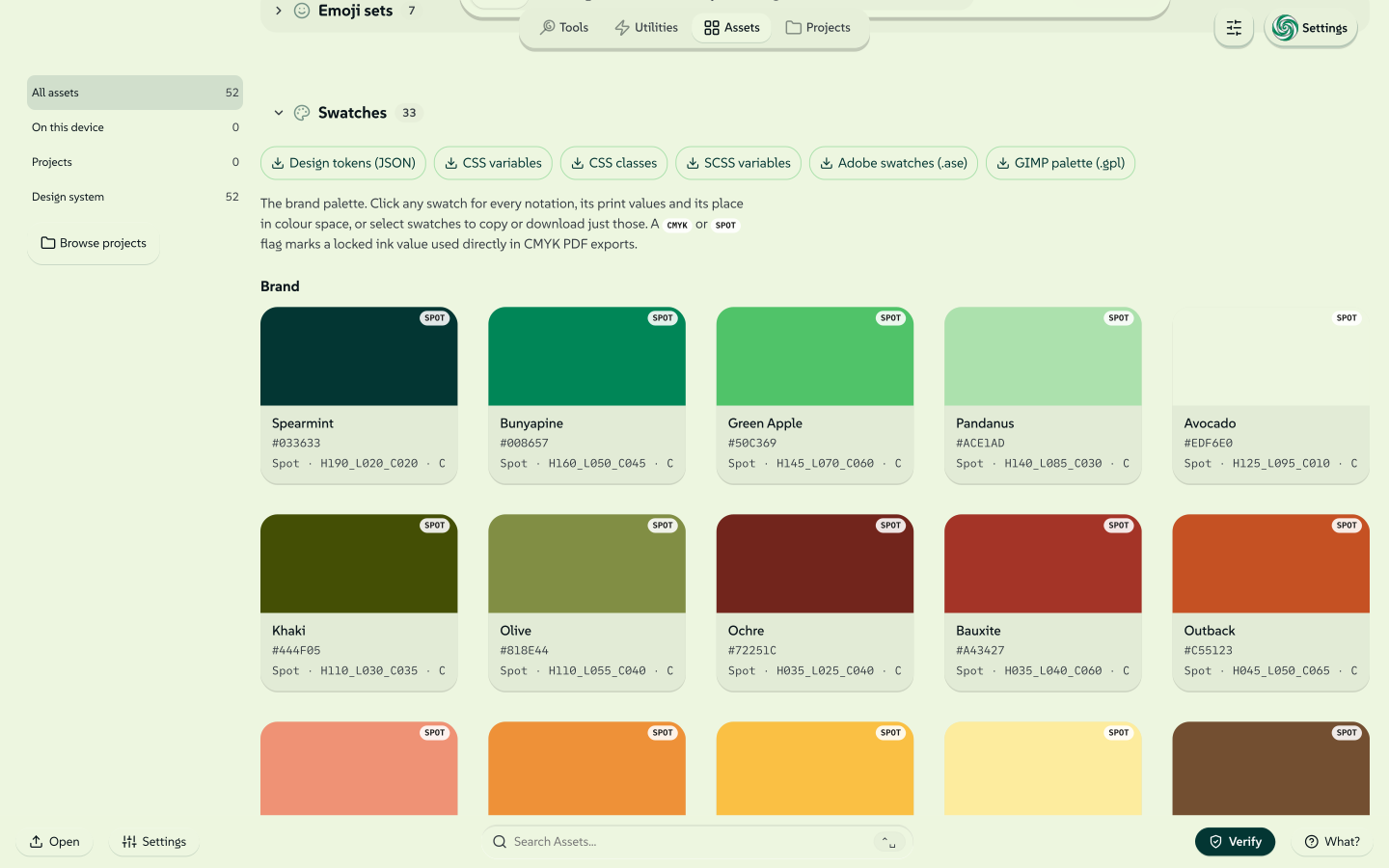
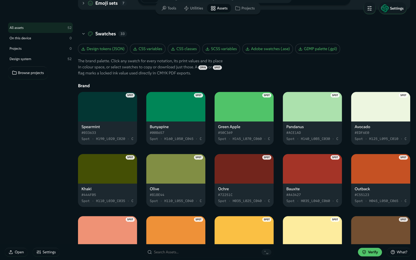
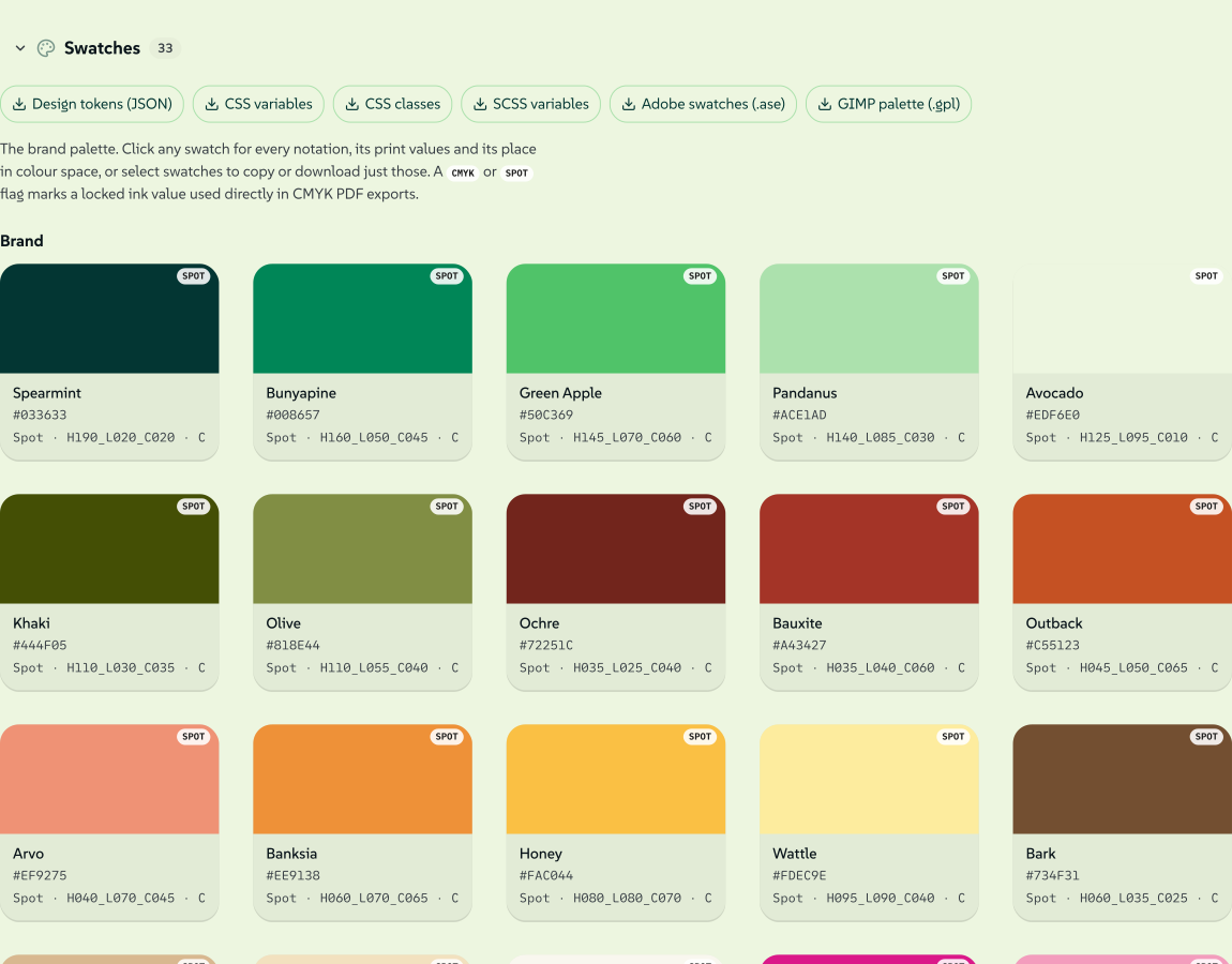
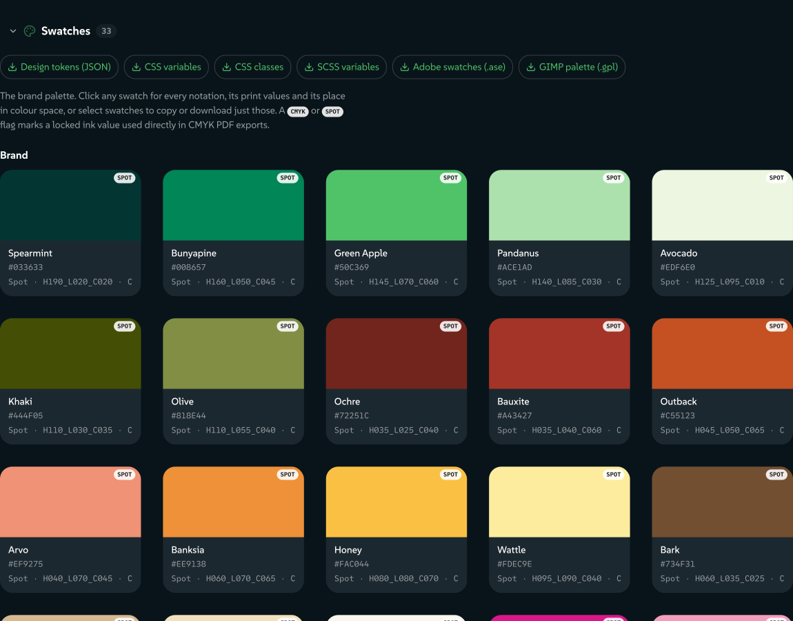
The Swatches panel in Assets shows the colours your brand is made of: its brand colours, colours you added, its ramps and its spectrum. The role colours Lolly keeps for the interface (text, surfaces, edges, colourway leads and copies of a brand colour under another name) wait behind a grey Show colour roles card at the foot of the panel.
Each colour is a card like any other asset. Click one to open its details, select a few to download just those or download the whole palette in the format your other tool reads:
- Design tokens (JSON), CSS variables or CSS classes, for a stylesheet or a build. A colour wider than sRGB keeps its wide value: the CSS sets it after the hex, and the JSON keeps the hex with the wide colour, the CMYK build and the spot ink alongside.
- Adobe Swatch Exchange (.ase), for Illustrator or Photoshop. A colour locked to a CMYK build arrives as that CMYK swatch, a spot ink as a named spot swatch and a colour wider than sRGB as Lab.
- GIMP palette (.gpl), for GIMP or Inkscape, and SCSS variables, both in sRGB.
 signed by Lollyvector SVG87 paths~23k nodes204 groups290 KBCheck it yourselfGet the signed file
 signed by Lollyvector SVG87 paths~23k nodes204 groups290 KBCheck it yourselfGet the signed file


Select colours with the dot on each card: Shift-click a second dot for everything between, drag a box through the gaps or press Cmd/Ctrl+A with a card focused. The bar offers Download as… in the same six formats, Copy hex and Favourite. Before you pick a format, the menu lists any colour no format can hold (Transparent has no colour at all), which formats save a wide colour as its sRGB fallback (SCSS and GIMP) and which carry the CMYK and spot values (JSON and .ase). Right-click a card for the same actions on one colour.
A colour's details fill the preview with the colour and fold out Linked values (its CMYK build or spot ink, any value authored for a particular space or press and its design token), Every notation (hex, OKLCH, Display-P3 and the rest, each with a copy button), Plotted on a colour space, Tones and Readability. The arrow keys step through the palette, Copy link shares the colour itself and Open in Colour Lab takes it further.
The Fonts panel lists your brand faces with a download for each, to install locally or hand to a print shop.
Make the grid yours
- Favourite what you use. Right-click a card and choose Add to favourites, and it gets a big tile in a strip above the grid. Your favourites covers the strip.
- Hide a tool you never use. Right-click a card, or select several, and choose Hide tool. It drops out of the grid and out of what typing in the grid finds. A grey Show hidden tools (N) tile at the end reveals them again, dimmed, each with Unhide tool in its menu. Hiding only changes your grid: the tool still opens from a link or a bookmark.
- Your tools, first. Once you have saved work in three different tools, a Yours row of chips above the grid leads with your favourites and recent tools.
- Lay it out your way. View options sets the layout (Grid, Card or List), card size and density, the sort order and a category filter.
 signed by Lollyvector SVG348 paths~31k nodes790 groups6 images2,083 KBCheck it yourselfGet the signed file
 signed by Lollyvector SVG348 paths~31k nodes790 groups6 images2,084 KBCheck it yourselfGet the signed file


Act on several cards at once. Tick each card's checkbox, drag a selection box across empty space or Shift/Cmd-click, and a bar appears with what that view allows:
- Tools and Utilities: Favourite, Hide, Available offline, View sessions (Projects, showing only the sessions made with those tools) and Copy link for a single card.
- Assets: Favourite and Hide for any selection. Duplicate, Download and Delete appear only when every selected item is one of your own uploads, because a shared design-system asset is a permanent contract.
- Projects: see Find and recover your work.
 signed by Lollyvector SVG22 paths~1.5k nodes22 groups26 KBCheck it yourselfGet the signed file
 signed by Lollyvector SVG22 paths~1.5k nodes22 groups26 KBCheck it yourselfGet the signed file


View sessions appears only once something is selected. Right-click a single unselected card instead and it offers N saved sessions, a list of that tool's saved sessions where a delete moves the session to the Trash.
On a phone
On a narrow screen the layout becomes one column:
- The controls become a sheet at the top with a drag grip on its lower edge. Drag the grip to snap to peek, half or full, or tap it to collapse and expand. The preview fills the space below and stays in view while you edit.
- A floating Export button opens the export sheet: format, size, copy, save and download in one place. Tap the backdrop to close the sheet.
 signed by Lollyvector SVG102 paths~2.7k nodes143 groups2 images89 KBCheck it yourselfGet the signed file
 signed by Lollyvector SVG102 paths~2.7k nodes143 groups2 images89 KBCheck it yourselfGet the signed file


Settings, sound and comfort
Settings, at the foot of the home screen, holds your details, your design systems, accessibility, storage and offline downloads. Settings maps every tab.
- Your details and headshot fill in any tool built to use them, such as an email signature or a badge. Profiles covers them.
- Accessibility has four comfort switches: Reduce motion, Hide colourful previews, High contrast and Large text. They change the app around your work, never a tool canvas or an export.
- Sound plays gentle assistive sounds for what you do, and Neurospicy Mode plays a calm focus track. Both are off until you turn them on, in Settings → Accessibility or the profile menu.
- Available offline downloads the rest of the app, your tools, the catalogue and the guides before you lose the connection. Lolly is a web app you can install: use your browser's install button, or Add to Home Screen on a phone, for a full-screen app that updates itself when you are back online.
- Storage shows what Lolly keeps on this device. If you clear your browser data explains what clearing removes, and the Privacy Policy lists everything the app fetches or sends.
A blank panel or a "failed to fetch" message right after an update usually clears with one reload. Your saved work, sessions and design systems are untouched, because they are stored on your device. Only a picture you added and never saved may need adding again.
Where to go next
- Design: the free canvas: the canvas, shapes, the timeline and presenting a deck.
- Batch and Multi-edit: many versions of one design, or several saved designs edited together.
- Export a file: choosing a format, size, print units, transparency and video.
- Import a design: bring a Figma, Penpot, Illustrator or InDesign file into Design and keep editing.
- Templates: saved starting points for a tool.
- Wide Colour and HDR: keep original image precision in Design and Darkroom.
- Find and recover your work: where everything is, and how to move it to another device.
Section links from the earlier guide
- Opening a tool
- Ask Lolly
- The canvas (preview)
- The free canvas (Design)
- Resize, scale and rotate
- Layers and Inspector
- Drawing your own shapes (the pen)
- Combining shapes (path operations)
- 3D scenes
- Tools inside a design
- Timeline (Sequence)
- Presenting
- Live pages that take the clicker
- Controls (inputs)
- Your details & headshot
- Projects
- Live camera (motion-reactive tools)
- My images
- Sound & accessibility
- Storage & privacy
- Moving to another device
- Batch (Pro) mode
- Editing side by side (Multi-edit)
- Offline & install
- Import a design
- Export a file